@DopeOblivion I don’t like specially, I think you can work a little more on the image and elements placement to make it a little bit more creative, also maybe use more trendy elements (not sure how your audience will perceive that). Maybe you can look on some Framer templates for inspiration.
@AlexCristache 🤣 I think a palette can have let’s say no more than 5 colors? Trio, mono, etc? A ramp maybe between 12/22 and they hold the same hues. One works better for branding/marketing, whereas the other is more for digital products? I guess that’s what I wanted to say he he.
@AlexCristache Mmm I don’t agree 😊, I can create a palette (mono, trio, etc), they can address accessibility or not, not mandatory. They have less colors. Color ramps (need more than one) IMO have to address, with enough ramps, anything you want (proper strategy) + accessibility (APCA).
@AlexCristache A color palette is just a group of colors. They can be harmonious or not. They can or cannot match. A color ramp in the other hand is something different for me, as the colors have a specific purpose for specific elements inside the anatomy of a component.
Start your digital journey now.
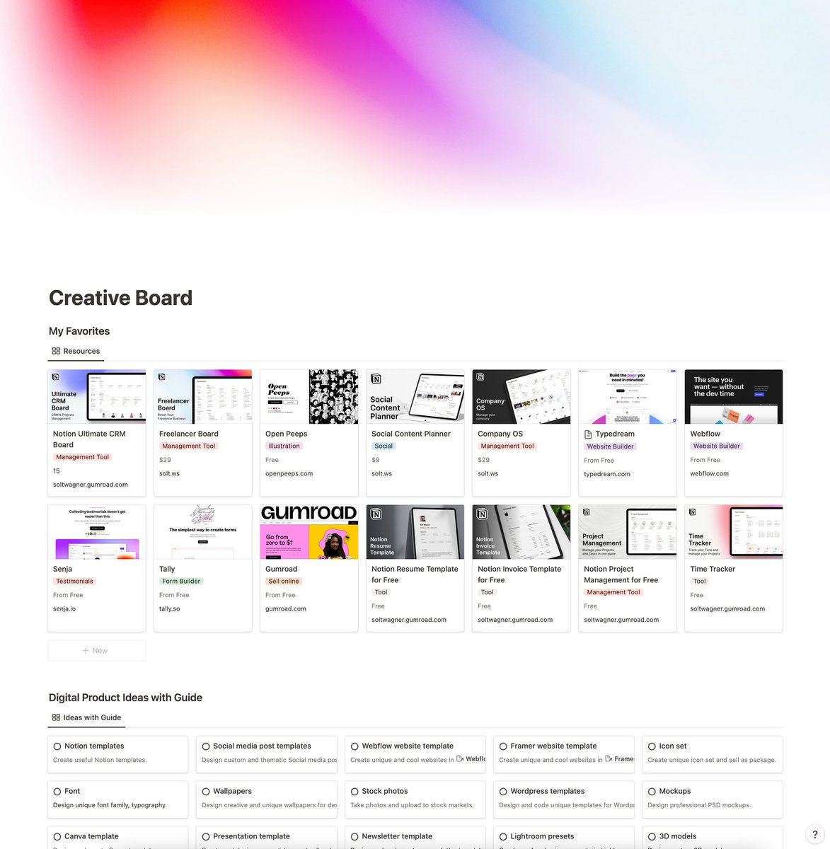
Get 50 product ideas with guides and 200 useful resources now for Free. 🎉
Reply "Send", RT, and Like this post to receive them via DM. Follow me for more. 🙌