Hi everyone, I'll be running a mentorship circle with @wia_animation, "From Artist to Art Director: How to Move Up". Read about the class here, and consider joining this great organization! https://t.co/HabZ6xYfYu
I was really inspired by Chinese fonts/typography and graphic design, it's not very well known in the design field yet. Chinese characters themselves are pictographic by nature and something I've yet to see in animation design!
I grew up reading about the Monkey King's journey as a child so I was so, so excited to have the opportunity to work on this project! Stylistically, I wanted to get away from curvy designs (ala KFP) and oft cited Chinese paintings. I wanted it to be graphic, edgy and fresh.
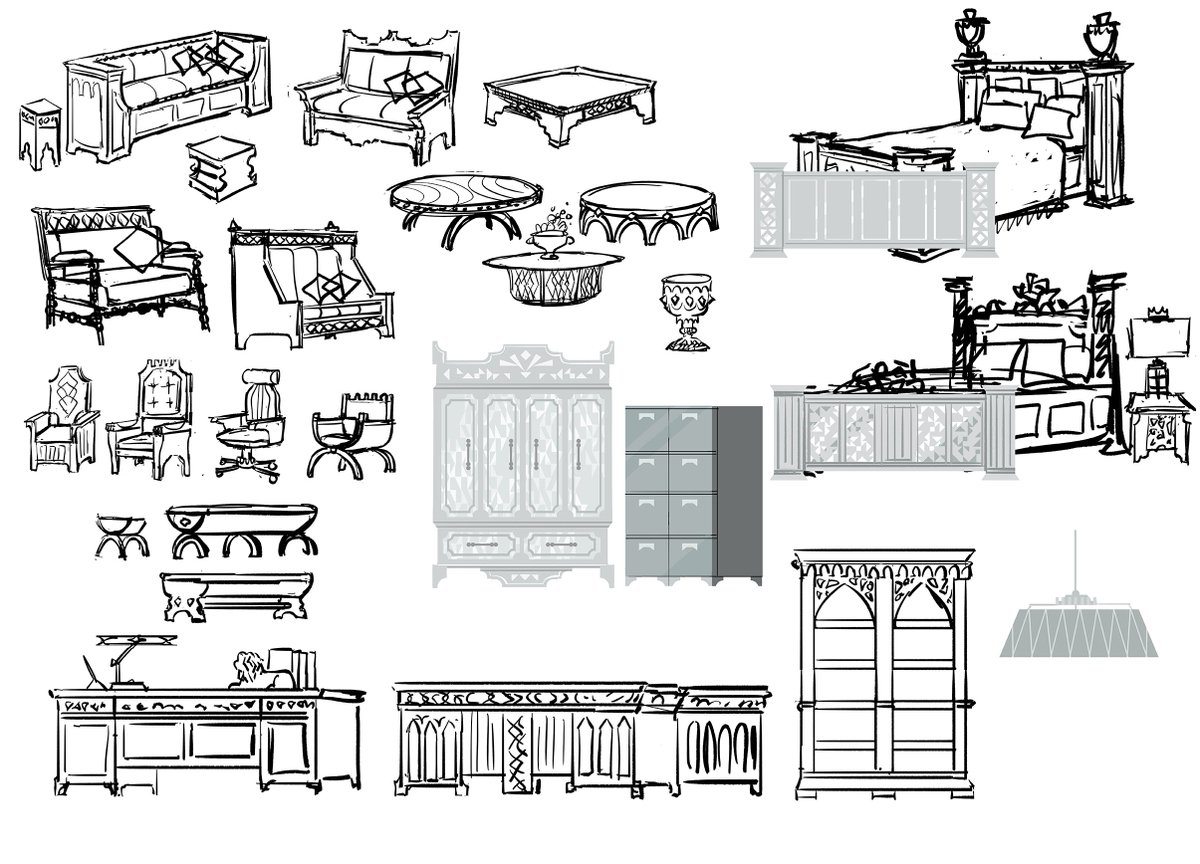
Goldenloin's room got axed from the final cut but it was the beginnings of a specific style for furniture within the Institute - the assignment was to mash medieval with futuristic/modern design - quite the opposite of one another! A really fun design assignment.
#Nimona was definitely a project that required a robust style guide. It challenged all the artists and production to work in a very specific way to achieve a fully committed, stylized look from start to finish.
You could say the stylization limited each artists' "individual" expression (ie we are all working together in a similar style), but I think in exchange it pushes each artist to problem solve creatively - which to me was very satisfying.
Funny seeing work I did just a few years ago and how many other different stylized projects I've worked on since. They've all really affected me as an artist over the years! I get bored only working in just one style for too long.
It was important to find a way to keep that "medieval" vibe in there and it was mostly achieved through the silhouette of battlements on architecture and furniture in the above paintings. We later found other ways to do that as the look of the film continued to evolve.
I started working on Nimona in the summer of 2017 first as a freelance artist. These are some of the first paintings I made for the inside of the Institution! They're all different rooms but I wanted it to feel controlled and branded. It's a tightly run organization.
The Institute had serene and clean looking outward facing spaces, open concept offices, a more utilitarian looking mail room, and then darker, more covert computer rooms on the inside. I wanted to show that range within the Institute's brutalist/modern/medieval style.
I remember not being able to sleep the first week of work because I wanted so badly to be a part of this project haha, so I was thrilled when @jeff_turley took me on full time a few months later!
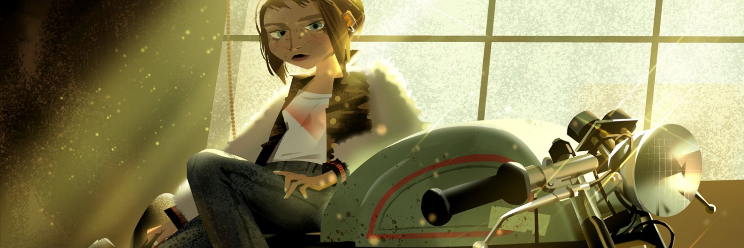
Nimona is finally out on Netflix! It is such a fun and beautifully made project despite all the setbacks that happened along the way! Here's some of the work I did on the project a year before Blue Sky closed shop - https://t.co/j2Gk6ABRpQ
Did I write about this subject already - you can see I have strong feelings about it ahaha - disorganized projects and set-by-set design drives me a little nuts.
Don't design in a vacuum, ie: design something on it's own without considering it's relationship to everything else. Same for color, lighting etc. Work off of a loose outline so you know what happens before/after the piece of the linear puzzle you're working on.
A doc creates consistency in the style, perimeters for artists to work off of, allows you to see how everything works together for the entire movie, and helps keep track of changes (things will definitely change).