Your thumbnail has only 2 seconds to win the click
Great video, weak packaging = nobody ever sees the video
Composition, contrast, focus every choice earns the click
That's all I do, all day, 7 days a week
Let's fix yours. DM me
I redesigned a random thumbnail from youtube
one gets you the click. one makes viewers trust you less
why left damages the brand
the scale between both phones is clearly off = manipulation
as a result trust drops before they even click
why right works?
true scale, bright and clear, visible apple logo, no clickbait
dm to get a free redesign 📥
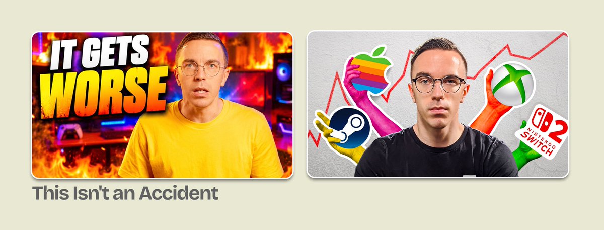
I redesigned a random thumbnail from youtube
one screams at you. one tells a story
why left loses
"IT GETS WORSE" and "This Isn't an Accident" are two different hooks fighting each other
viewer can't even tell what the video is about
right fixes it
thumbnail answers what → these companies, prices rising
title answers why click → it's deliberate
📥 DM to get a free redesign
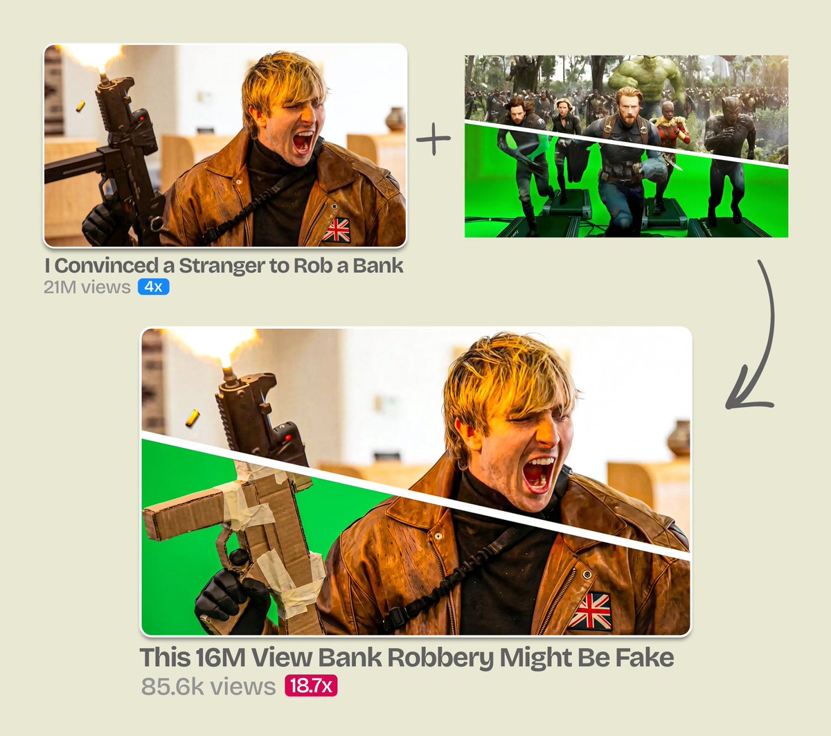
21M views. not our video. we still ate. here's the thumbnail that cut our slice
green screen is a universal "fake" symbol. everyone decodes it instantly
viewer feels smart for seeing behind the curtain. that feeling gets the click
we used the exact same structure to expose Mack's bank robbery video
21M views thumbnail shot on top, cardboard gun + green screen below
result: 18.7x outlier. 0.4% of his audience. that's all it took
you have only 0.4 seconds before the viewer scrolls past your thumbnail
most creators stuff everything into the frame thinking "more = better"
it's the opposite
the original had gazillion things fighting for attention
books, body, map, pins, NYC tag
I cut it to 3
plus theres no breathing room, tiny face, zero location clarity - the pins serving nothing there
fix ?
- bigger face
- negative space behind.. the sky
- better location cue
- better color contrast
suddenly the title makes sense at a glance