I designed this skincare hero to do more than look good — it’s built to guide visitors toward action.
Clear messaging, trust signals, social proof, a guarantee, and a strong CTA all work together
Would you change anything?
#DTC#eCommerce#CRO
#EcommerceDesign#SkinCareBrand
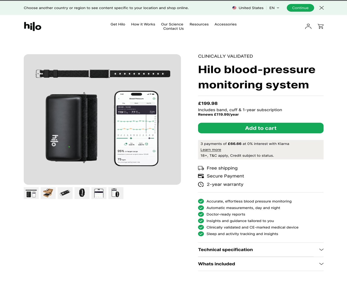
I designed this product page around the questions customers are already asking:
What is it?
Why do I need it?
Does it work?
Can I trust it?
Is it right for me?
What do you think of the approach?
Design@figma
I redesigned this product page to make buying feel simple, not overwhelming.
Clear hierarchy, stronger product visuals, easy-to-scan benefits, smart bundle offers, and a frictionless path to checkout.
The goal? Help the right customer say “this is for me” faster.
Good product design starts before the customer clicks “Add to cart.”
I designed this page around the questions a buyer is likely to have:
What is it?
What does it do?
What do I get?
And can I trust it?
That’s where conversion really starts.
#figmadesign#buybox
A product page has a lot of work to do before someone ever clicks “Buy.”
For this redesign, I focused on making the journey feel natural: understand the product, see the benefits, build trust, compare options, and finally feel confident enough to take action.
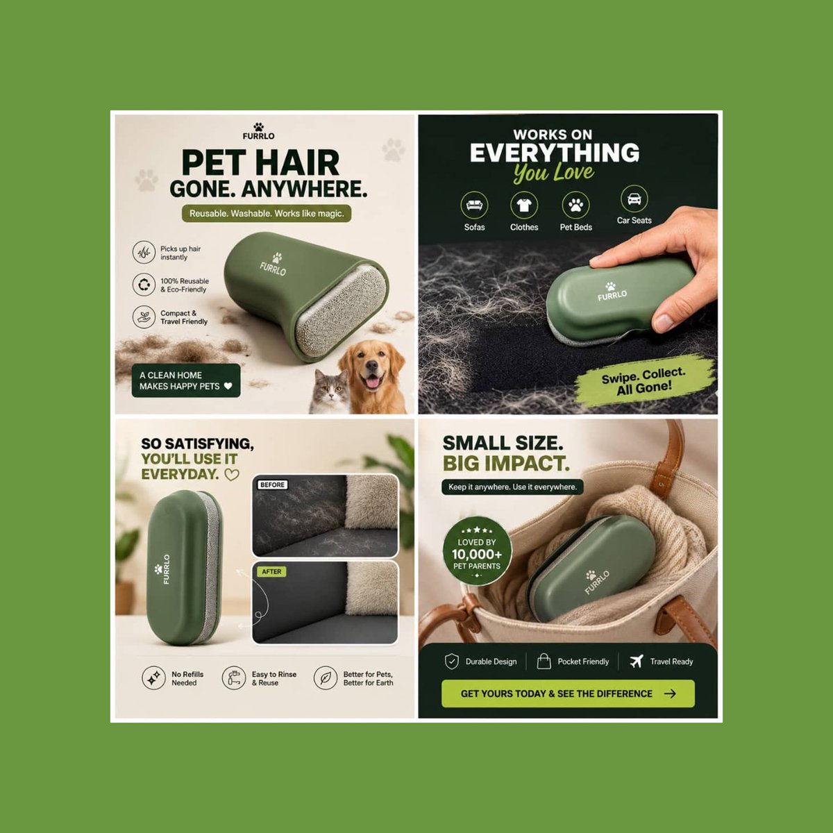
Your product might be great, but the creative has to communicate that quickly.
This concept was designed to capture attention, highlight the value, and create enough curiosity to earn the click.
Staticadbuilt@figma
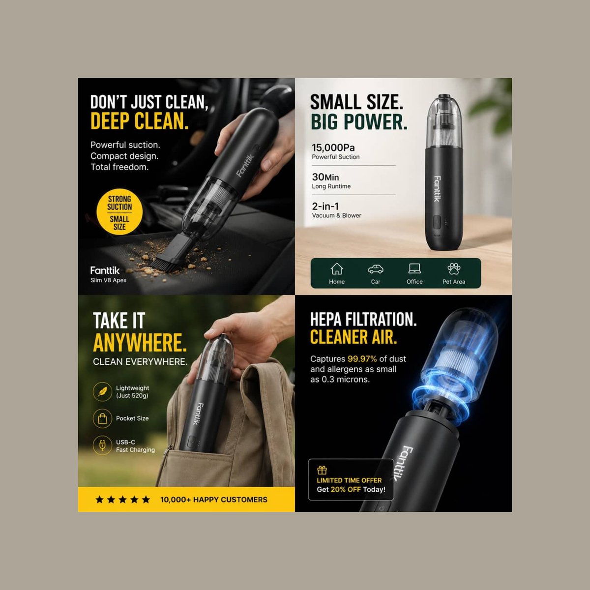
Good-looking ads aren't enough anymore.
Every element in this creative is designed to capture attention, build trust, and encourage action.
#Staticadbuilt@figma
Creating ads that respect people's attention is becoming more important than ever.
Simple, direct, and intentional usually beats complicated.
That's the thinking behind this piece.
Every pixel should have a purpose.
From hierarchy to spacing and CTA placement, every decision was made to improve clarity and conversion.
That's what performance-focused design looks like.
Building a library of performance-focused creatives, one design at a time.
Always exploring cleaner layouts, stronger messaging, and better visual storytelling.
A strong creative should guide the eye naturally.
If people have to search for the message, the design is already working against itself.
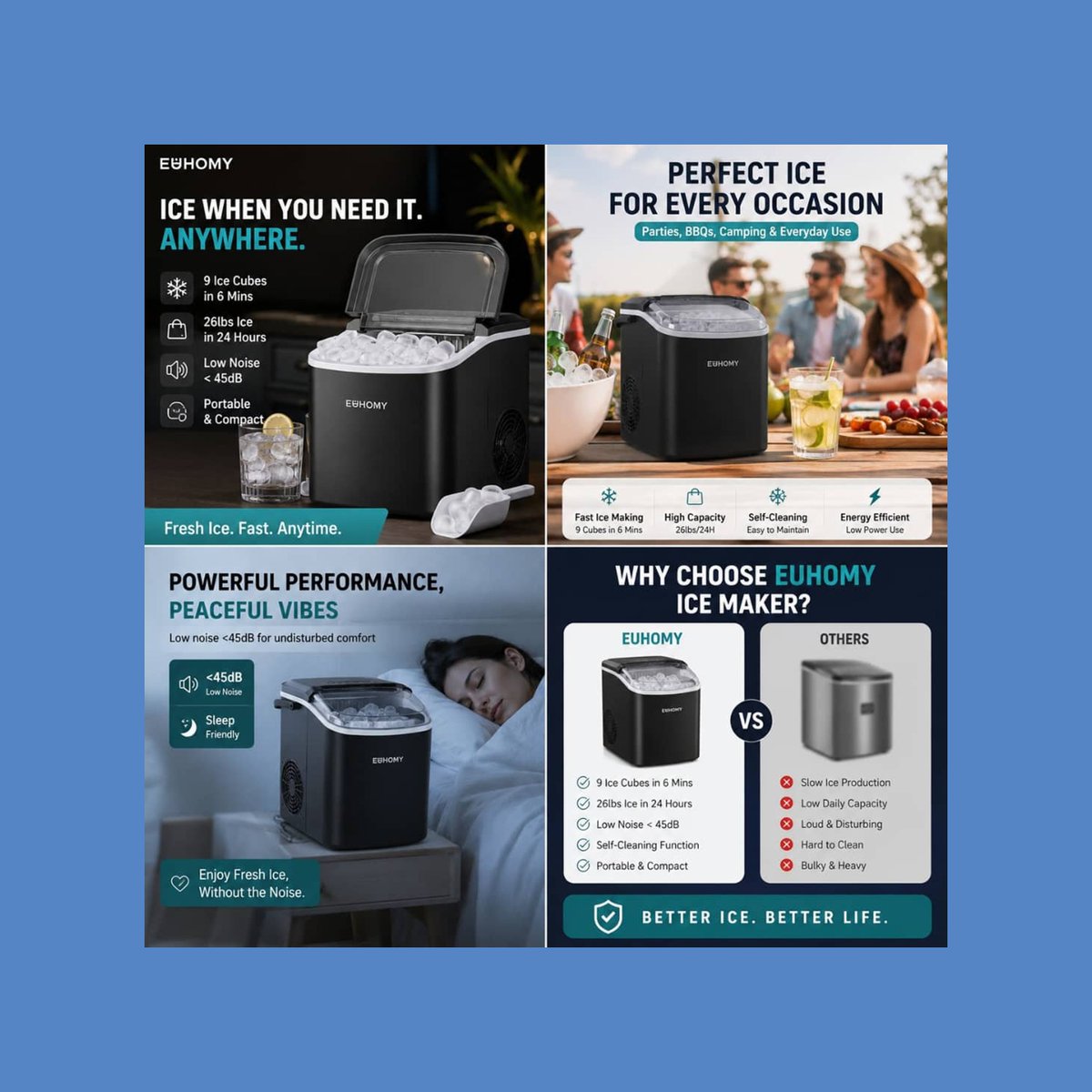
Here's a recent concept built around that idea.
I've been spending more time refining the fundamentals.
Better hierarchy, cleaner layouts, and stronger messaging consistently outperform overdesigned creatives.
Here's one recent example.
Design@figma
The best-performing ads are often the easiest to understand.
No unnecessary effects.
No visual clutter.
Just one clear message delivered with confidence.
One creative.
One message.
One clear action.
The fewer decisions users have to make, the more effective the experience tends to be.
#StaticAddesign@figma