@visualgrapher20@Su2412@TIME Your website is very organized and easy to navigate! You kept the color palette consistent and I love the animated background of the website. It makes your website stand out! Great job!!
@allis_on2412 Hi Allison! I love how you kept the minimalist theme consistent throughout the website. Although the color palette was mainly beige throughout the website, you added visual appeal by incorporating alignment and colors from your photos. Great job!😁
I made a digital portfolio to showcase the work I've done throughout my visual social marketing course! Check it out here! #su2412#website
https://t.co/Kv0I6UOpHn
@stoddart_bri@YouTube This is a great video! You kept it concise but still included important information. I loved how you showed all of the features of the app. Great job!!
Not too sure how a piece of furniture would look in your room? I found an app that’s perfect for interior design!
https://t.co/XRO8M2vSwd
#su2412#homedecor
@ShariarHos85257@YouTube This is a great video! She definitely explained everything clearly and had a great slideshow presentation that wasn't too cluttered with information.
https://t.co/Fl7kAODxoD
This video is a great watch! She has great tips and information that is explained effectively. This is perfect for anyone who wants to create social media content for their small business. #su2412#SocialMediaStrategy
Mike chose a great campaign because Oreo effectively used repetition, and successfully targeted a younger demographic. Its digital presence allows more people to see it, which makes the campaign successful. #su2412#oreo
I think @Oreo's campaign with @PostMalone is fascinating. It provides a unique product with a strong digital presence. My favorite visual element is the repetition of the cookies and the primary colors throughout the pictures. #su2412#PostMalone#Oreo
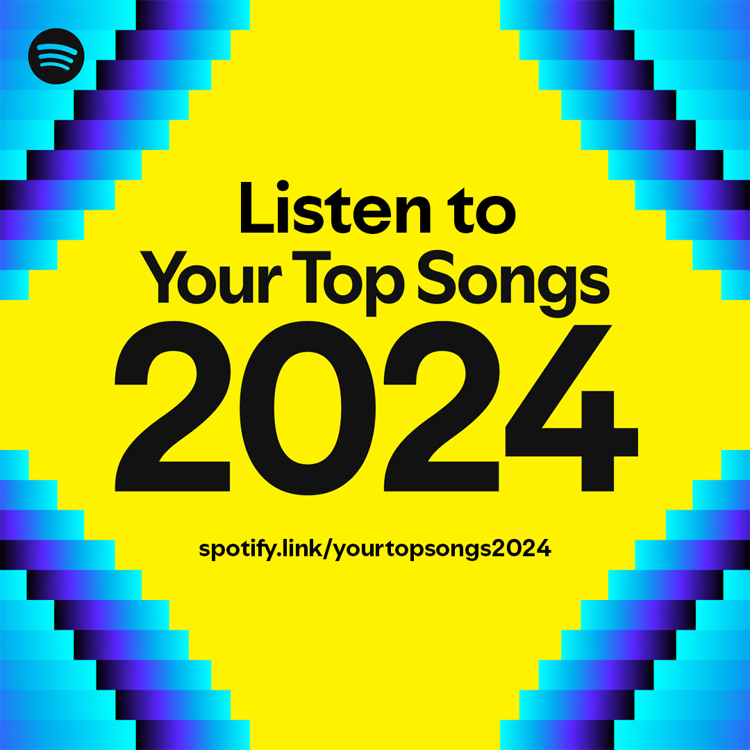
I think the Spotify Wrapped campaign is successful because listeners are always excited to see it in December. My favorite visual element is repetition because it increases the brand recognition since Spotify uses same fonts and designs every year. #su2412#SpotifyWrapped#Music
@s0cial_mikey@Oreo@PostMalone I think Oreo did an excellent job with this marketing campaign. The fact that the Oreos have been sold out says a lot about the campaign