Will Shapiro, ’04 co-founder of @topos_ai aims to transform the way we understand cities. They've come up with “a real-time way of understanding COVID in relation to a lot of other relevant variables that have to do with place."
Read more:
https://t.co/1VaTx8e2l2
Amazing article from PennToday on covid data, mapping and history of systemic racism. Featuring me and our @topos_ai COVID19 compiler project.
thanks @Penn@WeitzmanSchool@PennIUR
https://t.co/NMIYd5xWkv
Summertime is drinking time, but saddling up to an air conditioned bar still isn’t an option. Fortunately, many of your favorite NYC establishments are offering drinks to go. Beat the heat and the COVID gloom by easily finding cocktails near you. Cheers! https://t.co/HZiUs8YXeh
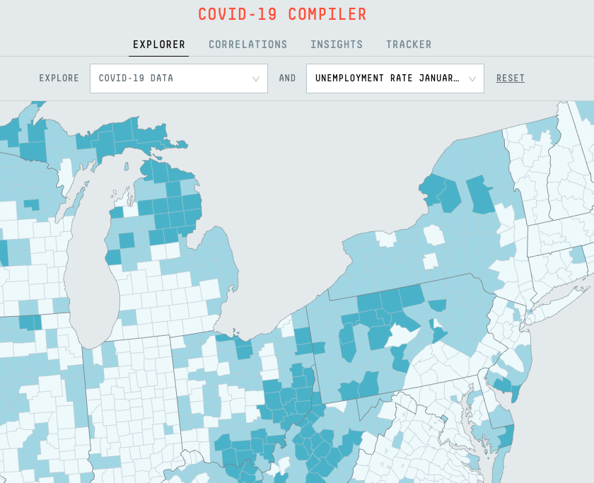
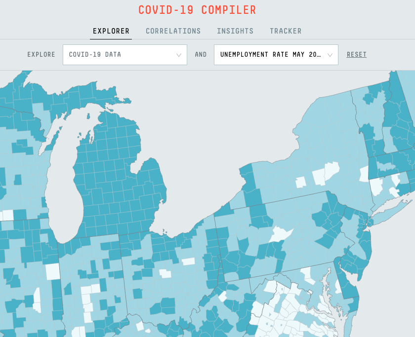
Although the nationwide #unemployment rate dropped between April and May, county-level data provides a more nuanced view of the current state of labor in the US. In this last example, we can see how unemployment spread and intensified across the country between January and May
The Dept. of Labor released new #unemployment data yesterday (https://t.co/YHbS2Y4fmW) showing that counties in Michigan and along the West Coast are being hit especially hard by the economic effects of #COVID19
Meanwhile, in the Rust Belt region, high unemployment rates have gradually shifted and become especially concentrated within #Michigan (January and May unemployment rates seen here)
There’s a massive surge in #COVID19 cases across the US. In the spring, most new cases were in NYC and nearby areas. Now, the Southeast, Southwest, and parts of the Midwest are seeing the most new cases. This gif shows weekly new cases per cap on 3/23, 4/23, 5/23, and 6/23
There’s a massive surge in #COVID19 cases across the US. In the spring, most new cases were in NYC and nearby areas. Now, the Southeast, Southwest, and parts of the Midwest are seeing the most new cases. This gif shows weekly new cases per cap on 3/23, 4/23, 5/23, and 6/23
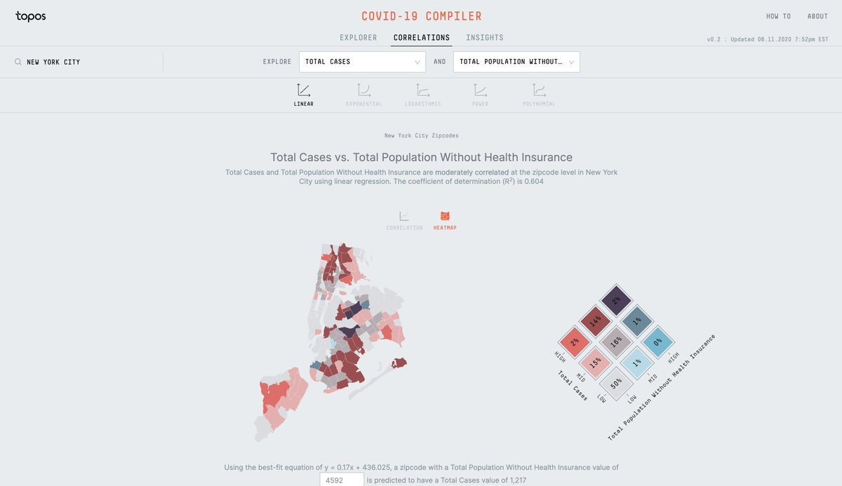
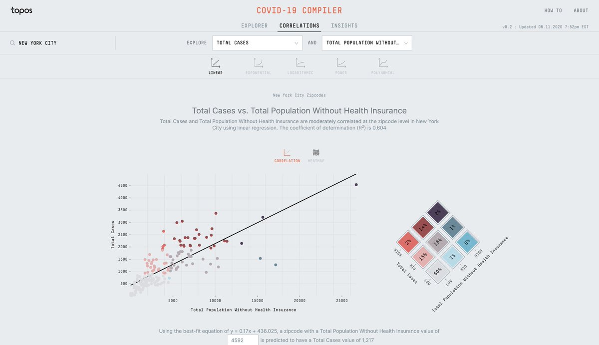
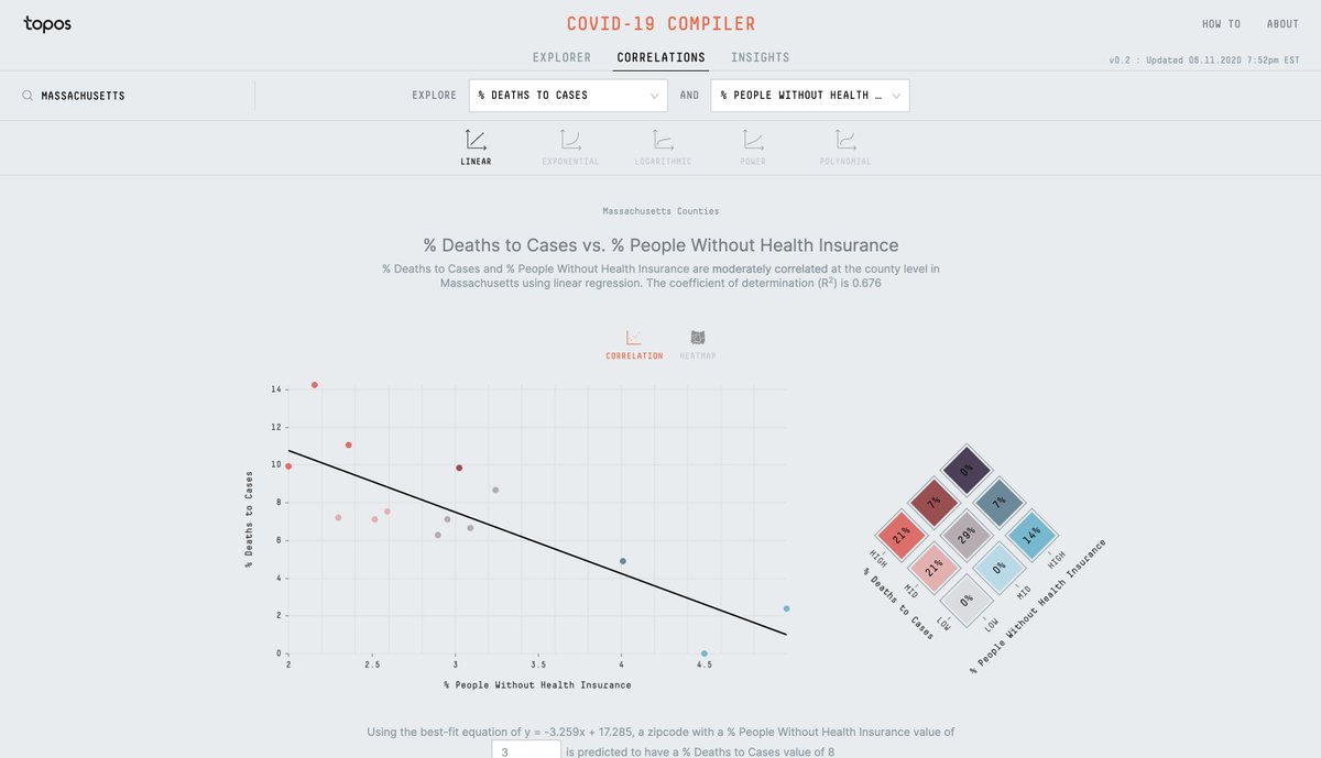
Today we are releasing the Correlations view on our COVID-19 Compiler. It offers a way to explore the relationships between #COVID19 data and various datasets at zipcode and county level.
To explore more correlations, please go to https://t.co/HMEAmFBC2x
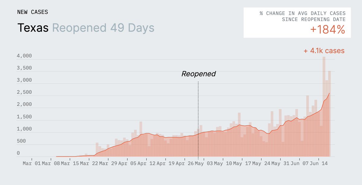
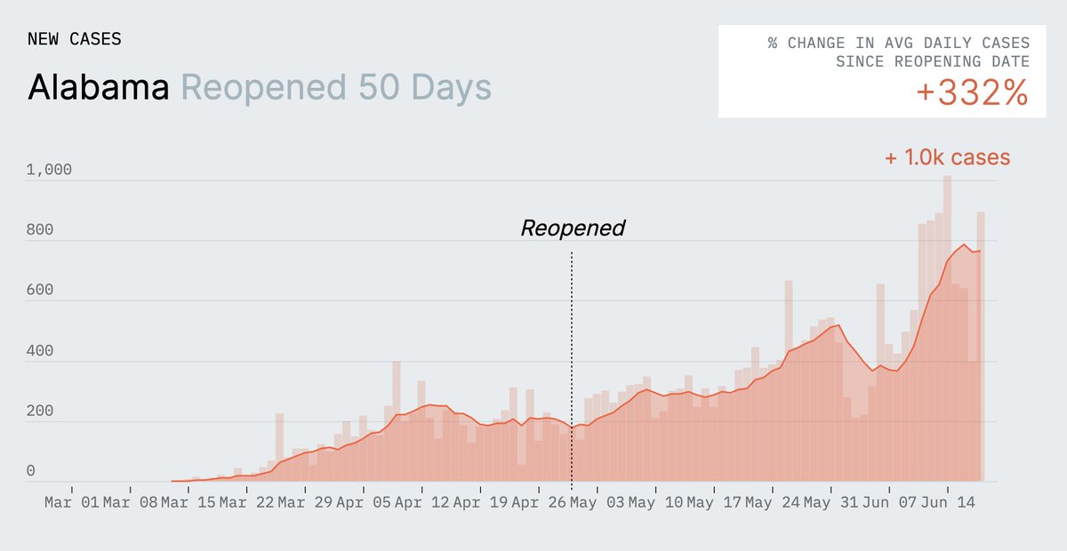
How's your state doing since reopening?
(Coincidentally, all the states that start with "A" are doing terribly, so the top-to-bottom alphabetical scroll starts ominously):
https://t.co/aDGKntI4jS
Early hot spots such as #NewYork state have seen a sustained drop in new #COVID19 cases but infections are rising in at least 20 states. You can see our charts @maddow featured in her show here: https://t.co/TtDSkgWNu1
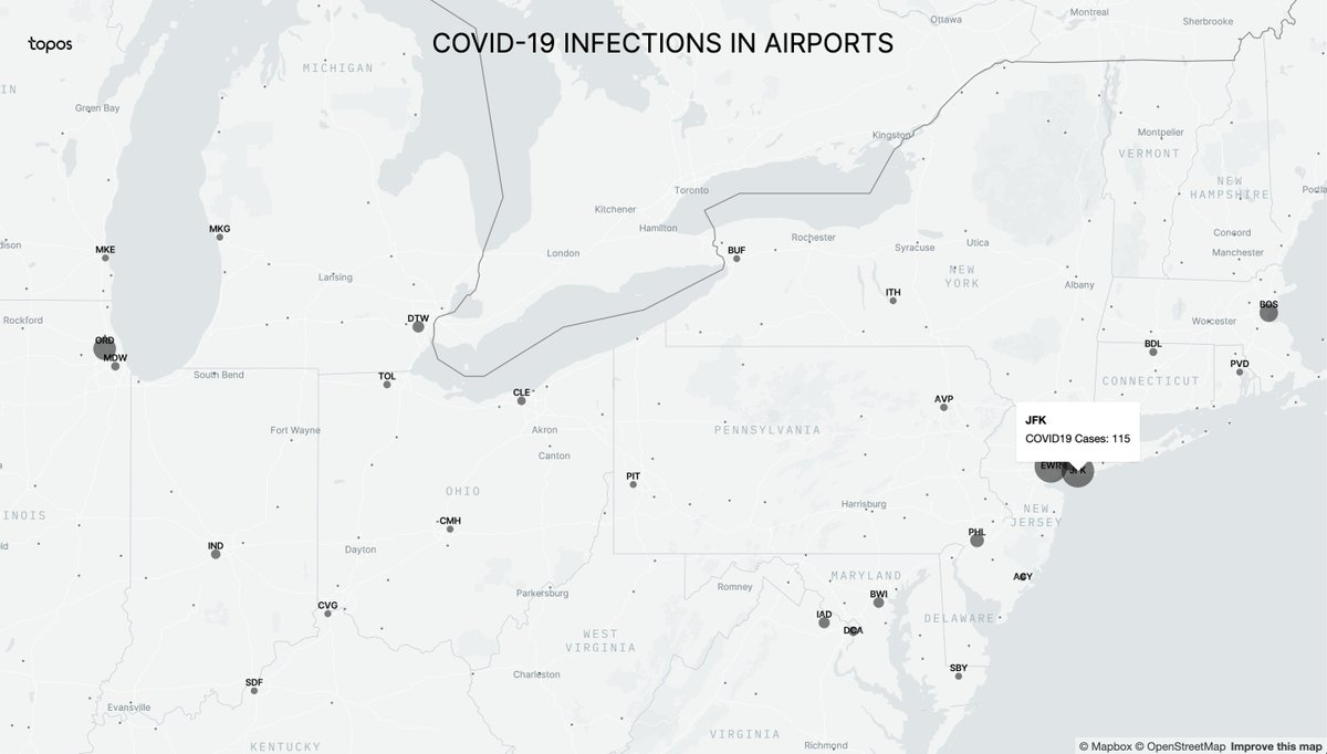
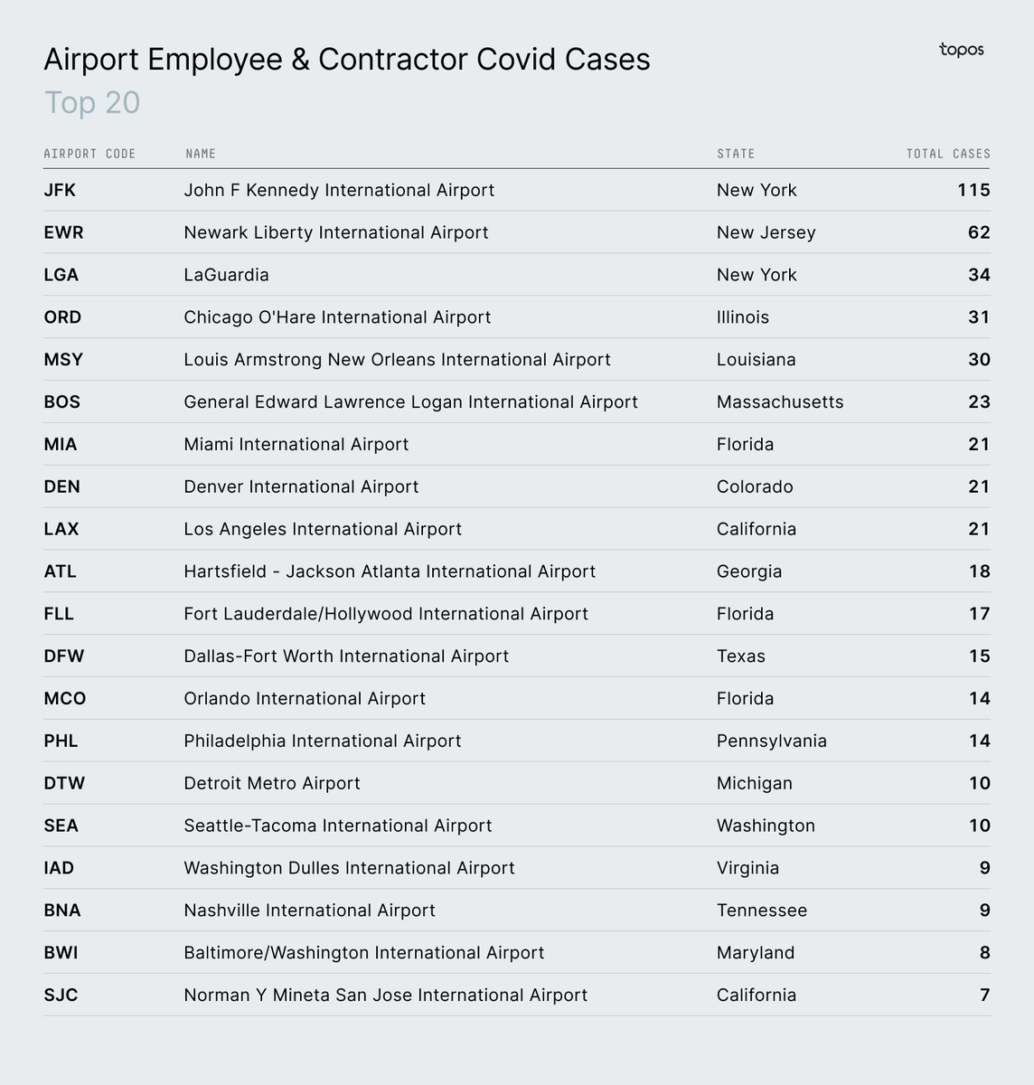
Here are the top 20 airports with the most confirmed #COVID19 cases among employees and contractors (note that the TSA only counted individuals who may have interacted with the public, such as screeners)
In our latest study we looked into the relationships between zipcode level tax data and #COVID19 cases in #NYC and we built a model to see if we can predict cases in other geographies
https://t.co/DX1oo20ePJ
Flight attendants are at higher risk of contracting #COVID19 due to the nature of their jobs (https://t.co/HjTtm9mLRr). But what about TSA employees? To check this, we mapped airports with confirmed #COVID19 cases among employees
Here are the top 20 airports with the most confirmed #COVID19 cases among employees and contractors (note that the TSA only counted individuals who may have interacted with the public, such as screeners)
Flight attendants are at higher risk of contracting #COVID19 due to the nature of their jobs (https://t.co/HjTtm9mLRr). But what about TSA employees? To check this, we mapped airports with confirmed #COVID19 cases among employees