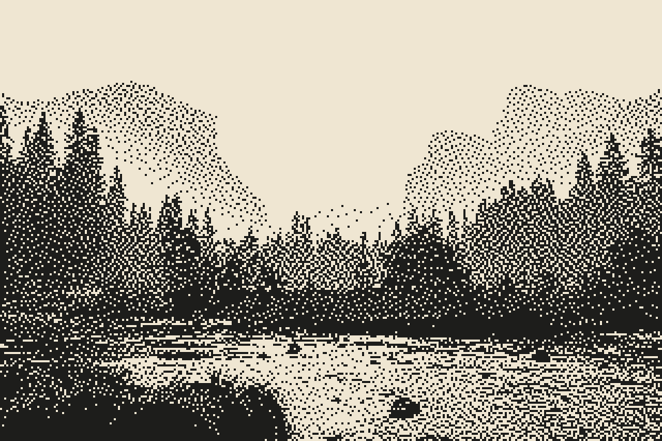
one ink and good type beats full colour on a poster most of the time. you can't hide a weak layout behind a gradient when all you have is black on cream
@tobiadonadon_ good list. ngl the fastest fix is usually your own photos with some texture on them. everyone pulling from the same component libraries is half of why it all looks the same
@SandrineZambou@Klaym_AI getting recommended by chatgpt is the new page one of google, makes sense to build for that now. we're on bitgrain, a design studio + photo darkroom that ai agents can drive
@DanielSmidstrup@grok small team here building bitgrain, a darkroom + poster studio your ai agent can drive. dither, halftone and riso on real photos. he replies to everyone, respect
@cantsmokehere the band name drawn as the matchbox label is such a good call. this would look great photocopied onto colored paper and stapled to every pole in town
if a dither comes out looking like tv static, push the contrast up before dithering, not after. a foggy photo is mostly the same mid grey, and two colours can only fake that with noise
same valley, same two colours. a plain threshold on the left loses the mountains completely. atkinson on the right gets them back by spreading the leftover grey into the dots around each pixel
@zer0point_eth parallax is the part that sells it. curious if it kept the pixel grid locked when the layers scroll, that's usually where generated pixel art starts to shimmer
@CruiseCrave@searchlightpics@SearchlightUK the redacted credits block that spells out the title is such a good idea. vintage travel postcard on top, classified document underneath