Typografie- und DTP-Lehrkraft @designkrefeld. Dr. phil. @HBK_BS 2019. @Fontstand News editor. Amateur design historian researching 19th C. German typefoundries.
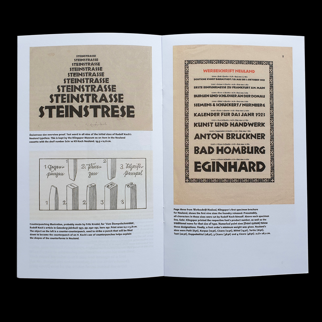
Near Frankfurt? Coming to the Buchmesse? @jeromeknebusch, Edvinas Žukauskas & I will speak at the Klingspor Museum on the evening of October 20th. All about Neuland & its newest revival Koch Grotesk from @poem_editions. It would be great to see you! https://t.co/LMseVtztVH
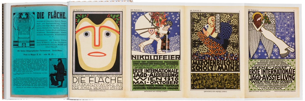
Announcing the latest from Letterform Archive Books! Die Fläche: Design and Lettering of the Vienna Secession, 1902–1911, a hi-fi facsimile edition of the periodical that introduced Vienna’s modern design movement to the world.
Available for preorder now: https://t.co/Ofhu7iVzAu
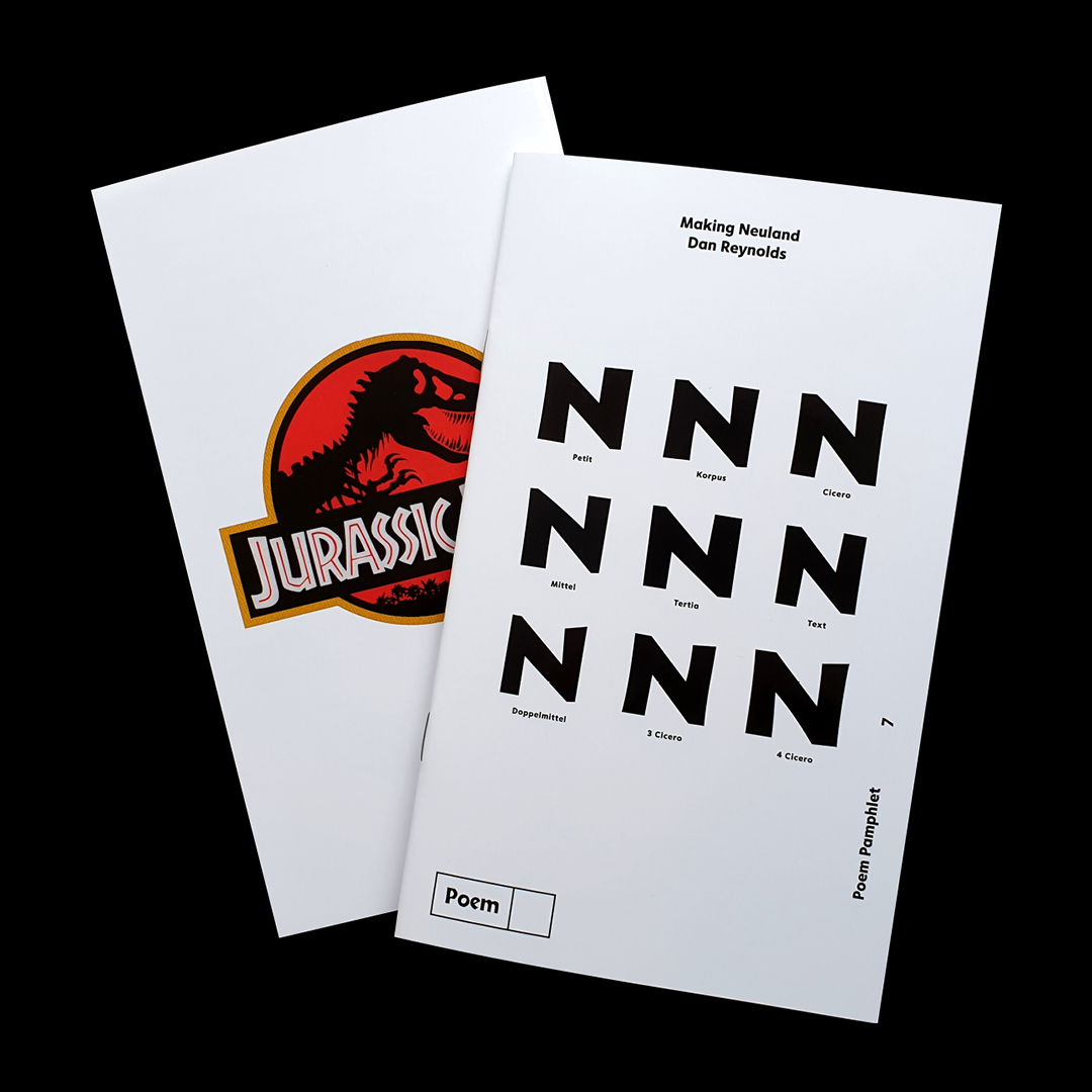
New fonts 🌿 Koch Grotesk by Rudolf Koch, Edvinas Žukauskas & Jérôme Knebusch
The newest revival of Neuland, published exactly 100 years ago by Klingspor in Offenbach. One separate font for each of the nine original sizes + a never-released lowercase.
https://t.co/prOoS94t5n
Today on Fontstand News, we published an interview from Michela Zoppi with Seb McLauchlan about his typefaces. Check them out over at https://t.co/4GcaGBT9sQ
125 years ago today – at exactly 12:05 in the afternoon, Berlin time – H. Berthold AG filed prints of 13 sizes of Akzidenz-Grotesk’s regular weight with the Berlin Muster-Register. That means that it is the typeface’s “birthday” right now. https://t.co/icKy4fjeAF
@typeoff We are pleased to have these holdings in our archive @Technikmuseum_B and that we can make a contribution to research by making them accessible. For the #Akzidenz-Grotesk we refer to these files.
Thanks to the Historical Archive at the Deutsches Technikmuseum, several internal Berthold documents related to Akzidenz-Grotesk are now available to the public. All roads point to Stuttgart. Akzidenz-Grotesk’s design came to Berthold from Bauer & Co.; Berthold then expanded it.
Ein laufendes #Erschließungsprojekt im @Technikmuseum_B erfasst Akten aus der Berthold AG und macht diese der Forschung zugänglich. Es finden sich Listen mit Schriftnummern die uns auch bei der Arbeit im Depot helfen: https://t.co/YD2IuXiX68 #typography#berthold#archive
A snow-capped typeface to match today's weather from the Stempel Foundry's giant 1925 specimen book.
https://t.co/7dVrXf7sA1
#typography#TypeSpecimen#libraries
About 100 years ago, there were two methods by which brass-type fonts for bookbinders were industrially manufactured in Germany. I found a detailed description for one method (sandcasting) and translated it for you over on my website.
The German squad is flaming out of the tournament because its players suck and there is no kind of sensible organization or planning behind them. Instead, foreigners have to be blamed for stealing the team’s chances 🤦♂️