Smartphone Wallpaper Feature: June’s font is TP Sky Round. Under TP Sky’s grand concept of “Sky,” TP Sky Round 50 is envisioned with the keyword “Cloudy,” and TP Sky Round 100 with “Rainy.” Try out this wallpaper—it’s perfect for the June mood! https://t.co/EFjXcUsdLC
It’s raining heavily in Tokyo today because of the typhoon. TP Sky Round 100 uses “雨 (Rainy)” as a metaphorical keyword.
Discover more on our Instagram: https://t.co/2BQEMPFX9J
‘Today, I would like to introduce “In Praise of Type.”This book is a collection of essays on print culture by 26 notable figures from various fields, including editors, designers, typography researchers, and writers.’
[TP Staff Blog]
https://t.co/AeLyljeHzq
AXIS Round 100 is a “contemporary round Gothic” that is both approachable and possessed of a sense of being neatly attired.
Discover more on our Instagram: https://t.co/2BQEMPFX9J
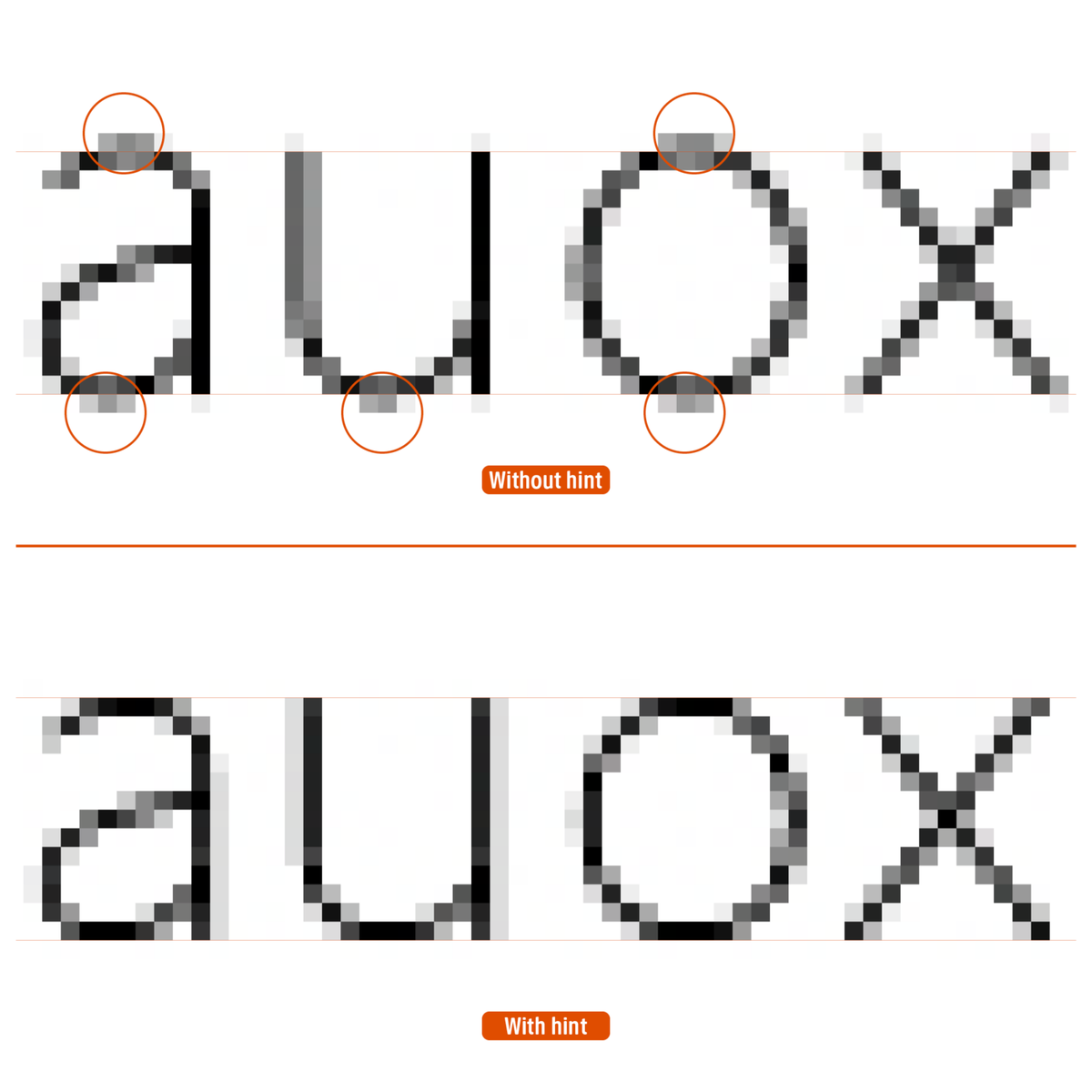
‘IExtreme point refers to the position in which the angle of the handle used to draw a curved line is completely “horizontal (0 degrees)” or “vertical (90 degrees).”’
[TP Staff Blog]
Story of Hints 05: “Extreme Points and Hints”
https://t.co/PEotk0II09
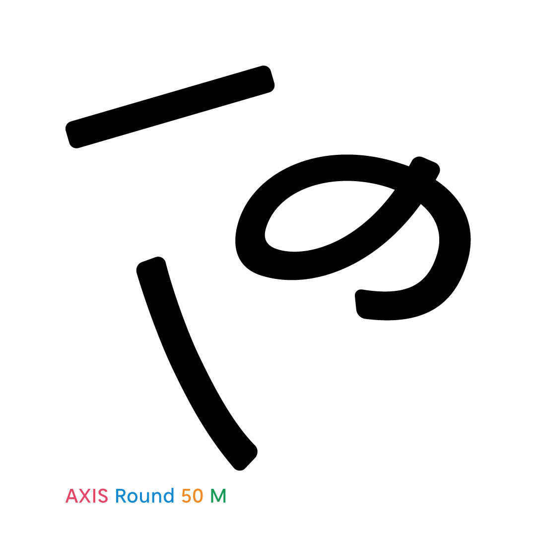
With its sharp AXIS Font contours given a subtle rounding, AXIS Round 50 retains the crisp feeling of the modern sans-serif while generating a soft and airy quality.
Discover more on our Instagram: https://t.co/2BQEMPFX9J
A key charm of Kinshachi Font Hime’s Kanji is the dynamic energy of the ツ and ソ-shaped components in 栄, 金, 来, and 笠. Fine details in the entry strokes and uroko (serifs) add to its luxurious, gorgeous look when typeset.
Look at Kinshachi Font Tonos Kanji side by side, and its unique design accents instantly stand out. The most eye-catching feature is the upward-curling terminals on characters like 八, 大, 金, and 天. There are plenty of other hidden gems—can you spot them all?
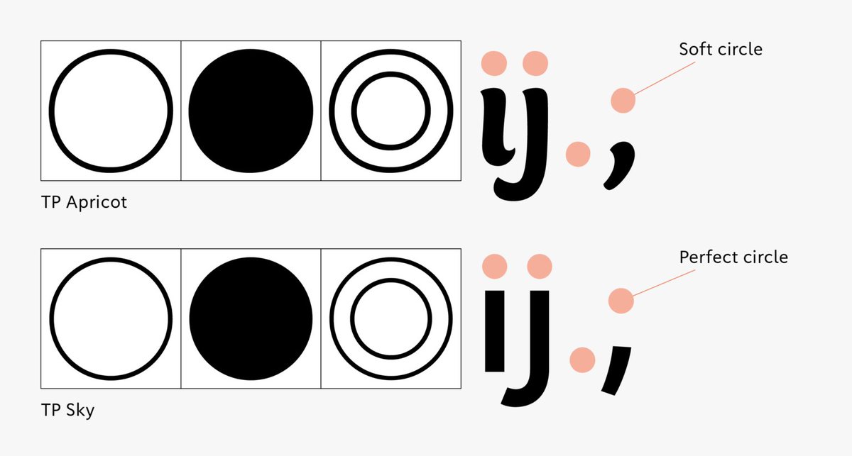
‘For the circle, we deliberately avoided making a perfect circle but just made it a soft shape. The dots in Latin characters like “i,” “j,” “.,” “;,” etc. are slightly softer and rounder, so we have aligned them accordingly.’
TP Apricot Development Story
https://t.co/GLjDJROgwd
Hama Mincho’s design incorporates the scale and distinctive character of the city of Yokohama, and for styles that accentuate vertical/horizontal stroke contrasts.
Discover more on our Instagram: https://t.co/2BQEMPFX9J
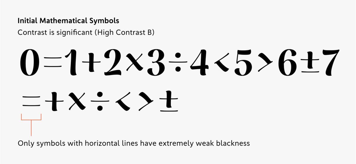
‘During the design process of TP Apricot, the design of mathematical symbols required ingenuity in adjusting thickness. For thick weights in high contrast in particular, we struggled to determine the appropriate thickness.’
TP Apricot Development Story 03
https://t.co/F2tpKGqo5l
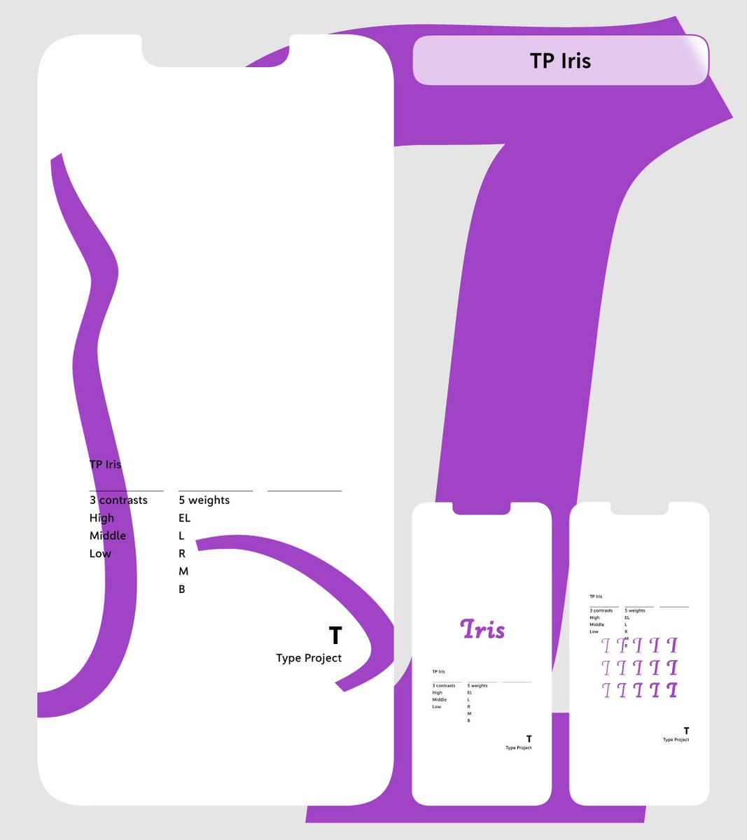
Our smartphone wallpaper series is going strong, and May’s featured font is TP Iris, inspired by early-summer irises. There are still very few known examples of the font in actual use, so we’d love to see you bring out its full potential! https://t.co/EFjXcUsdLC
A hands-on online workshop will follow the next week on May 9. The program is designed for participants to select a Latin typeface of their choice and design Kanji, Hiragana, and Katakana characters that harmonize with it. https://t.co/ff6DSB7xfn
An online lecture featuring Yui Yoshitomi (Type Project) and Ikumi Honda (Iwata) will be held on May 2. Hosted by https://t.co/ff6DSB7xfn, this session will provide an overview of the history of Kanji, Hiragana, and Katakana, alongside insights into contemporary typeface design.
‘horizontal hints cannot be specified for characters that do not have horizontal stems, such as the uppercase letter “I” in sans-serif typeface. In cases like these, ghost hints are used.’
[TP Staff Blog]
Story of Hints 04: “What are Ghost Hints?”
https://t.co/hy8TMcJKdo
‘It is a story blending fantasy and mystery, in which a witch and an investigator team up to tackle magical crimes. Jun Mincho and TP Mincho High Contrast are used in the title, for the name of the author, and on the book band part.’
[TP Staff Blog]
https://t.co/P5gCnjI0OB
‘Because I experienced a lot of twists and turns with the hiragana design, I created three design proposals for Japanese brackets in the initial prototype.’
[TP Staff Blog]
TP Apricot Development Story 02:
Japanese Brackets, Three Types of Prototypes
https://t.co/jSRT9NM19E
Our smartphone wallpaper for April features TP Gothic. It’s a classic Gothic at its core, but the architectural precision of its forms reflects the Type Project identity. We also love the lively flow of the double-story “g.” Check it out! https://t.co/EFjXcUsdLC
‘The position of the top vertex of the triangle “A” is slightly shifted to the left of the center of the line connecting the two lower vertices. This is because placing the vertex in the middle makes it look tilted to the right.’
[TP Staff Blog]
https://t.co/YJ1P7m4DU2
‘In the previous article, I explained about how horizontal and vertical hints work to control stroke thickness and position. Another major role of hints is to “arrange heights.”’
https://t.co/Wt96sNI0L6


![typeproject_en's tweet photo. ‘IExtreme point refers to the position in which the angle of the handle used to draw a curved line is completely “horizontal (0 degrees)” or “vertical (90 degrees).”’
[TP Staff Blog]
Story of Hints 05: “Extreme Points and Hints”
https://t.co/PEotk0II09 https://t.co/Ldye3XroAu](https://pbs.twimg.com/media/HJIy6hLaUAAddBw.jpg)


![typeproject_en's tweet photo. ‘horizontal hints cannot be specified for characters that do not have horizontal stems, such as the uppercase letter “I” in sans-serif typeface. In cases like these, ghost hints are used.’
[TP Staff Blog]
Story of Hints 04: “What are Ghost Hints?”
https://t.co/hy8TMcJKdo https://t.co/tRCtDxFJW5](https://pbs.twimg.com/media/HG4ofCRbwAA7318.jpg)
![typeproject_en's tweet photo. ‘It is a story blending fantasy and mystery, in which a witch and an investigator team up to tackle magical crimes. Jun Mincho and TP Mincho High Contrast are used in the title, for the name of the author, and on the book band part.’
[TP Staff Blog]
https://t.co/P5gCnjI0OB https://t.co/27k3dFTW7r](https://pbs.twimg.com/media/HGUkt0KaUAAvhIH.jpg)
![typeproject_en's tweet photo. ‘Because I experienced a lot of twists and turns with the hiragana design, I created three design proposals for Japanese brackets in the initial prototype.’
[TP Staff Blog]
TP Apricot Development Story 02:
Japanese Brackets, Three Types of Prototypes
https://t.co/jSRT9NM19E https://t.co/BirK7SdAHR](https://pbs.twimg.com/media/HFwf5DjbsAAJ7Iw.png)

![typeproject_en's tweet photo. ‘The position of the top vertex of the triangle “A” is slightly shifted to the left of the center of the line connecting the two lower vertices. This is because placing the vertex in the middle makes it look tilted to the right.’
[TP Staff Blog]
https://t.co/YJ1P7m4DU2 https://t.co/mgj3iavY4i](https://pbs.twimg.com/media/HFMa-1lbQAANf8W.jpg)