Hey! I kind of gave up on Twitter a while back, but I'm even more uncomfortable with the way it seems to be going. So, I'm not monitoring this account these days. If you want news or whatever from me, please visit my site https://t.co/Cp6PUgFLm4 and sign up for my mailing list.
I'm so proud of this project––the first big one I've been a part of as UX design editor here at @NatGeo! We dive into the incredible details of Tut's treasures, beautifully photographed and modeled in 3D by @SandroVannini. The dazzling type & ornaments are by Tal @typesupply 🤩
I drew a whole bunch of typefaces, lettering and ornaments for this incredible issue and the stunning accompanying digital stories. I'll be talking about this massive project (including the tale of a particularly pesky comma) at @MICA_GD in November.
The 1922 discovery of King Tutankhamun’s tomb became a global media sensation—and captured the imagination of millions. Learn more about King Tut's treasures in our November issue: https://t.co/odiDQfmCoi
Do I have any followers from the @NFL? The league has a very overdue invoice for a heavily NDAed project and all of my contacts have left the company. My DMs are open.
@agyeidesign @letterror I have a 2020 M1 Air for writing code on the go and day-to-day kerning. I love it. I rarely draw on it, though. I did see some complaints a while back in the animation community about external monitor support being a bummer. That would be my only hesitation.
We're looking for a freelance web/product/UI/UX/whatever-we're-calling-this-now designer with availability in the near future, or immediately, to help out on a project. Reply with your portfolios, please!
(RTs appreciated)
@nicolesjchung@MsPackyetti Thank you for this discussion. My wife and I are the white parents of two Korean-American boys and the last three years have been such a struggle with these issues. It was so cathartic to hear that we aren't alone in trying to figure out how to talk about all of this.
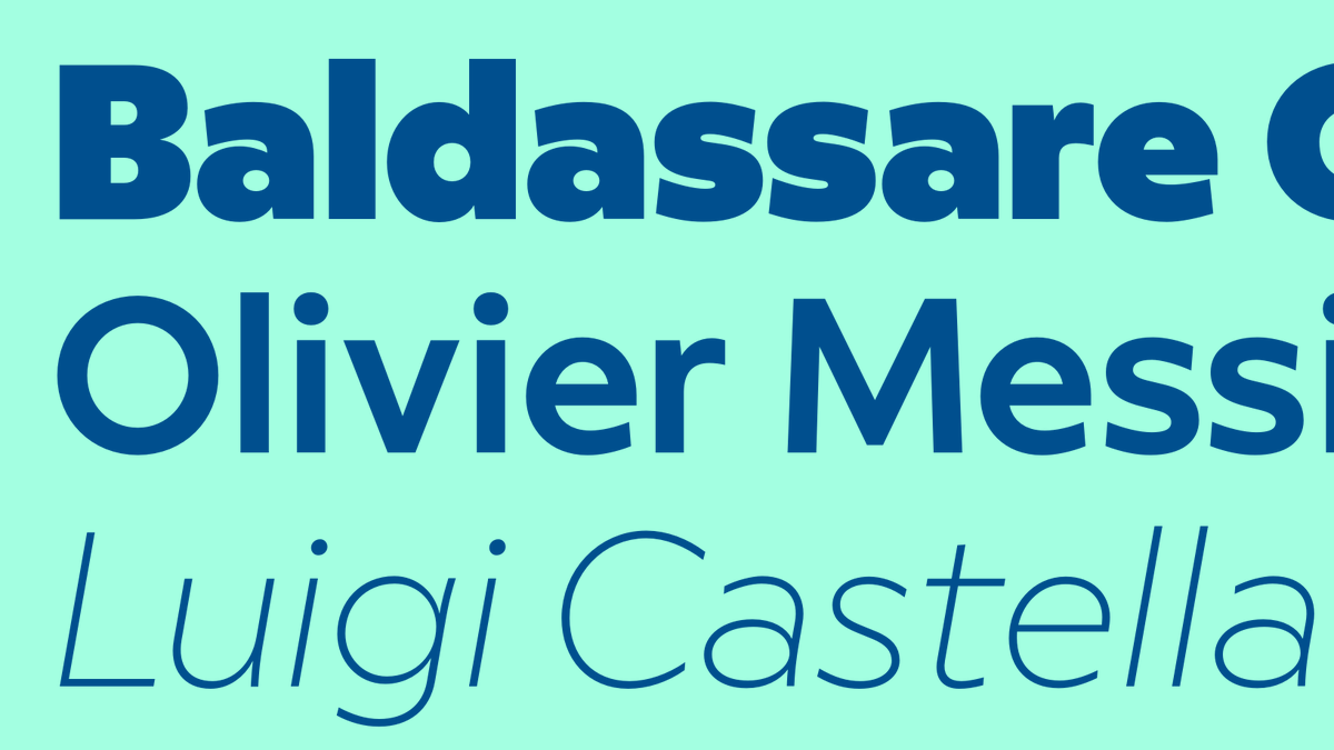
NEW: lota “was designed to adhere to a strict geometric logic, except for the thousands of places where strict geometry needed to be politely
ignored so that our eyes would feel a bit more comfortable” in the process of reading. In 16 styles by @typesupply
https://t.co/w6Dw9eZRXQ
I have a new R&D typeface for sale: Epoxy. It is (I'm sure no one will disagree with this) a Neo-90s, Quasi-Industrial, Postpostpostmodern sans serif typeface. I made it because… I wanted to make it.
Trial fonts, PDF sample, credit card entry field at:
https://t.co/8qBzU0GPcy
@typographica@irondavy Now with a mono™!
Thanks for the kind words. I love Queue more than most of my other junk and will never understand why it doesn't get used more than it does*.
*Generously defined as "very, very rarely."
My boss told me that I could replace my very tired and ailing eight year old iMac if I finished some new fonts. So, here, in the late afternoon of a Wednesday, is Epoxy. It's… fonts. I don't know how to explain it.
https://t.co/tBAgxNpU8s