RT erik_kwakkel: Split-screen and multitasking before the smart phone: this so-called dos-à-dos [back to back] binding allowed the 18th-century reader to consult the Old and New Testament simultaneously (Manchester, Chetham Library). Source: … https://t.co/6Jl27gC356
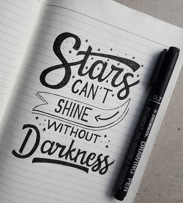
RT ninastoessinger: Can we stop using words like “ninja”? Its not a magical superpower, it’s craft. It’s work. If you work with type it’s your job. https://t.co/LspRboOAOz
RT adrien_midzic: 🔥Shrill Typeface will be published on futurefonts on May!
Stay tuned and stay Thin :)
#ShrillTypeface#typefaces#pizzatypefaces#type#graphic#designgraphic#futurefonts https://t.co/n2hBexVB1O
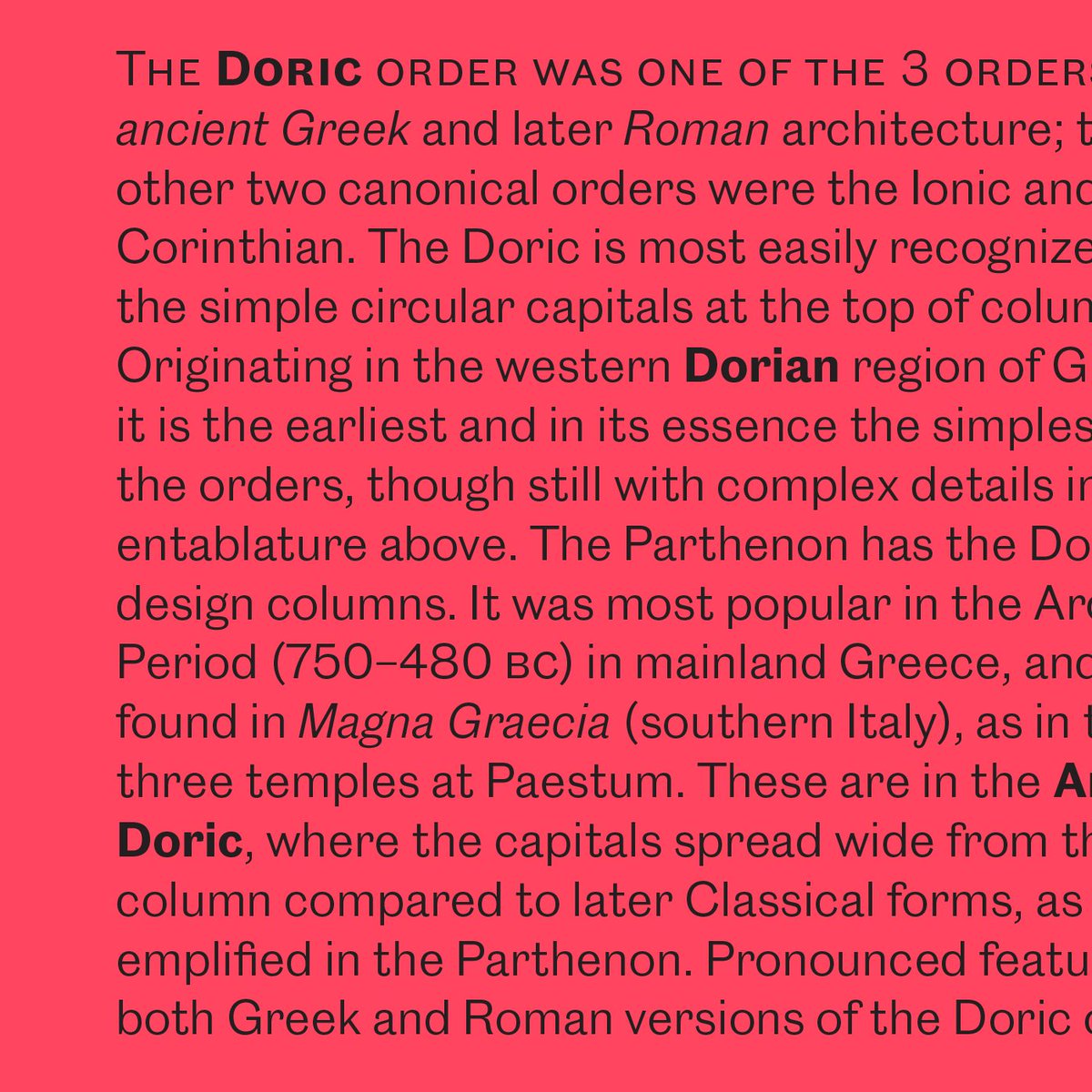
RT commerclassics: Caslon Doric is a face in Light to Bold can work effectively as a text face. We have designed it with what you would expect with a matching italic and small capitals.
RT fresh_fonts: 🔥 Our 35th issue is here! 🔥
Showcasing three new typefaces with ink traps, designed by abcdinamo kontourtype and Fontsmith, exploring their use in fonts for print and screen.
Have a look 👉🏽 https://t.co/N2QbMYglH4
#typography#GraphicDesign#FontSunday #…
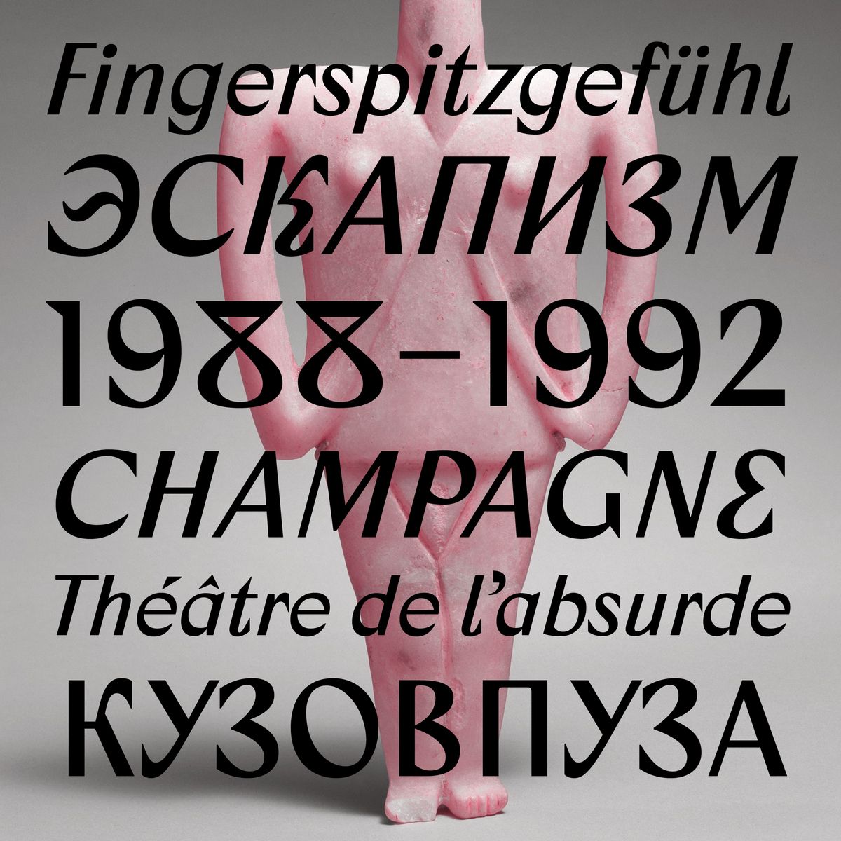
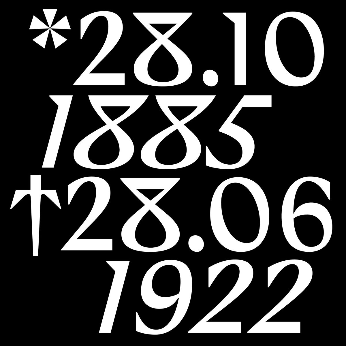
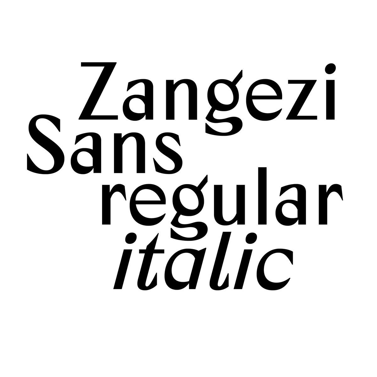
RT futurefonts: ✨NEW RELEASE✨Daria Petrova’s Zangezi Sans strikes out on its own! It can now be licensed separately, and both are a little cheaper now. In addition, there’s Cyrillic and a new italic in the sans! Free update for previous customers. $3…