One telehealth brand. Three color directions. One final decision. 👀
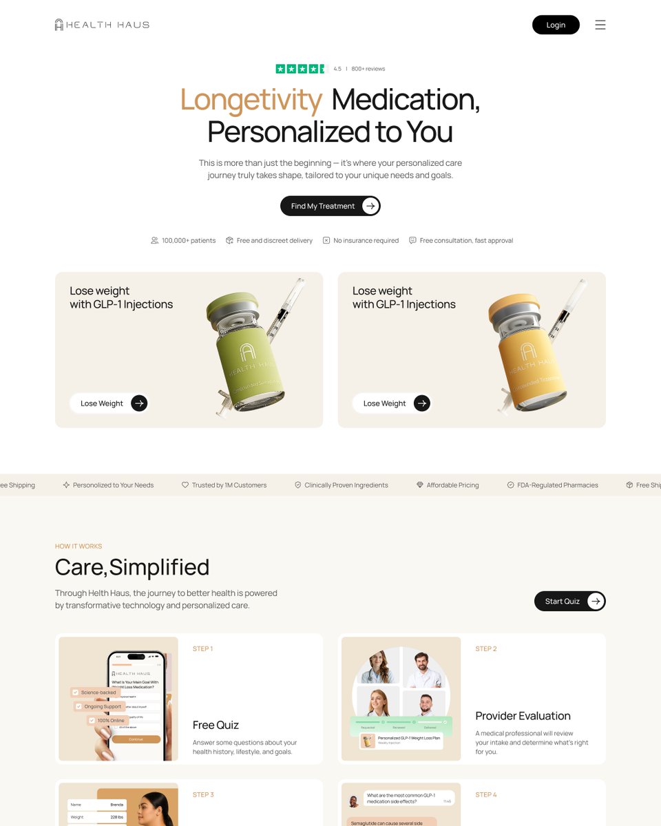
For Health Haus, I explored three distinct visual moods: fresh pastels, clean neutrals, and warm earthy tones.
The client made their choice in under a minute. 😅
Which direction do you think won? 👇
#WebDesign #UIDesign #EcommerceDesign #telehealth #uxuidesigner
@TheDesyner I see your point! Earthy tones definitely feel more grounded and natural, while pastels can look a bit overused in telehealth. That’s why I wanted to explore different directions!