Our free product design challenges are LIVE!
Build your portfolio and expand into new skills with real-world problems that you can tackle!
👉 https://t.co/1hbrALk3v6
Framer has taken the design world by storm, and it uses 3 UX principles in its product.
• Familiarity
• Ease of use
• Workflow
Find out more in our newest YouTube video https://t.co/7d6jRsQdG7
AI won’t take your design job.
Designers using AI will.
My new favorite AI design tool is Autodesigner by @uizard
Here’s 5 ways you can use it to crush your competition:
#createwithautodesigner
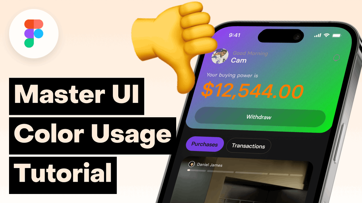
Colors are the make or break of any interface (outside typography)
A lot of people still make subtle mistakes, so thus why I created 6 or 7 or 8 tips to immediately improve your user interface
Today we are shipping a massive update to our landing page.
It features students' work, new designs, and some interesting micro-interactions.
https://t.co/8DR1FpX2JN
Our whole goal as a course and community is to help each other grow.
We want to share the awesome people in the community so from this week we are starting a weekly showcase with one of our best students @TheShoaibM
Read his amazing story ⬇️
https://t.co/CnLvHLjGLe
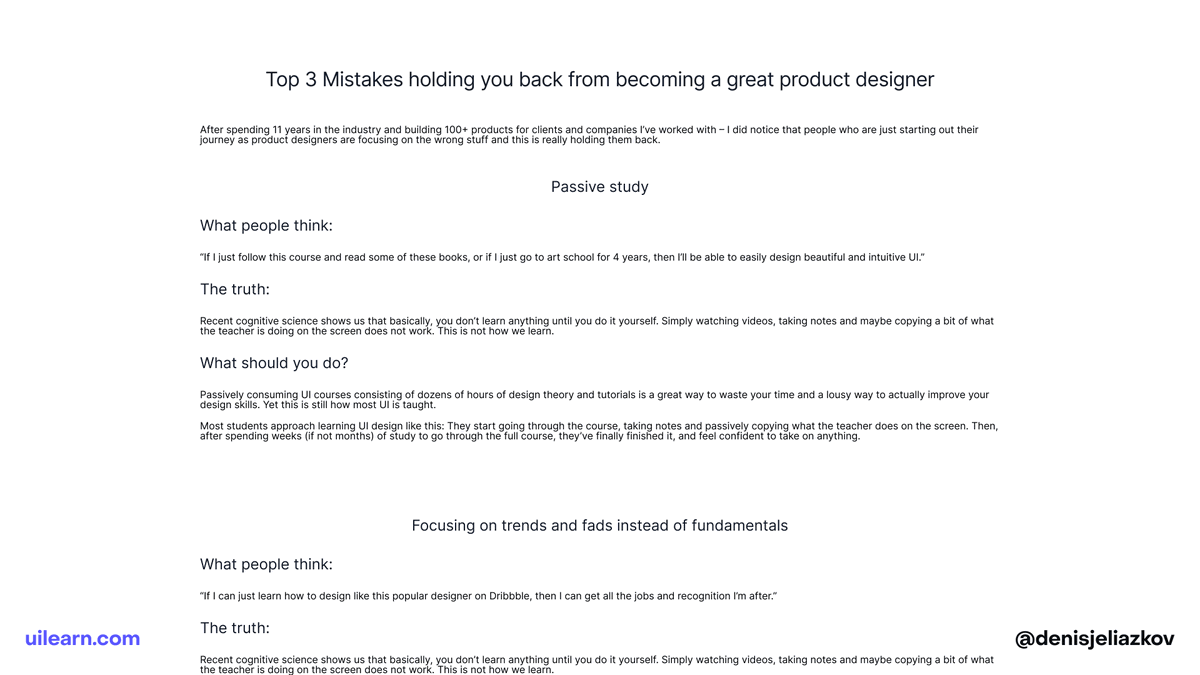
You learn music by reproducing other music.
You learn to cook, by following other people's recipes.
You learn to write by writing like somebody else first.
And yet, beginner designers want to be good at design by being "original" at first.
Figura is LIVE on @producthunt
We created the most curated network of product designers, and now the grilling is done.
It’s time for your product to become better!
We did the grilling, so you can enjoy the party 👇
I saw many candidates for the role of a designer, but they didn't even go through the recruiting stage.
Here are 6 tips that companies will definitely like
Let’s dive in 🧵
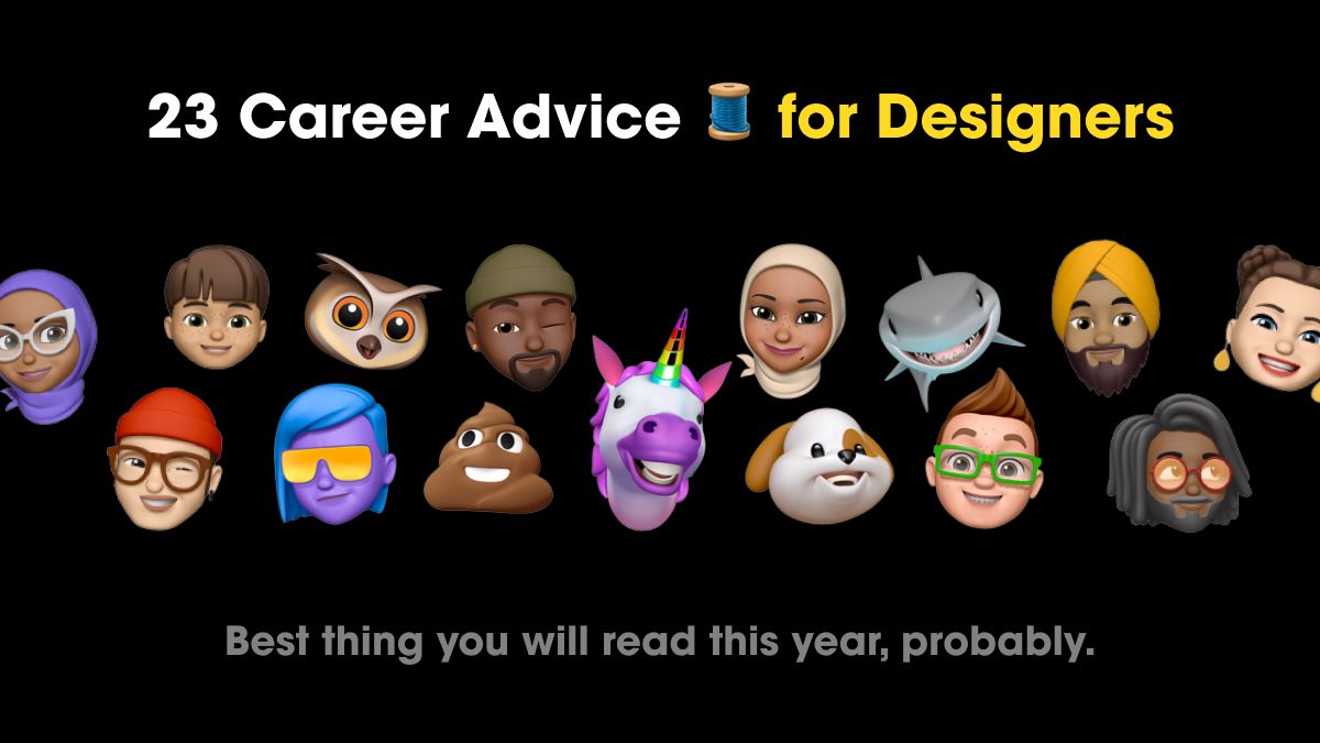
I asked 23 Senior Designers & Devs — “What’s your best career advice to young designers?”
Here’s what they said:
MUST READ 🧵 for any budding designer
This week I interviewed 159 UX designers to join Figura 😰
Here are the 5 biggest mistakes people make:
⭐ Rushing to a solution
⭐ Lack of storytelling
⭐ Ignorance of the process
⭐ No iterations
⭐ Bad self-perception
No matter how good your visual skills are, badly styled text can ruin every single interface.
Especially if you are doing an editorial piece.
But how do we make long blocks of text more readable? 👇