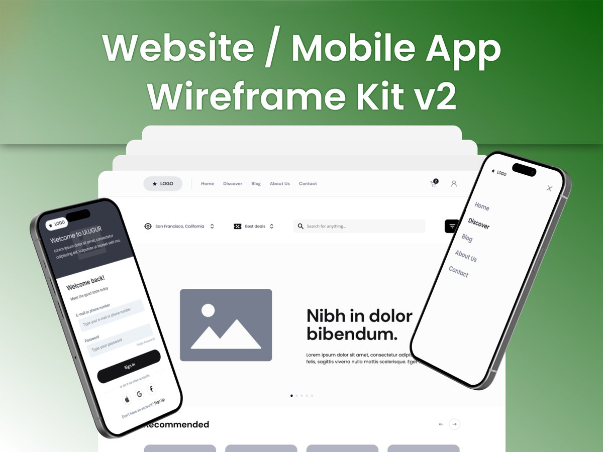
How to choose the right mobile menu in 2026:
• 3-5 core screens → Tab Bar • Contextual / quick actions → Bottom Sheet • Clean & modern SaaS apps → Rudder • Complex settings → Three Dots
Bookmark this for your next wireframe 📌
Which one is your default?
#uidesign#figma
@kefayatkhadim Thanks for the heads up! Really good point about keeping a buffer above the minimum so the 14-day counter doesn't reset. Checking my Console dashboard now!
Almost launching FitQuest—an RPG home workout & fasting app! 🏋️♂️
Google needs 20 testers for 14 days, and I'm 12 people away.
Got Android?
1. Group: https://t.co/2xDpNoIrrS
2. Play Store: https://t.co/iFztZoL7ZH
Drop your app below, I'll test back! 🤝 #buildinpublic#androiddev
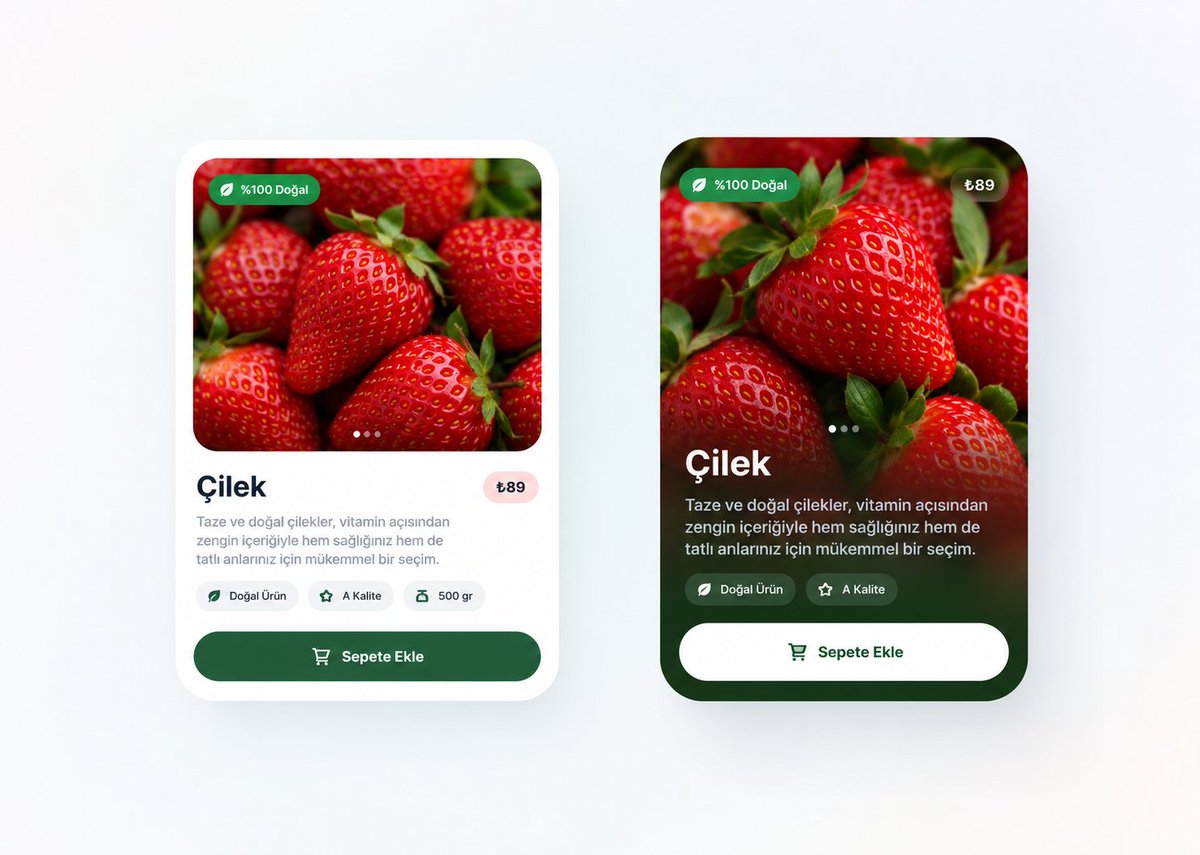
Designed in Figma as part of our Mobile E-Commerce & Delivery UI kit.
Explore the full design system & 80+ screens here:
https://t.co/61LdYsIYcP
Most mobile crypto apps try to cram desktop trading terminals into a 6-inch phone screen.
Result? Unclickable buttons and visual fatigue.
Simple portfolio view or full candlestick charts on mobile: which do you actually trade with?
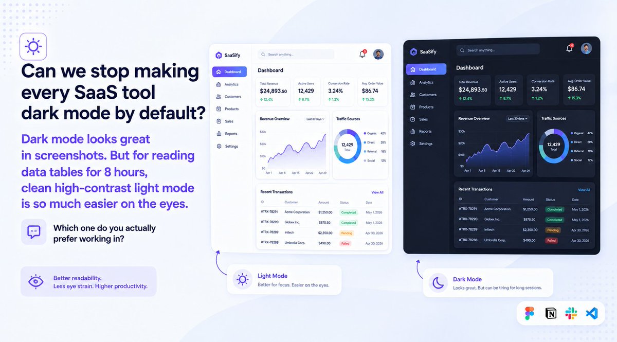
Can we stop making every SaaS tool dark mode by default?
Dark mode looks great in screenshots. But for reading data tables for 8 hours, clean high-contrast light mode is so much easier on the eyes.
Which one do you actually prefer working in?
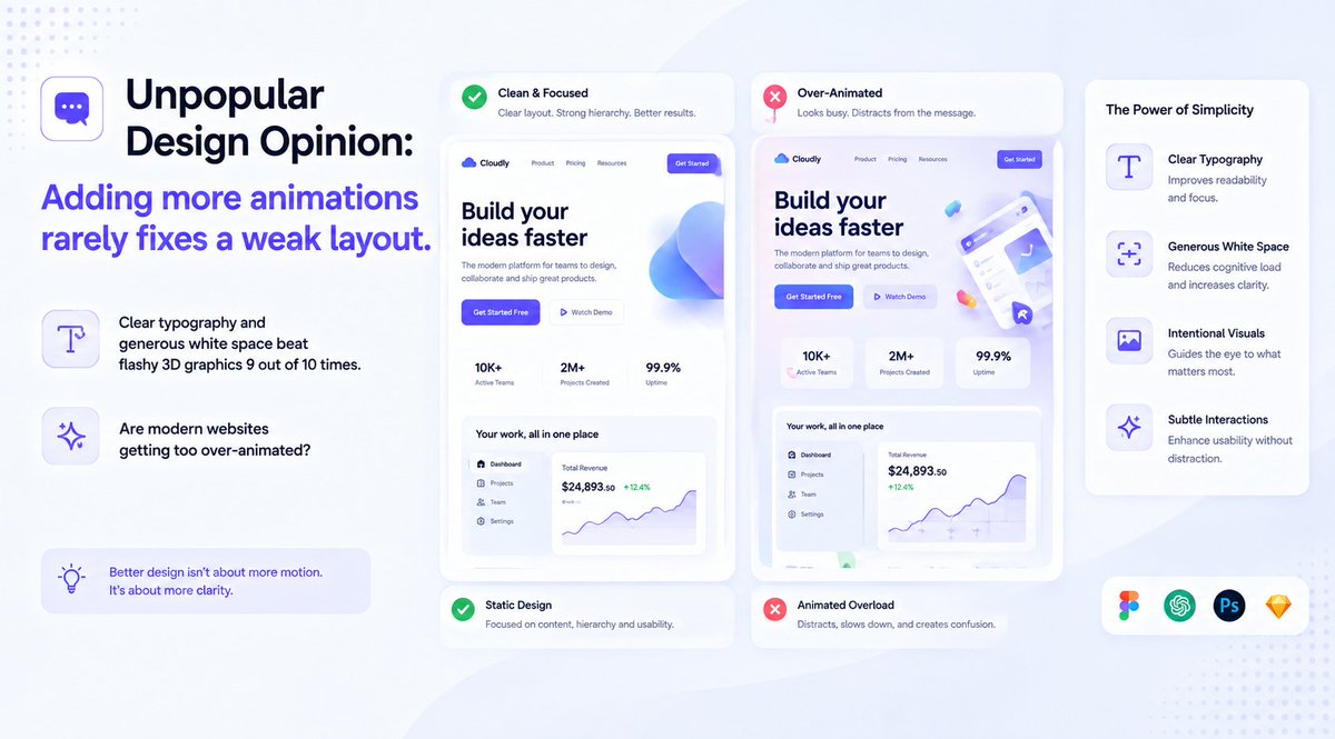
Unpopular design opinion:
Adding more animations rarely fixes a weak layout.
Clear typography and generous white space beat flashy 3D graphics 9 out of 10 times.
Are modern websites getting too over-animated?
Shipping client work fast isn’t about working late.
It’s having a modular UI system ready before day one.
Bundled 6 master kits (500+ screens, 1,800+ icons) into one Figma file.
Explore the full system: https://t.co/lvHSaHYXUP
Hot take:
Most early-stage startups don’t have a product problem. They have a landing page problem.
If visitors can’t understand what you do in 5 seconds, no amount of marketing will save you.
What’s the biggest mistake you see on startup homepages?
Blank canvas syndrome is the real reason client projects get delayed.
Starting discovery with 300+ pre-built wireframe blocks turns 3 days of layout drafting into a 2-hour session.
Live preview: https://t.co/5I82hAZfd8
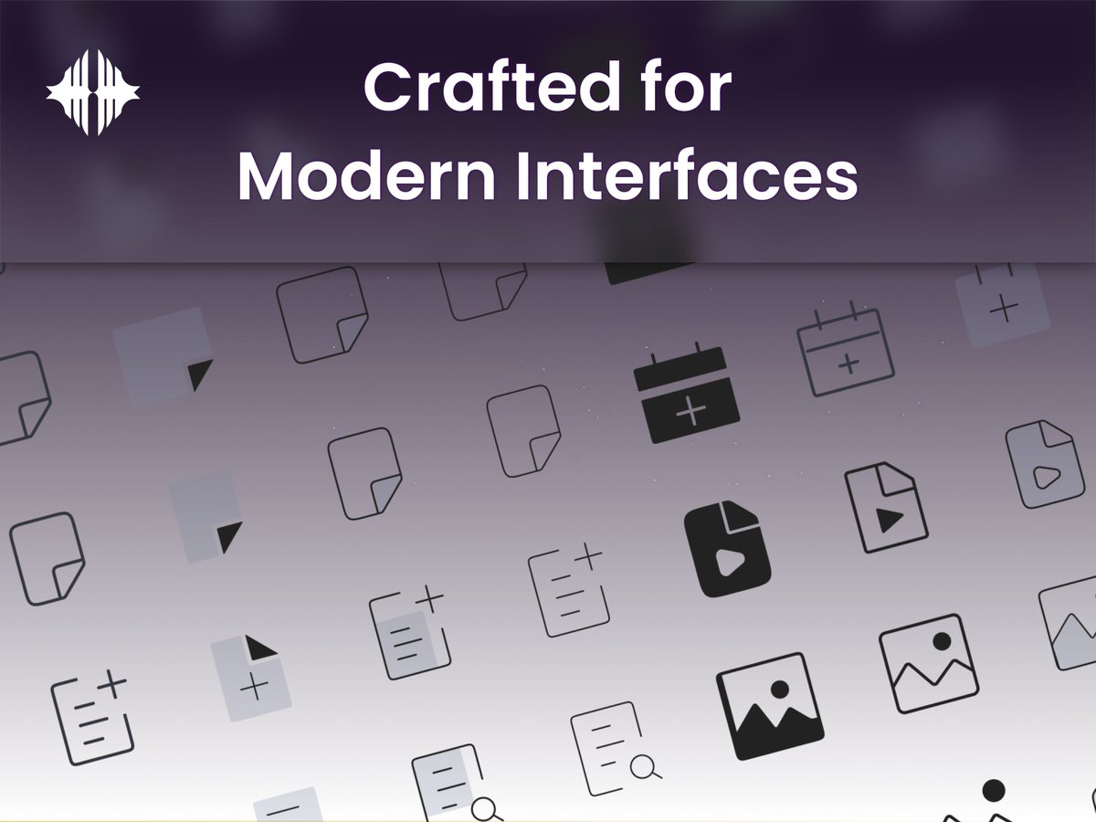
Outline vs filled icons: what's your default for mobile navigation bars?
Crafting 1800+ icons on a strict 24x24 grid taught me that stroke consistency matters way more than decorative details.
Live preview: https://t.co/katLjJPknD
Do you start projects with lo-fi sketches or jump straight into high-fidelity Figma components?
Designing Desktop (1440px) and Mobile (375px) side-by-side cut our client revision rounds in half.
Live preview: https://t.co/snvwxOrzub