UI/UX & Interface Designer
I design modern, intuitive digital interfaces that turn ideas into clean, functional experiences people actually enjoy using.♦️♦️♦️
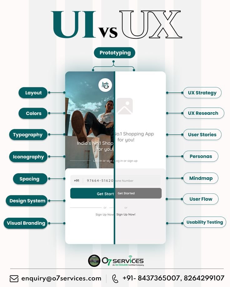
UI is the skin and controls; UX is the entire journey and whether it actually works for people.
This graphic gets the distinction mostly right and presents it cleanly:♦️♦️♦️
Clean modern aesthetic: Soft purple-blue gradients, rounded shapes, subtle geometric accents, and a light background create a calm, tech-forward, creative feel that matches the industry.♦️♦️♦️
This is a clean, professional, and well-structured promotional flyer that effectively sells UI/UX design services. It looks modern and trustworthy, with strong visual hierarchy and a good balance of text, icons, and product mockups. It successfully communicates expertise without
Clear hierarchy and instant readability. The big “UI/UX DESIGN” headline + short tagline immediately tells you what the company does. Pricing cards are easy to scan, and the process bar (Research → Wireframe → Design → Prototype → Testing) is a smart, trust-building element.
Visual hierarchy and layout are strong. The bold “UI/UX STRATEGIES” title, the list of six clear principles with icons, the two realistic phone mockups, and the bottom benefit strip create an easy scanning path. Purple is used consistently as the brand accent without overwhelming
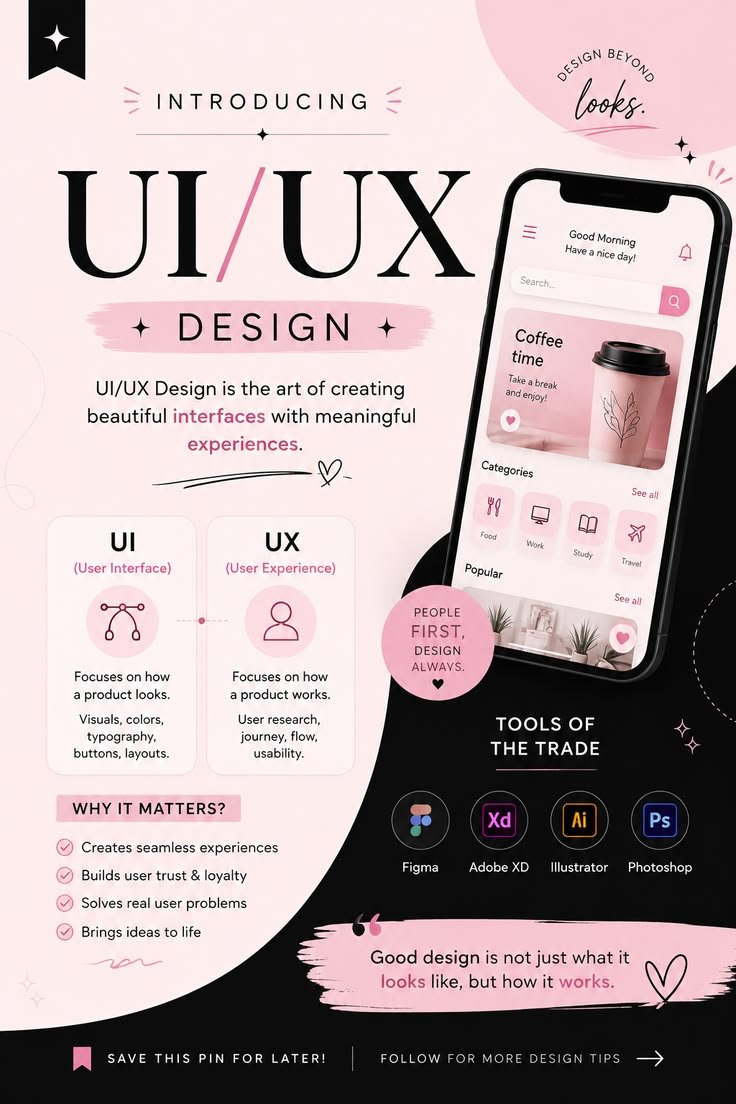
Visual hierarchy and layout are clear. The big “UI/UX” title, the phone mockup, the UI vs UX cards, and the tools section all guide the eye naturally without feeling cluttered.
Color palette (soft pink + black + white) feels modern, friendly, and consistent with a lot ♦️ ♦️♦️
Aesthetic & color system: The soft teal/cyan glassmorphism style with frosted cards, subtle gradients, and rounded corners looks fresh and cohesive. It avoids the usual heavy reds/oranges of many food apps and feels more refined and “calm luxury.”♦️♦️♦️
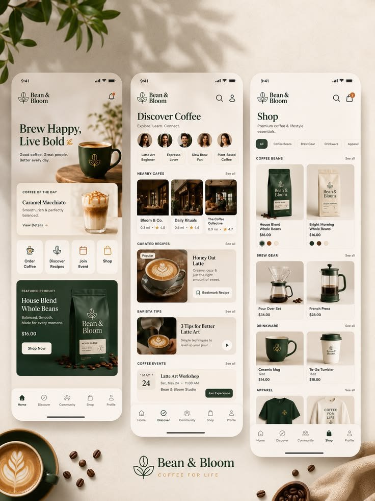
Brand feel is excellent. Soft cream backgrounds, muted greens, high-quality product photography, and the leaf-and-bean logo create a calm, premium “coffee lifestyle” aesthetic rather than a pure transactional coffee-shop app. It feels like something between a specialty roaster♦️
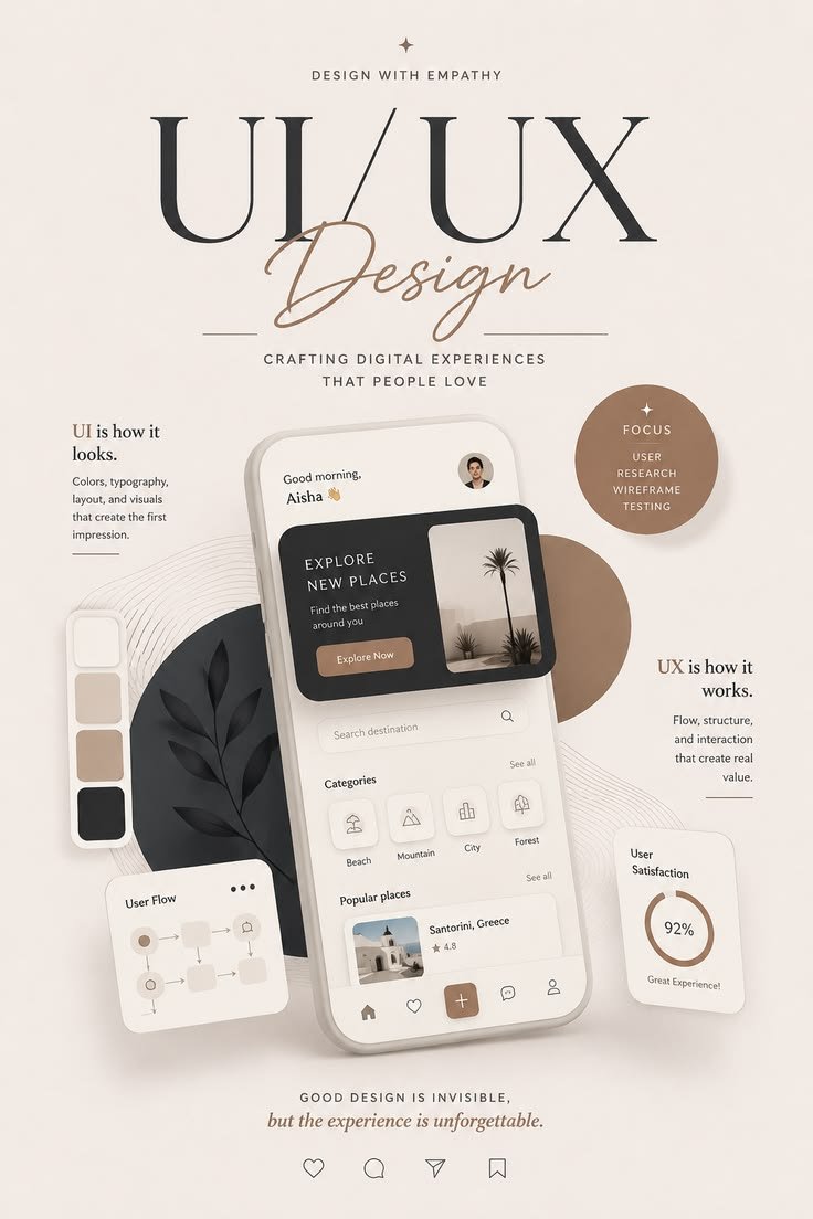
Clear hierarchy and messaging: The big “UI/UX Design” title with the elegant script “Design” creates instant focus. Supporting lines like “Crafting digital experiences that people love” and the bottom quote (“Good design is invisible, but the experience is unforgettable”)♦️♦️♦️
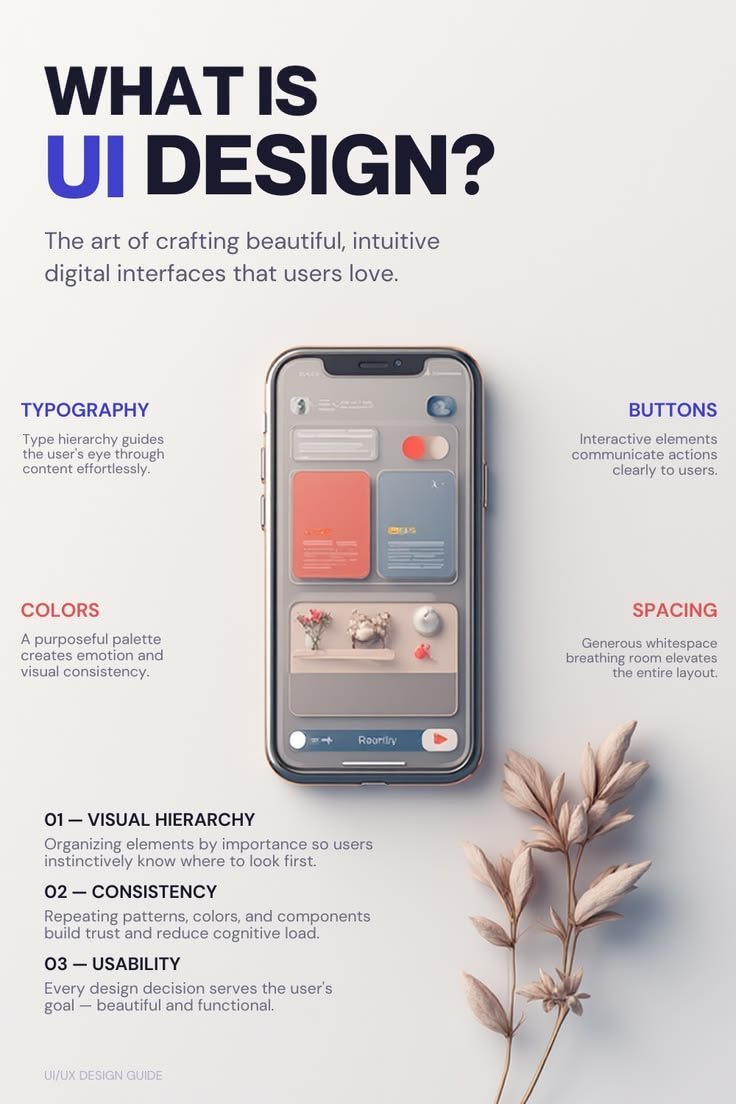
@ShotByKess Visual hierarchy is clear and intentional. The big bold title pulls you in first, the phone mockup acts as the visual anchor, and the supporting points radiate outward without competing for attention.
Spacing and breathing room are generous. The layout feels calm and uncluttered,
Visual hierarchy is clear and intentional. The big bold title pulls you in first, the phone mockup acts as the visual anchor, and the supporting points radiate outward without competing for attention.
Spacing and breathing room are generous. The layout feels calm and uncluttered,