ChatGPT worst redesign I have seen.
Visually this looks incredible, functionally absolutely broken.
Wanna know, why?
Wrote a blog about the UX issues in this redesign 👇
Still, people love this shi*. I’m not kidding—even prominent people from OpenAI praised it.
That’s how good designers get overlooked. If they don’t produce something this visually appealing or aesthetically polished, their work gets little to no attention.
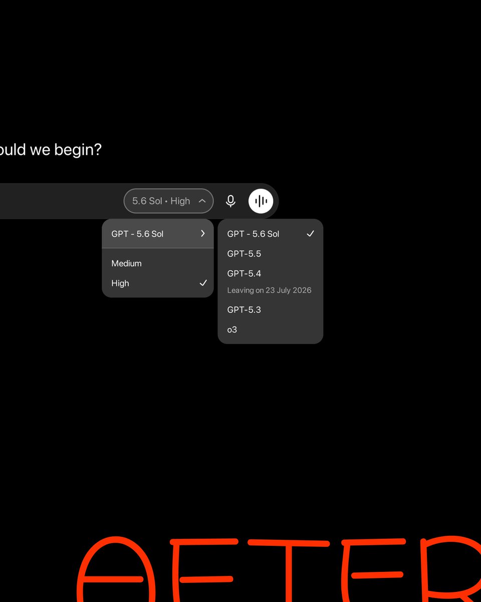
GPT-5.6 Sol was selected, but the menu still offered "Instant 5.5."
I redesigned the system rule: show model + effort, keep modes relevant to the active model, remove redundant copy, and include the year. Small UI, clearer logic.
What would you test first?
The selector shows “High,” but not the model using it.
As ChatGPT automatically changes reasoning modes, users need to see the active state without reopening a selector. My fix: show model + effort together. Tiny label. Less doubt.
A designer portfolio full of screens is incomplete.
A developer portfolio full of code is incomplete.
Show the whole chain:
Idea → decisions → design → AI-assisted build → launch asset → result.
Keep one deep craft. Prove you can carry the work farther.