"The simplicity of the stripes means they can present complex data in a visually compelling way, and communicate a key message effectively."
https://t.co/ZPYnGRewNY
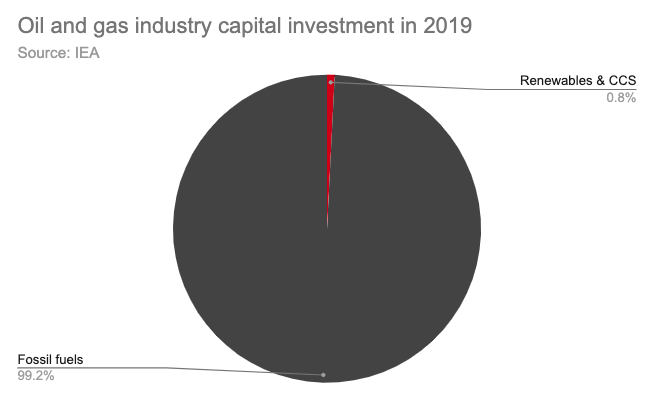
Very occasionally, this most hated of #dataviz tools (the humble pie chart) is actually a good way to tell the story of oil and gas industry investment in clean energy…
https://t.co/3bmgIf0awM
Nearly six in ten (58%) are now either “Alarmed” or “Concerned;” from 2014 to 2019, the proportion of “Alarmed” nearly tripled while Doubtful + Dismissive stayed the same. My take-home? 80-90% can be moved, big-time. Let's not waste our time on the rest.
via @YaleClimateComm