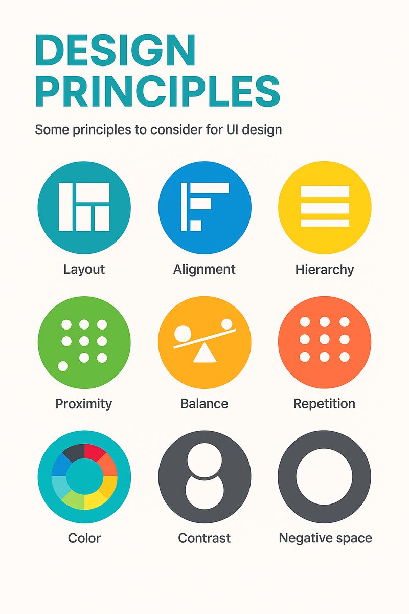
9 timeless design principles every UI designer should know 🙌
Overview:
1. LAYOUT
Layout is the arrangement of visual elements in a design to create balance, clarity, and visual appeal.
2. ALIGNMENT
Aligning elements in a design along a common axis to create order and visual consistency.
3. HIERARCHY
Organizing elements to establish a clear order of importance, guiding the viewer's attention.
4. PROXIMITY
Placing related elements close together to indicate their connection or importance.
5. BALANCE
Weighting or arranging the elements within the image to create visual, even distribution of shape and space.
6. REPETITION
Consistently using the same design elements (e.g., fonts, colors, shapes) to create unity and reinforce visual identity.
7. COLOUR
Utilising colours intentionally to convey mood, meaning, and visual impact in a design.
8. CONTRAST
Contrast can highlight differences or add a focal point by using opposing colour, shade or textures.
9. NEGATIVE SPACE
Also known as white space, it's the empty or unmarked area around or between design elements, used to enhance readability and create visual balance.
Original cheatsheet by Jaxon White
#UX #UI #UIDesign #UXDesign
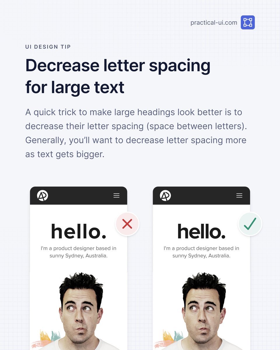
⚡️ UI design tip - Decrease letter spacing for large text
A small trick to make large headings look better is to decrease their letter spacing (space between letters).
How much you decrease letter spacing depends on the typeface and size, but generally, you should decrease letter spacing more as text gets bigger.
This is because many typefaces were designed to be read at small sizes in long body text. They’re known as “text type” typefaces and have wide letter spacing to make them more legible at small sizes.
You probably won’t need to decrease letter spacing for “display type” typefaces, as they were designed to be used at large sizes and generally have closer letter spacing.
PS This is just 1 of 100+ design guidelines from my @PracticalUI design book 📘
👨🍳 UX Cookbook
Handcrafted recipes to get you started with everything UX:
✅ User research
✅ Design
✅ Usability testing
+ more
→ https://t.co/gM4EeIsbq9
Created by the UX team at the University of Arizona Libraries
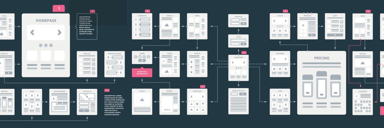
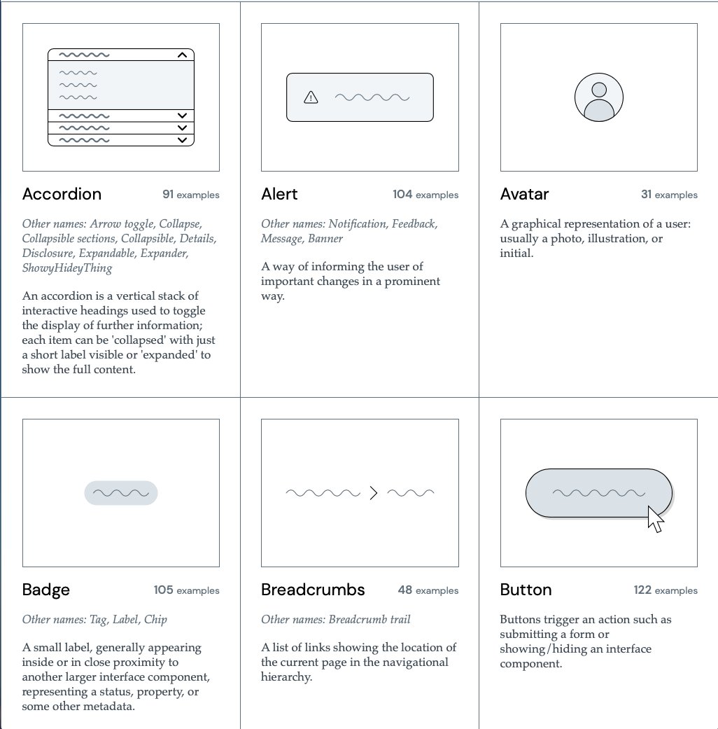
Excellent UI Component Gallery to Boost Your Next Design Project! 🙌
Designed to be a reference for anyone building component-based user interfaces.
The Component Gallery is an up-to-date repository of interface components based on examples from the world of design systems.
Designing interfaces around components, specifically components from a design system, has a number of benefits:
1. Consistency: Using a design system can help maintain a consistent "look and feel" across multiple interfaces.
2. Reusability: Instead of building something from scratch, reusing something that's already been tried, tested, and proven to work can speed up development.
3. A common language: Design systems can help all teams involved in a project communicate effectively, using a shared set of names for components that everyone understands.
#UX #UI #UXDesign #UIDesign #ProductDesign
Check out the Component Gallery website 🙌
https://t.co/K83PXII7iK
💎 Elevation in UI Design
The diagram below displays the relationship between UI elements and their elevation levels. A great reference when building an evaluation system for your product.
👇
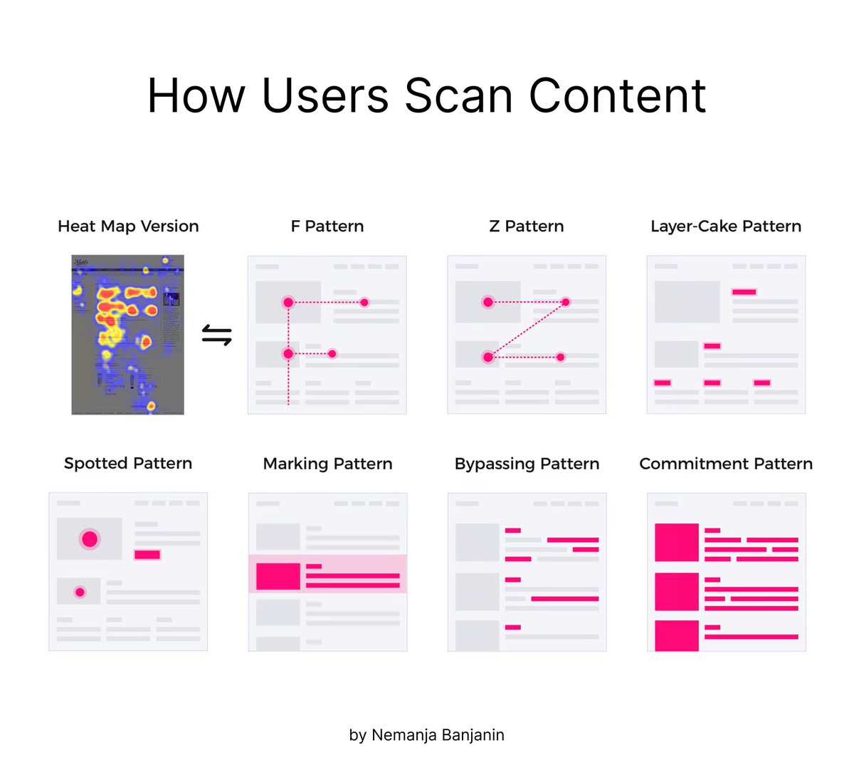
💡How people scan information on the web (top 5 patterns)
People don't read online—they scan. When people scan information on the web, they typically follow a few common patterns:
1️⃣ F-shaped
2️⃣ Z-shaped
3️⃣ Layer-cake
4️⃣ Spotted
5️⃣ Marking
👇
💡Semantic Colors in UI Design
You need only 5 types of colors for UI
1️⃣ Surface: color of a canvas
2️⃣ Surface-container: content container color
3️⃣ On-surface: text or icons that appear on top of a surface
4️⃣ Border: borders around containers or dividers
5️⃣ Accent: CTAs
Check out this Excellent Design System Component Checklist / Cheatsheet 🙌
Add to your favs and refer back to it when you need to 🙌
A component is considered stable if it has met all of the requirements for both design, engineering, & documentation.
Design
Accessibility
- This component leverages the accessible color palette, has considerations for keyboard interaction, and has appropriate typescale.
Interaction
- This component has a defined interaction definition, which clarifies how it responds to user input or interaction.
Context
- This component has a defined context defintion which clarifies how and when this component should be used.
Completion
- This component has defined states for neutral, active, hover, focus, and disabled states.
Content
- The content has been approved by a UX editor, if necessary.
Customization
- This component has defined aspects which are customizable, if applicable, as well as the corresponding values.
Resolution
- This component has defined how it scales across varying viewport sizes and screen resolutions.
Engineering
Accessibility
- This component includes all of the accessibility features for keyboard navigation, screen reader compliance, color contrast, and high-contrast mode
Responsiveness
- This component responds gracefully to different viewport sizes.
Completion
- This component includes all of the neutral, hover, focus, and disabled states as defined in the design.
Customization
- This component includes all of the defined customization which is defined in the design.
Error Handling
- This component handles errors gracefully.
Browser Compatibility
- This component has been tested in supporting browsers and provides polyfills for newer technologies that are not readily accessible.
Documentation
Properties
- The properties for this component have been documented with the property name, it's valid values, and whether or not it's required.
Code Snippets
- The code for this component has been provided in all of the available states.
Interactive Example
- The component has been embedded in the style guide to show its interactivity.
Context Definition
- The context definition has been included to inform designers and engineers where and when to use this component.
Follow @UXlinks to Massively increase your UX skills and knowledge 🎯
#ui #uidesign #ux #uxdesign #design #productdesign #designsystems #uikit #sketch #figma #adobexd #google #apple #ibm #airbnb #audi #shopify #ecommerce #atlassian #webdev #ios #materialdesign #iphone #react #js #css #business
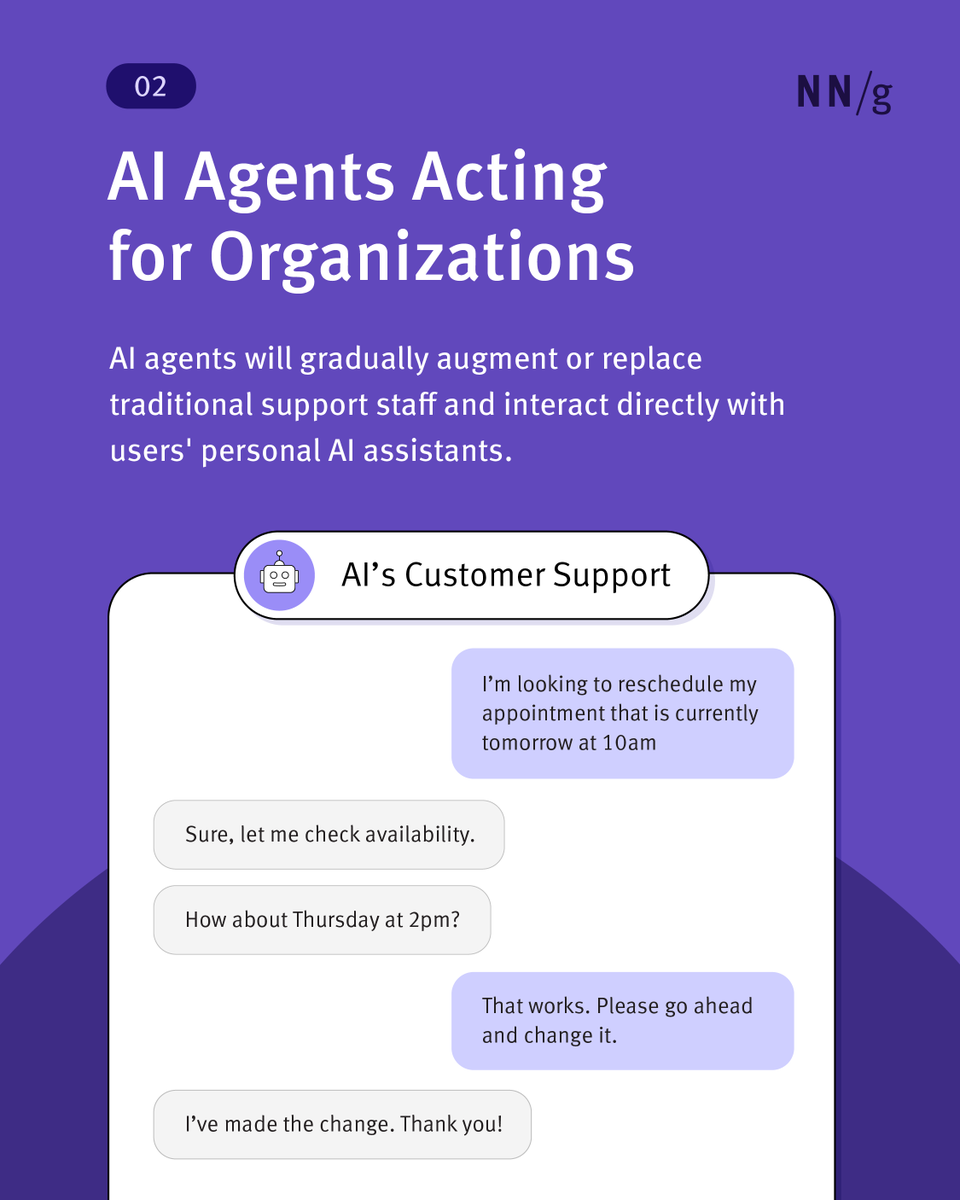
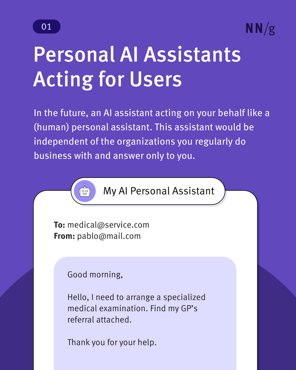
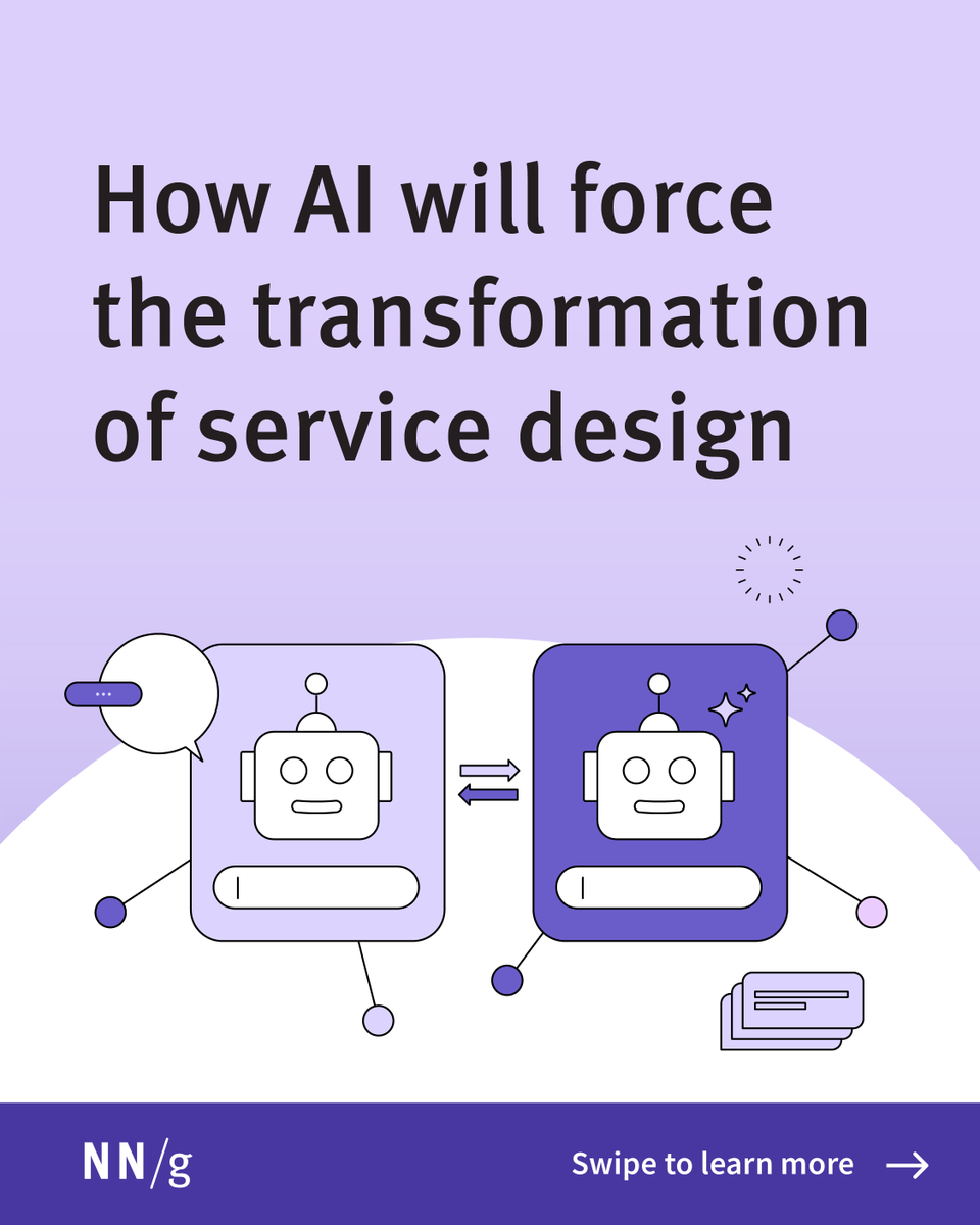
The future of service design? AI talking to AI. 🤖 Personal AI assistants will handle tasks for users, while company AI agents will respond. This shift challenges UX as we know it. Read more: https://t.co/ngBpn1uVv8 #AI#ServiceDesign#Ux
💎 Responsive Grid System
Ready-to-use system for tailoring your design to 3 popular mediums: mobile, tablet and desktop. Crafted by @Michelin design team
👇
Need to brush up on UI definitions like tooltips, split buttons, or megamenus? Raluca Budiu & Kara Rivenbark’s UI component glossary has you covered. Bookmark it for later: https://t.co/n1mILzXAnf
#UXDesign#UIComponents#UXGlossary#UserExperience
Excellent Calls to Action Decision Tree Diagram to Boost your next Design Project! 🔥
FREE Cheatsheet attached! 🙌
This super useful flow diagram will help you to choose the appropriate Call to Action for your designs.
The flow diagram covers the Primary, Secondary and Tertiary Call to Action buttons.
Save it for future reference 🔖
#ux #ui #uxdesign #uidesign #productdesign #cta #calltoaction #mobile #iOS #android #webdesign #webdevelopment #react #html #css #business #startup
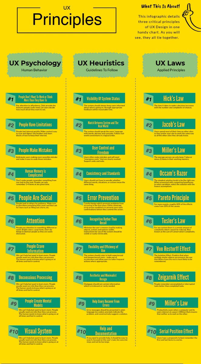
Useful UX Principles Infographic, Detailing Three Critical Principles of UX Design in a Handy chart! 🔥
FREE Infographic attached! 🙌
Overview
UX Psychology: Human Behaviour:
#1 People Don't Want lo Work or Think More Than They Have To
#2 People Have Limitations
#3 People Make Mistakes
#4 Human Memory is Complicated
#5 People Are Social
#6 Attention
#7 People Crave Information
#8 Unconscious Processing
#9 People Create Mental Models
#10 Visual System
UX Heuristics: Guidelines to Follow:
#1 Visibility Of System Status
#2 Match Between System and The Real World
#3 User Control and Freedom
#4 Consistency and Standards
#5 Error Prevention
#6 Recognition Rather Than Recall
#7 Flexibility and Efficiency of Use
#8 Aesthetic and Minimalist Design
#9 Help Users Recover From Errors
#10 Help and Documentation
UX Laws: Applied Principles:
#1 Hick's Law
#2 Jacob's Law
#3 Miller's Law
#4 Occam's Razor
#5 Pareto Principle
#6 Tesler's Law
#7 Von Restorff Effect
#8 Zeigarnik Effect
#9 Miller's Law
#10 Serial Position Effect
by shaneketterman
#ux #ui #uidesign #uxdesign #design #productdesign #uxpsychology #uxlaws #usertesting #userresearch #usabilitytesting #research #iOS #android #mobile #design #business #startup


