@figma, what's going on with your design team? I see you reduced the height of input fields, but why did you make a dropdown for a selector with only two options? Do you realize it now takes two clicks instead of one? What was wrong with using a checkbox?
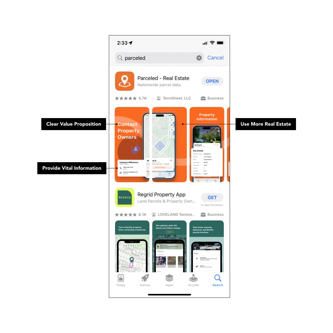
In the Apple App Store, your app will consistently appear alongside your competitors. Try to make your objective to swiftly captivate user attention ahead of your rivals.
Here’s an illustration of how you can enhance the visibility of your app.
New App Store screenshots for Parceled
Leading with value proposition, highlighting key features, and designed for readability.
DM me to work with @BQWork
@MiriamT_SMM @JordanBanaf No doubt. With extremely short mobile sessions it’s vital to deliver the message as quick as possible without any noise or distractions.
Looking to enhance your Product Detail Page (PDP)? See how we transformed this one with 5 straightforward principles:
1. Streamline the screen layout by displaying only information essential for guiding your customers' purchase choices.
2. Implement an effortless solution for viewing more images. Blend mobile-friendly swipe gestures with on-screen prompts for a seamless experience.
3. Craft your product title to be concise and clear. A succinct title aids customers in identifying the product and contributes to robust SEO.
4. Optimize the default purchase selection. This simplifies the decision-making process, especially crucial for swift mobile purchases.
5. Minimize distractions surrounding the primary call to action. Ensure customers remain focused on the critical moment of making a purchase decision without unnecessary interference.
Interested in this type of optimization for your site? Reach out @BQWork - https://t.co/nYOu7BUlZI or DM me.
@SchutteJessie Open Gmail on desktop -> Go to Updates tab -> Select all Unread (from checkbox on the top) -> Mark as Spam -> 🥳 If needed repeat this step for Social and Promotions tab. Optional: uncheck important from a Spam folder.