The same visual logic continues through category marks and icons across the platform https://t.co/ZyLqLUHFrU. Each one feels different, but still belongs to the same system.
archive work w/heartbeat.ua
A pair of illustrations for https://t.co/hdXy4wcfzn, showing continuous scanning and how the platform connects across its ecosystem.
archive work w/heartbeat.ua
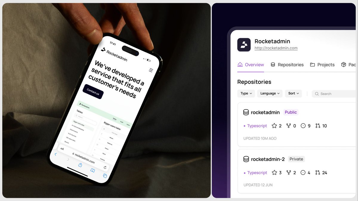
Website and product design for Rocketadmin.
A look at how the same visual language carries from the marketing site into the product.
archive work w/heartbeat.ua
Product identity shouldn’t stop at the product or website.
The visual system of TSP Pilot was created to scale into marketing ads without feeling like a different brand. Same colors, typography, just adapted to a new format.
A design language built to scale.
Each visual explains one part of the flow without adding more complexity. The goal was simple: make a technical product feel clear.
Share your ideas with me: [email protected]
archive work w/heartbeat.ua
Complex products shouldn’t need complex explanations.
For https://t.co/4kxw6RpDan, complex product flows were translated into simple illustrations that make the system easier to understand.
A logo shouldn’t just be a mark. It should be a system that can scale.
For https://t.co/pKZnlxWm9S, the identity was created around one core element that can transform into different forms for different parts of the brand.
Instead of just showing numbers, the system gives every step a sense of movement and makes the next milestone feel closer. Sometimes a little gamification is all it takes to make a functional experience feel motivating.
Share your ideas: [email protected]
w/heartbeat.ua
Good gamification in UX isn’t about making a product feel like a game.
It’s about making progress feel exciting. For TSP Pilot, the referral experience turns progress into something visual and rewarding to follow.