Visualization folks: as you're prepping for #CHI2021 and elsewhere, consider making your work accessible to the public through MVs! We're looking for interesting work to highlight and would love to hear from you. Please reach out via DM or at https://t.co/[email protected]
How do we choose projections that equitably represent the geometries of our world? New results show that it's time for us to trade in Mercator for Equal Earth. New on Multiple Views from @gabymlp: https://t.co/pp7rf28vsN
New on Multiple Views: Missing #ieeevis this week? No worries. Inspired by @jsndyks love letter to infovis, I wrote my own personal account of what’s inspired & challenged me. I hope others find it useful! https://t.co/RA7uNF7XKS
Im also interested in publishing thoughtful reactions and critiques from the research community. What did you like, what didn’t you agree with, where is vis research missing (or hitting) the mark? I miss the depth of commentary of an in-person conference. Send me your proposals!
So many interesting exchanges and ideas so far at #ieeevis and more to come! We'd love to help you share your work with the broader public. Please reach out to us either at https://t.co/[email protected] or to @FILWD, @JessicaHullman, & @dalbersszafir directly for more.
New on Multiple Views: are our data deceiving us? The same data can tell very different stories. @_mcnutt_, @Birdbassador, and @glk1 discuss the dangers of visualization mirages and how to reveal them. https://t.co/lROoFSkOJR
New post! How do you organize data visualization design projects in class? Uzma Haque Syeda describes the Design Study "Lite" methodology in her "Teaching Visualization with Design Studies for Social Good" https://t.co/xQniO58p7L
New on Multiple Views: Josh Levine talks about how vis and ML can peacefully coexist. Check out this post to learn how deep learning can help us build better spatial visualizations. https://t.co/Y9hUGoIOmR
New post! "What eye tracking can tell you about visualizations (and other images)" by Zoya Bylinskii discusses advances in understanding and predicting what we look at in visualizations to help guide eye-catching designs. https://t.co/WpfhcdmHzQ
New! “Material Traces as Autographic Visualizations” by @dietoff: “Autographic visualization is a set of techniques for revealing visible traces. Instead of mapping data to visual variables, the designer sets the conditions that allow a trace to emerge.“ https://t.co/ZvZZFW8Cbo
New on Multiple Views: I reflect on the lack of uncertainty in many (most?) visualizations (aka All I Want For Christmas is Some Error with Those Estimates!) And, how we might get past it by thinking more deeply about inferences from graphs Happy holidays! https://t.co/kagCQ6HH6Z
New on @vis_research: @mattbrehmer considers a classic comparison between animation and static views, introducing new results for mobile contexts: Visualizing Trends on Mobile Phones: Animation or Small Multiples? https://t.co/0zs1ijpFD5
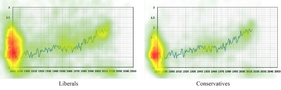
New Post: "How to engage different audiences with the same graph" | A study of how our beliefs shape how we look at climate data from @jiayingzhao and Yu Luo.
https://t.co/hVuBkCFWyH
New post: "A picture may be worth a thousand words, but words frame a picture" | Titles and text play a fundamental role in visualization. Here is research demonstrating how they affect what people get out of a chart: https://t.co/tWBrrZFqpM.
New post: "Data is Personal. What We Learned from 42 Interviews in Rural America." | Based on award-winning @chi2019 paper by @EvanMPeck, Sofia Ayuso, and @omareletr https://t.co/ADtsKvVIWB