iOS Devs, let’s be honest: Making App Store screenshots is a nightmare.
You spend 300+ hours coding a masterpiece, only to kill your conversion rate with ugly visuals because you: A) Don't have $1k for a designer
B) Hate fighting with Figma layers
Stop losing installs. I fixed this for you.
Watch me go from raw screenshots to "App Store ready" design in under 60 seconds 👇
Pocket Casts, three frames doing three jobs:
1) hook — the promise that stops the scroll
2) proof — rating + the main screen
3) feature — the one that earns the download
One cohesive ASO Expert look, generated in 60s.
screenfast — paste a URL or upload your screens.
The usual sleep pack: text-heavy, three centered devices, blue-on-white gradient — the set you've seen on a dozen competitors.
The redesign below: a cohesive Classic Art set — hook, proof, feature. No manual edits.
https://t.co/4KnLFCLBkZ — paste a URL, get the audit + 10 designs.
Pitch: "Learn a language by reading children's books out loud — your phone listens and corrects.".
I asked AI to give the App Store set the visual weight of a AAA launch. Here it is — a Classic Art set: hook, proof, feature.
Most indies can ship this for $9.99 instead of $20M.
https://t.co/4KnLFCL3vr
Watch the headline hierarchy, the device framing, and where your eye lands first.
The redesign came straight from cultureddev's public listing — no manual edits. Style: Bold Promise.
https://t.co/ks2xdLBxYl
Live zone cue, lead with it. Post-run analysis is table stakes, every running app shows stats. The real-time coaching moment is your differentiator and the emotional hook: the user mid-effort, being guided. That is the demo. Analysis becomes the payoff in frame 2.
But that is exactly the call PPO settles. Run both directions as a 50/50 and let install rate decide. What is Coachi's baseline CVR right now?
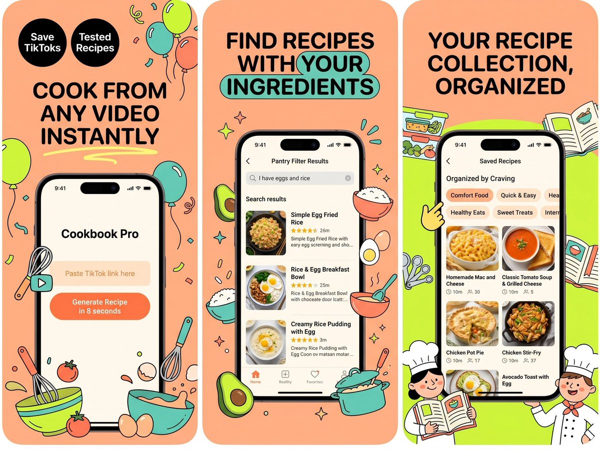
Brief: "Cookbook Pro — Save any TikTok cooking video — the app rewrites it as a tested recipe.". Tone: playful, food-blog warmth. Audience: millennials who screenshot recipes from Reels and never make them.
Got back a clean Festive Illustration set — hook, proof, feature. Which of the three frames would you click first?
If this gets traction I'll post a Codable scaffold tomorrow.
https://t.co/4KnLFCL3vr — every concept I post starts as a screenshot set.
Hero promise: "A net-worth tracker built for people who hate finance apps.".
Three frames in one cohesive Juicy Pop look: a hook, social proof, and the key feature.
Which frame earns the tap?
https://t.co/ks2xdLBxYl — a one-liner or an App Store link is all it needs.
One cohesive set, three frames:
1) the hook — the promise up top
2) social proof — rating + the main screen
3) the feature that closes the install
No copywriting, no Figma. Just the URL. Style: Panoramic Cinema.
Made with screenfast — paste an App Store URL, get 10 design directions in 60s.
Three frames — hook, proof, feature — in a cohesive Juicy Pop look.
Bonus: the same generation pass can localize the whole set into 16+ languages (it restacks the layout for each script's read order, not just translates the headline).
https://t.co/ks2xdLBxYl
Used @StrongApp as the test. Their live screenshots on the left, what ScreenFast gave me on the right.
I didn’t write any copy or mess with fonts. Pasted the App Store link, hit generate, and it spit out 10 different design sets. Each one’s based on whatever the fastest-growing apps are doing right now, so I just scrolled through and grabbed the one that felt right for Strong.
Best part is it exports everything at the exact App Store sizes already. No resizing, no cropping. If you’re launching in other countries it’ll translate the whole set into 16 languages too. You basically just download and upload.
It’s free to try. Paste a link or drop in your own screens: https://t.co/4KnLFCL3vr