https://t.co/j8ML9nGNXn
I chose this video because it goes over in detail everything we’ve covered this semester in class and also gives examples of how to use them in your own work.
#su2412#design
The decision to choose this campaign was a strong one because it’s an eye catching ad that uses color and also implements humor to push their campaign. #su2412#food
I think this is a successful advertisement because it catches the viewers attention because of the good looking food and sauce dripping over it. They also utilized a funny caption to make this ad memorable. #su2421#wings#food
@victoriabul2412 I agree that this is a great campaign. Personally this campaign made me try the food for the nostalgia and I know many others that did as well
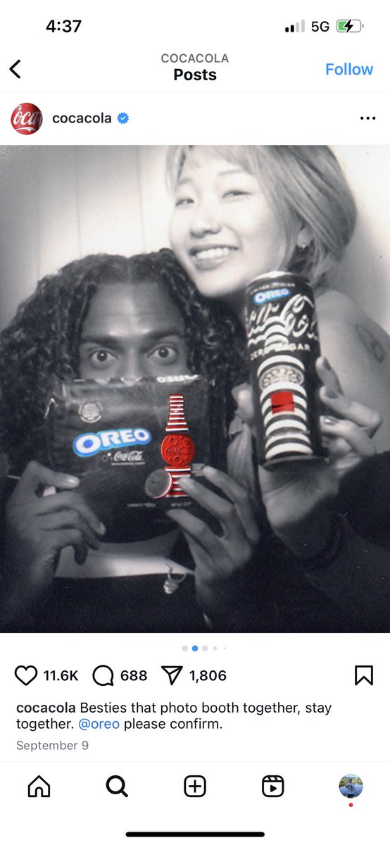
The marketing campaign that I chose is the one for the Oreo/Coca-Cola collaboration. My favorite aspect of this particular image for the campaign is the contrast of the colorless background to the colorful brand names to make them stick out.
#su2412#oreo#cocacola
This post displays contrast which is my favorite principle of design I have learned so far. The contrast is seen with how the focus of the photo is on the fish while the background is blurred.
#su2412#fishing
@Alexa_gracexo My DS days were definitely a big part of my childhood and brings up a lot of memories. Definitely cool to see them still coming up with new things
This post is important because it raises money and awareness for kids that need it. St Jude has been an organization that has done a lot of great things that my family and I have regularly supported and will continue to do so. #su2412