Most brands focus on getting shoppers to click Add to Cart.
I’d focus on what happens before that click.
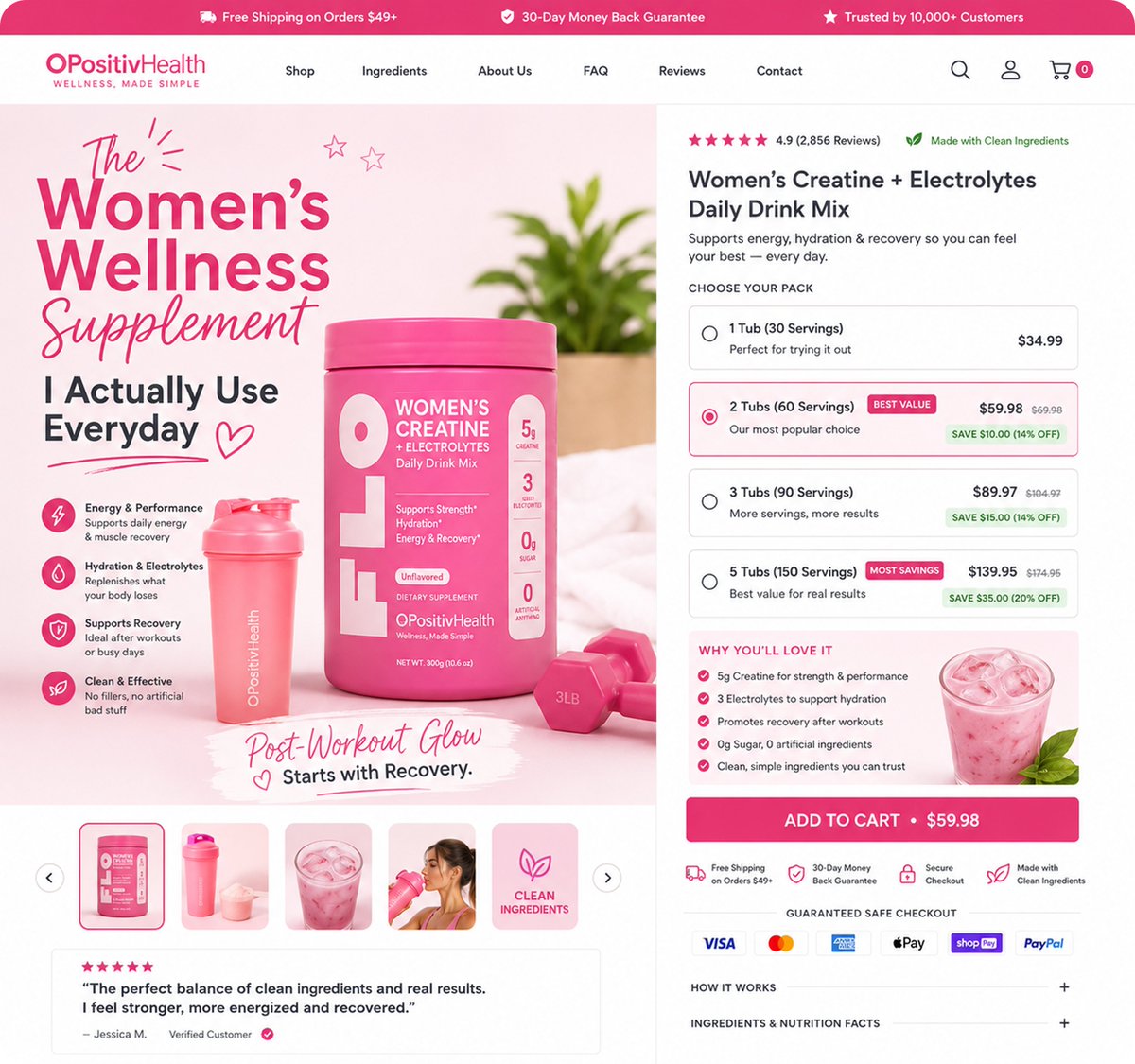
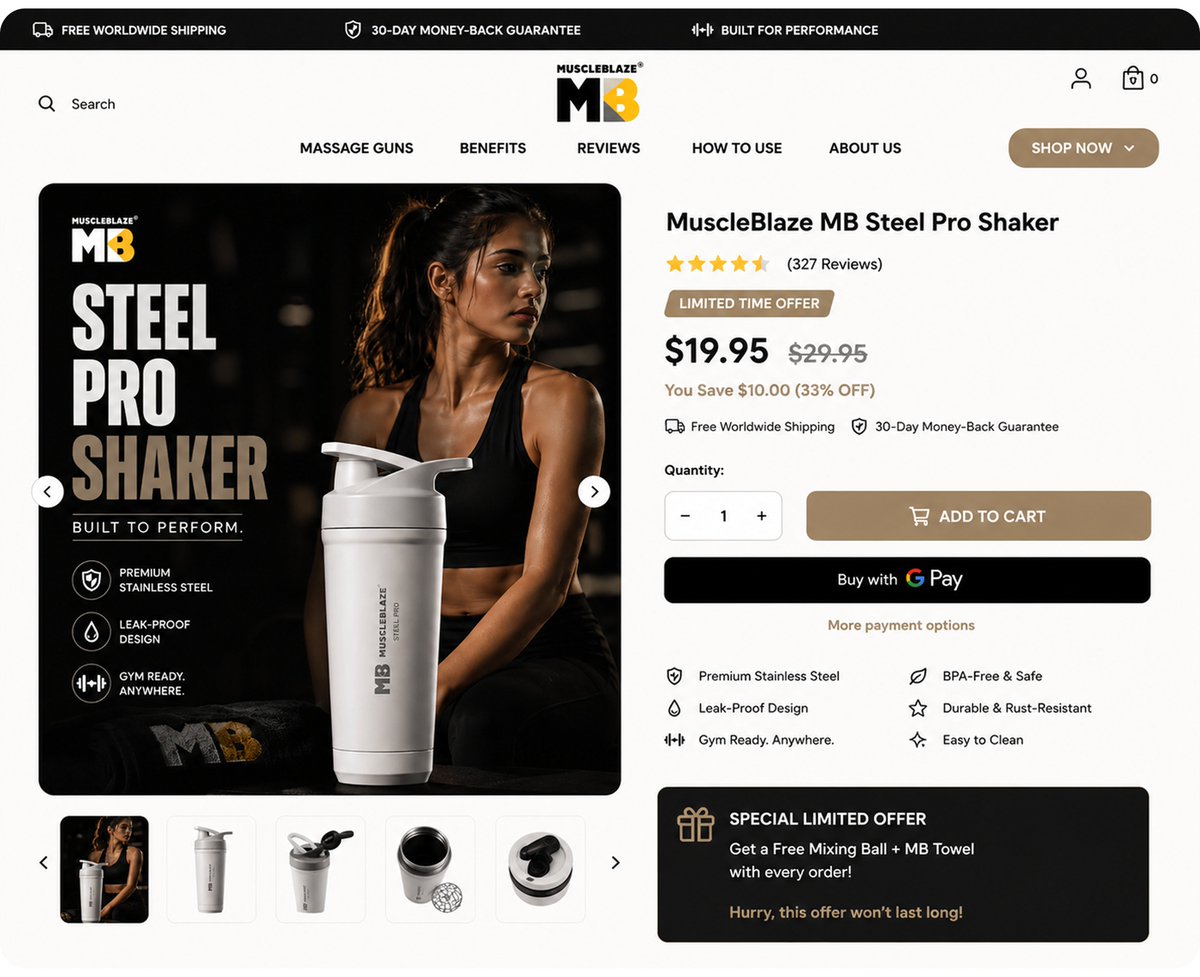
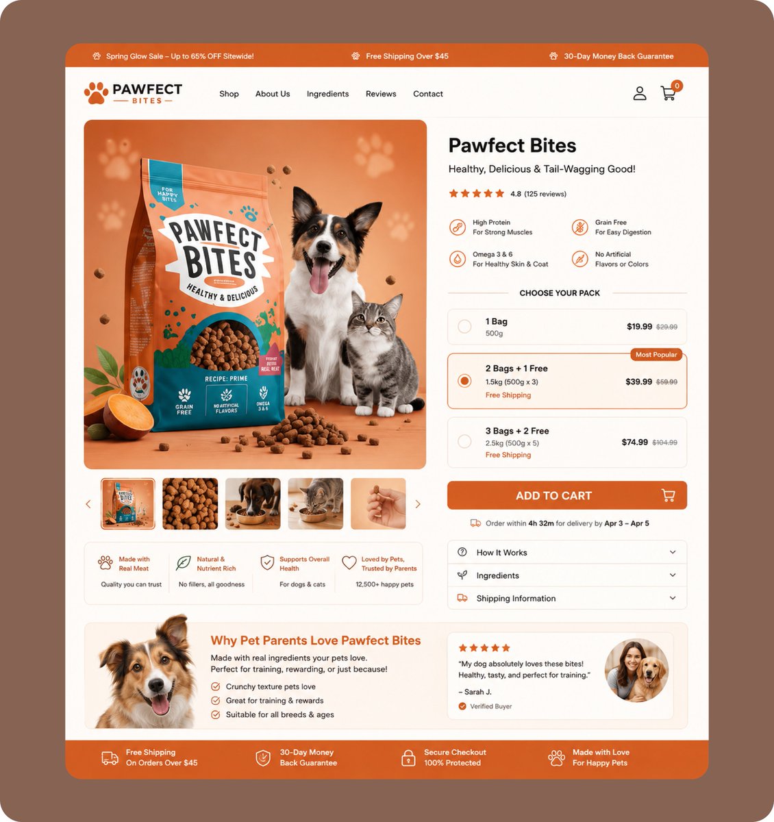
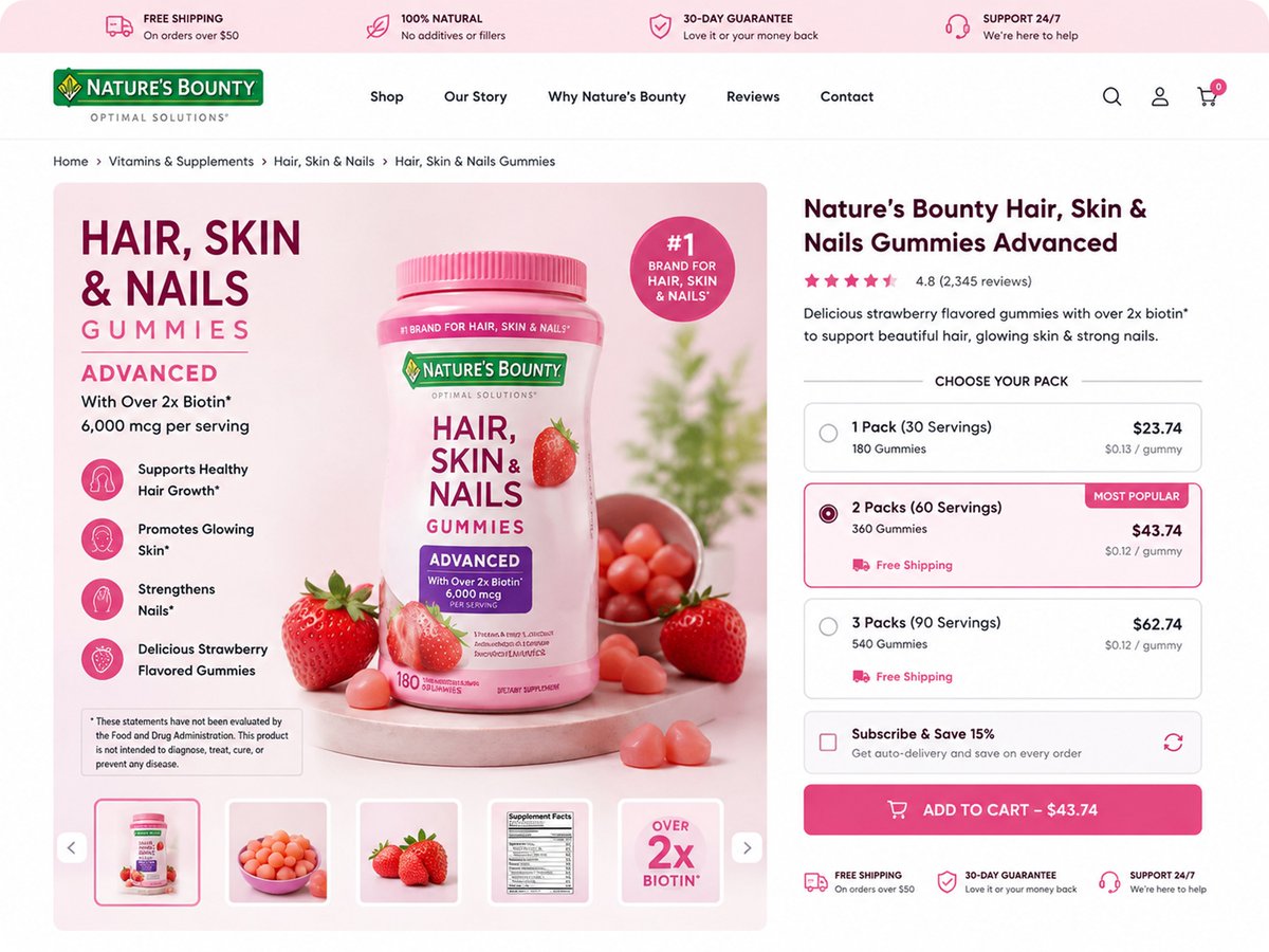
This buying box is designed to create more opportunities for CR + AOV:
→ Multiple quantity options give shoppers an easy reason to buy more
→ Savings increase as the order size increases
→ “Most Popular” guides shoppers toward a higher-value option
→ Subscribe & Save creates a stronger offer than a one-time purchase
→ Free gifts add perceived value
→ Reviews + guarantees reduce purchase hesitation
→ A clear CTA keeps the buying path simple
You don’t always need more traffic to grow revenue.
Sometimes you need to monetize the traffic you already have better.
That’s the thinking behind this product page.
#Shopify #Ecommerce #DTC #ShopifyDesign
Your product page doesn’t need more traffic.
It needs a better buying experience.
This buying box is designed to do 2 things:
→ Make the purchase decision easier = higher CR
→ Make higher-value packs feel like the smarter choice = higher AOV
Clear pack options.
“Best Value” positioning.
Visible savings.
Strong CTA.
Small changes to the buying box can have a big impact on how much revenue you get from the traffic you already have.
Your product page might be giving shoppers too many choices without giving them enough reasons to buy.
A PDP shouldn’t make customers figure out which option is best.
Instead:
→ Make the best-value bundle obvious
→ Show exactly how much they save
→ Use “Most Popular” to guide the decision
→ Add subscriptions for recurring products
→ Reinforce trust with reviews, guarantees & secure checkout
The goal isn’t to add more information.
It’s to make the buying decision easier.
Better UX → less friction → higher CVR + AOV.
#DTC #ecommerce #CRO #Shopify #AOV
Your PDP can have great traffic and still lose sales.
One common problem?
Customers don’t have enough reasons to choose the bigger bundle.
If your product page only says “Buy Now,” you’re leaving
AOV on the table.Instead:
→ Show the savings clearly
→ Highlight the “Most Popular” option
→ Give shoppers a reason to buy more
→ Show the price per unit
→ Reduce purchase friction with trust signalsA high-converting PDP doesn’t just sell the product.
It sells the better buying decision.
#DTC #ecommerce #CRO #Shopify #AOV
Your product page should make the buying decision easier.
Show the value.
Build trust.
Make bundles obvious.
Give shoppers a reason to buy more.
Remove friction before checkout.
That’s how you turn a product page from “looks good”
→ “sells better.”
Good design gets attention.
Good CRO gets revenue.
#DTC #ecommerce #CRO #Shopify
Your product page shouldn’t just get people to “Add to Cart.”
It should increase the value of every purchase.
I designed this buying box for both desktop + mobile with that in mind:
→ Bundle options to push AOV
→ Subscribe & Save to increase LTV
→ Clear value/discount messaging
→ Trust signals to reduce hesitation
→ Mobile-first layout to remove buying friction
Better buying experience = more opportunities to increase CR + AOV.
If your PDP isn’t doing both, you’re leaving revenue on the table.
#ecommerce #DTC #CRO #Shopify #AOV
It can directly influence your CR + AOV.
On this PDP, I used:
→ Bundle anchoring to increase order value
→ “Most Popular” + “Best Value” to guide decisions
→ Subscribe & Save to drive recurring revenue
→ Clear savings to make bigger purchases easier to justify
→ Trust signals near the CTA to reduce hesitation
The goal isn’t just to get more customers buying.
It’s to get more customers buying more.
That’s the difference between a pretty PDP and a revenue-focused PDP.
#ecommerce #DTC #CRO #ConversionRateOptimization #AOV #Shopify #EcommerceDesign #PDP #LandingPageDesign #DTCBrands
Your product page shouldn’t just show your product.
It should remove the reasons people hesitate to buy.
If visitors are still wondering:
• Is it worth the price?
• Can I trust this brand?
• What makes this product different?
• What do I get with my order?
You’re making them do the selling themselves.
Don’t redesign a PDP just to make it “look better.”
I redesigned this one around CR + AOV:→ Stronger product-first hero
→ Reviews surfaced earlier
→ 4-bottle bundle positioned as Best Value
→ Clear price/pack savings
→ Subscription made easier to understand
→ Stronger CTA + trust messagingThe goal isn’t prettier pages.
It’s less hesitation → more purchases → higher AOV.
If your PDP is getting traffic but leaving revenue on the table, the problem might be the buying experience not the ads.
Getting traffic but your product page isn’t turning enough visitors into buyers?
Your buying box could be the problem.
A strong buying box should make 3 things obvious:
→ What am I getting?
→ Which option gives me the best value?
→ Why should I buy now?
This one uses clear benefits, social proof, pack options, a “Most Popular” choice, free shipping and a strong CTA.
That can help reduce hesitation → improve CVR
while bigger pack options can increase AOV.
Brand owners: don’t just optimize for more traffic.
Optimize the moment visitors decide to buy.
#ecommerce #shopify #DTC #ecommercebrands
Honest opinion
Yes, this angle is stronger for attracting brand owners. It talks about a problem they actually care about—getting more revenue from existing traffic—instead of making the post sound like you're simply showing off a design.
Your product page doesn’t always need more traffic.
Sometimes, it needs a better buying experience.
Look at this buying box
• Clear product value
• Social proof before the decision
• Multiple pack options
• “Most Popular” choice
• Subscribe & Save
• Free shipping + guarantee
• Strong, visible Add to Cart
This does 2 important things:
1. Helps more visitors feel confident enough to buy → higher CVR.
2. Gives buyers a reason to choose bigger packs → higher AOV.
More traffic won't fix a buying experience that makes customers hesitate.
Make the buying decision easier, then make the bigger order feel like the obvious choice.
If you're a brand owner, this is the part of your product page I'd optimize first.
Your product page doesn’t always need more traffic.
Sometimes, it needs a buying box that gets more value from the traffic you already have.
For this redesign, I focused the buying box around CR + AOV:
→ Clear offer = less decision friction
→ 6, 8 & 16-jar options = more room to increase order value
→ Savings shown upfront = stronger reason to buy more
→ Bestseller positioning = easier decision-making
→ Delivery urgency = less “I’ll buy later”
→ Guarantee + secure checkout = less purchase hesitation
The goal isn’t to force customers into the biggest package.
It’s to make the value of buying more obvious while making the purchase decision easier.
That’s what a revenue-focused product page should do.
Turn more of your existing traffic into customers and give those customers a reason to spend more.
#Shopify #Ecommerce #DTC #ShopifyDesign
Developing this hero section in @replohq
The goal isn't just to make the page look good.
It's to make the product clear fast, build enough trust to keep shoppers moving, and create a stronger path toward the cart.
Less confusion. More intent.
@replohq#Shopify#DTC #ecommerce #CRO
Your homepage might be costing you sales before shoppers even reach your product pages.
The problem?
Too many stores make visitors work to understand:
What do you sell?
Why should I care?
Why should I trust you?
What should I do next?
Every extra question creates friction.
A strong homepage should do the opposite.
Grab attention → communicate the value → build trust → guide the next click.
You don’t need more sections.
You need a homepage that moves visitors toward a buying decision.
That’s what I focused on with this redesign.
#Shopify #Ecommerce #DTC #ShopifyDesign
Your product page doesn’t always need more traffic.
Sometimes, it needs a buying box that gets more value from the traffic you already have.
For this redesign, I focused the buying box around CR + AOV.
Increase CR:
Clear offer, strong trust signals, delivery reassurance, and a visible guarantee reduce the hesitation that can stop a shopper from buying.
Increase AOV:
6, 8, and 16-jar options give customers a clear reason to consider a larger order, while upfront savings make the higher-value options easier to justify.
The bigger idea:
Don’t just give shoppers a way to buy.
Give them a clear reason to buy now and buy more.
That’s how I approach product page design for brands that want to get more value from the traffic they’re already paying for.
#Shopify #Ecommerce #DTC #ShopifyDesign
Your product page already has the traffic.
The question is: how much revenue are you getting from it?
This buying box is designed to attack two problems:
Low CR
→ Clear benefits
→ Reviews + guarantee
→ Less purchase hesitation
→ One obvious CTA
Low AOV
→ 2, 3 & 4-bottle offers
→ Bigger savings for bigger orders
→ “Most Popular” guides shoppers
→ “Best Value” makes the higher-ticket option easier to choose
→ Subscribe & Save increases customer value
Instead of making every shopper choose the cheapest option...
make the value of buying more obvious.
That’s what a revenue-focused buying box should do.
our product page doesn’t need more information.
It needs to make the buying decision easier.
For this gaming apparel page, I designed the buying box to remove the friction that can kill conversions:
→ Clear product benefits
→ Visible size selection + Size Guide
→ Customer review beside the buying experience
→ Money-back guarantee
→ Familiar payment methods
→ Simple quantity selector
→ One clear Add to Cart CTA
And for AOV, the buying box creates the foundation for future upsells, bundles, and cross-sells without making the first purchase complicated.
Because more traffic won’t fix a product page that makes shoppers hesitate.
Make the decision easier first. Then give your traffic more chances to convert and spend.
#Shopify #Ecommerce #DTC #ShopifyDesign
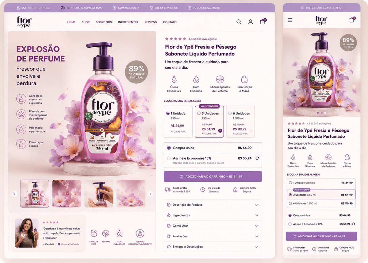
Your product page can get traffic and still underperform if the buying decision is poorly structured.
This buying box is designed to work on CR + AOV at the same time.
For CR:
→ Clear product benefits before the offer
→ Simple 1 / 3 / 6-unit choices
→ “Mais Vendido” guides the decision
→ Reviews + guarantees reduce hesitation
→ One clear Add to Cart CTA
For AOV:
→ Higher-quantity options are visible immediately
→ Per-unit pricing makes buying more feel like a better deal
→ 15% Subscribe & Save creates another value-driven offer
→ The 3-unit option becomes the natural middle choice
The goal isn’t to force customers to spend more.
It’s to make the higher-value decision easier to understand.
That’s how I think about product page design:
More clarity → less friction → more opportunity to increase revenue per visitor.
#Shopify #Ecommerce #DTC #ShopifyDesign
You’re paying to bring visitors to your product page.
Don’t let a weak buying box waste that traffic.
This is how I’d structure it to create more opportunities for higher CR + AOV:
→ Make the offer instantly understandable
→ Use “Best Value” to guide shoppers toward the bigger purchase
→ Make the savings impossible to miss
→ Add urgency without overwhelming the buyer
→ Use reviews, guarantees & shipping info to remove hesitation
→ Add a relevant free gift to increase perceived value
The result?
Customers have fewer reasons to hesitate and more reasons to choose the higher-value offer.
Your buying box is not just a checkout step.
It’s one of your biggest opportunities to increase revenue per visitor.
#Shopify #Ecommerce #DTC #ShopifyDesign
Your buying box shouldn’t just help customers buy.
It should give them a reason to buy more and buy with less hesitation.
For this product page, I designed the buying box around 2 goals:
↑ CR
→ Clear product value
→ Strong trust signals
→ Simple purchase options
→ One obvious CTA
→ Less friction before checkout
↑ AOV
→ 1, 2 & 3-bottle options
→ “Best Value” bundle
→ Savings shown upfront
→ Subscribe & Save
→ A clear reason to buy more
For brand owners, this is the opportunity most product pages miss:
Don’t just optimize the Add to Cart button. Optimize everything that happens before it.
More clarity → less hesitation.
Better offers → more value per order.
That’s what I’m building into product pages.
#Shopify #Ecommerce #DTC #ShopifyDesign