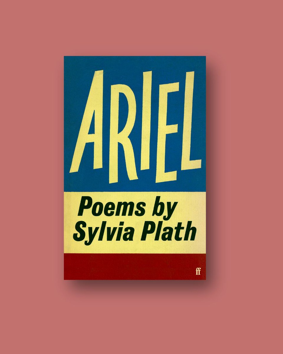
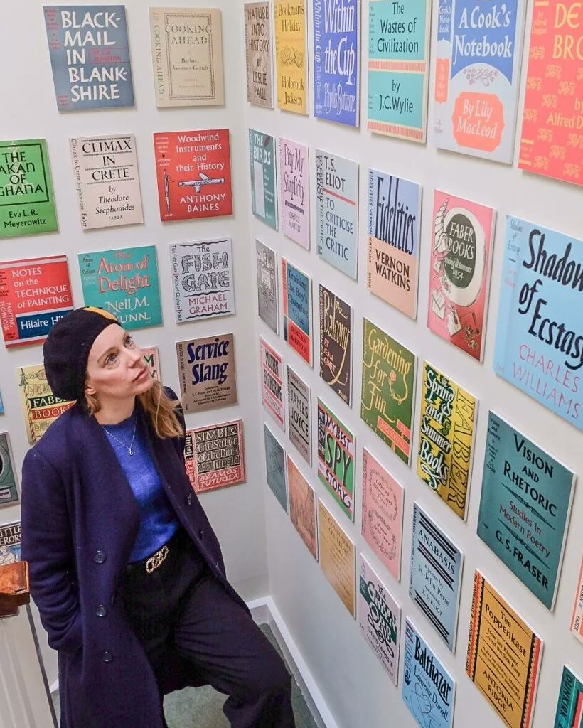
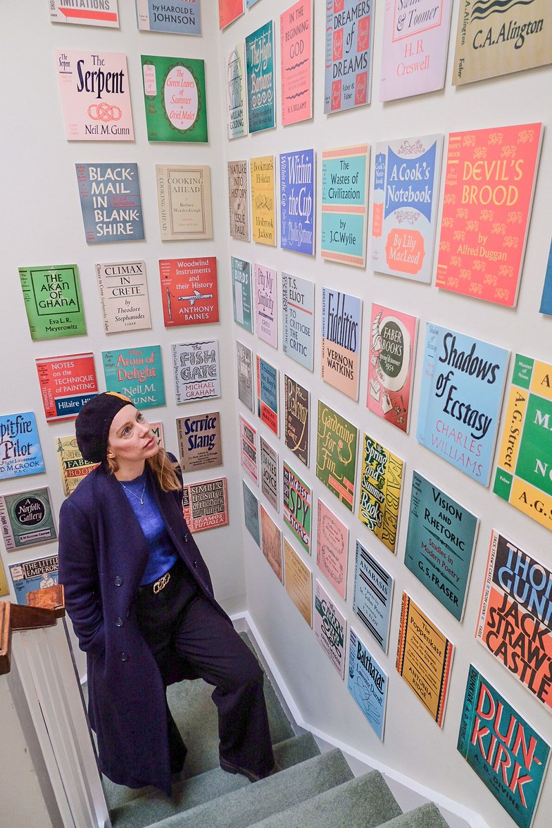
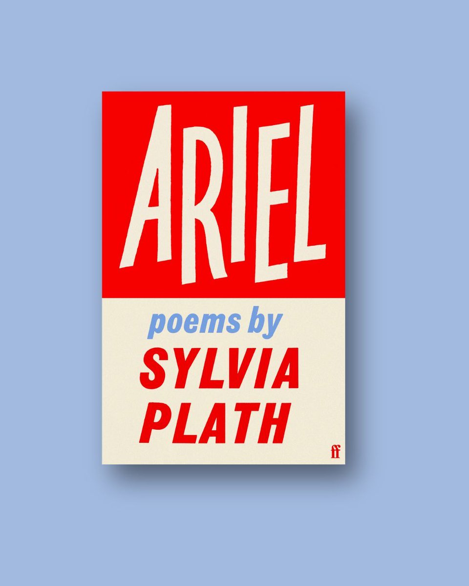
To mark sixty years since publication, introducing two beautiful new editions of Sylvia Plath's Ariel.
A heritage hardback edition which restores Berthold Wolpe’s iconic original jacket, and a paperback introduced by poet Emily Berry.
Out 3 July: https://t.co/CFRePNSzdg
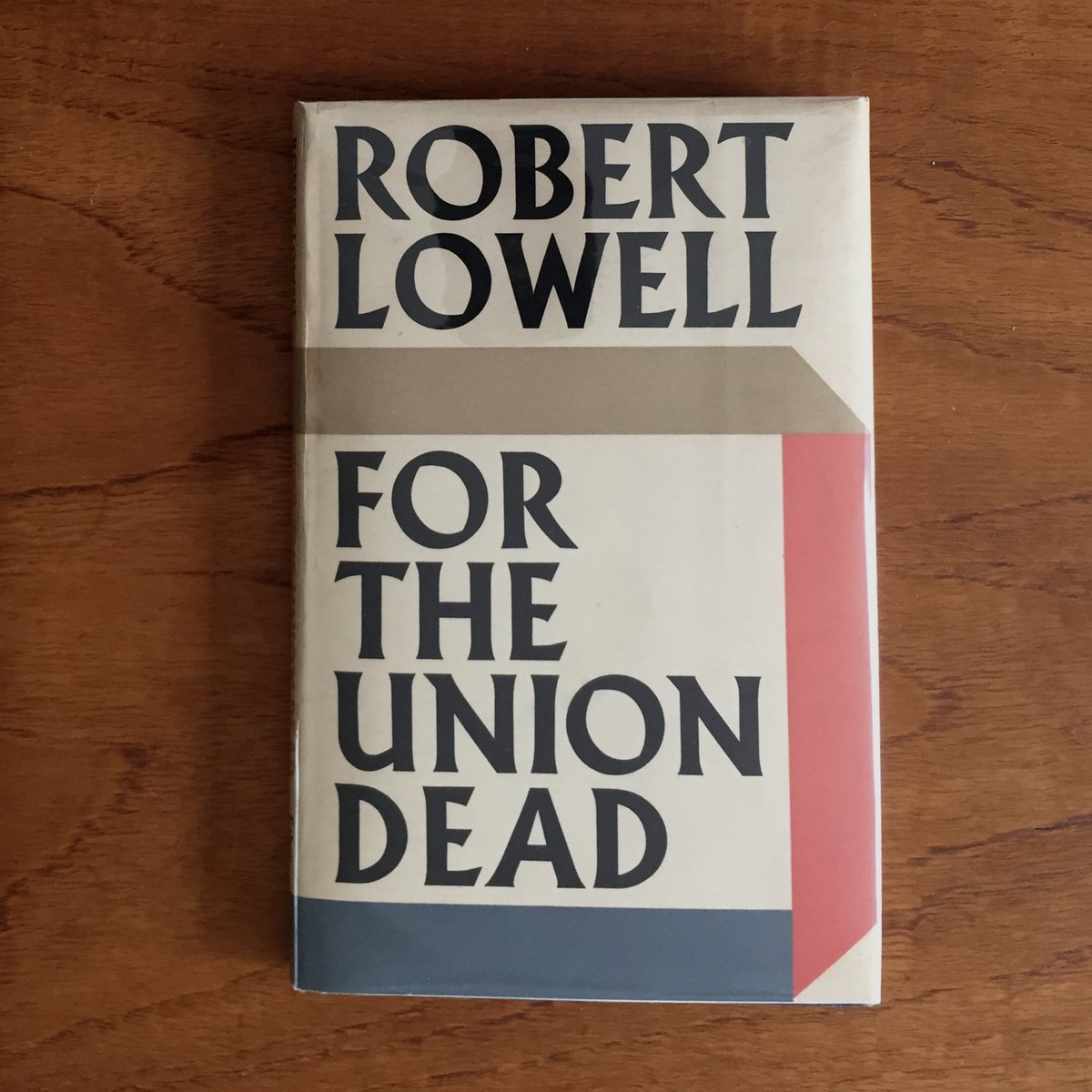
@TomCook24 Looks splendid, Tom. I have a Faber hardback first edition of Lowell's For the Union Dead I absolutely cherish. Berthold Wolpe was a genius.
Happy birthday Berthold Wolpe. The award-winning type designer, typographer, illustrator & educator, famous for his book covers for Faber & Faber as well as his myriad typeface designs, born today in 1905. #typedesign#bookdesign
In case you’ve had enough of me in print, I’m also on @theTLS podcast this week!
I had a great time chatting to @AlexClark3 and Lucy Dallas about typography, Baskerville, and @FaberBooks’ heroic postwar designer Berthold Wolpe:
https://t.co/oG8RRWAc9D
It was only a matter of time. I’m back in @theTLS this week, but in this issue… I’m talking about fonts!
The hero of the story is Berthold Wolpe, who escaped Nazi persecution and became the designer of countless iconic @FaberBooks in the postwar years:
https://t.co/eGqRdgTGFW
A present to myself for finishing my PhD, this Faber first edition of Robert Lowell's For the Union Dead (1964) has been on my wish list for years. Designed by Berthold Wolpe using the now legendary Albertus typeface, this is the complete package. You can keep your FSG.
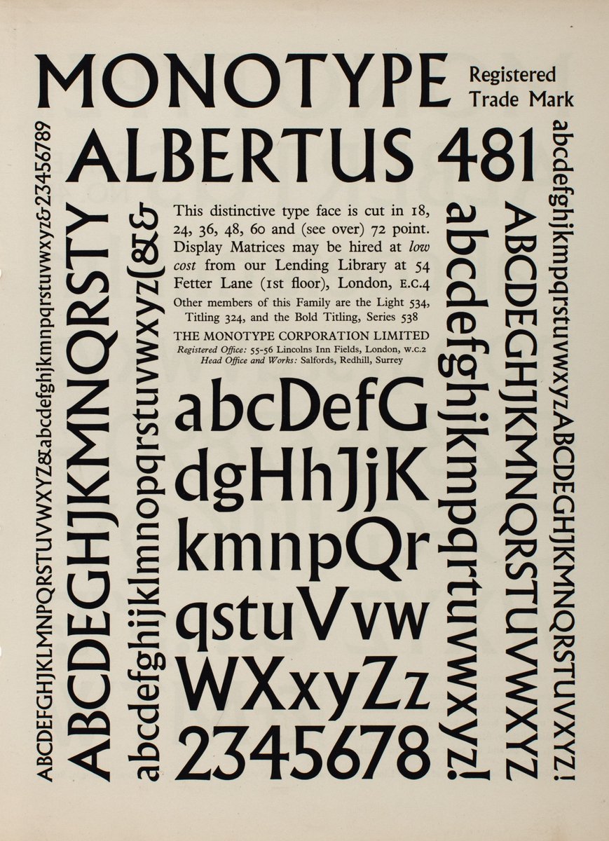
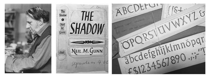
Monotype specimens for Albertus (c.1930s) from our library collection 📚
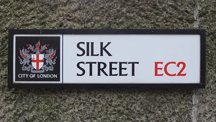
Albertus was designed by Berthold Wolpe and has particular links to Fleet Street as the typeface used on City of London street name signs.
#typespecimen#typedesign#typography#bertholdwolpe#type
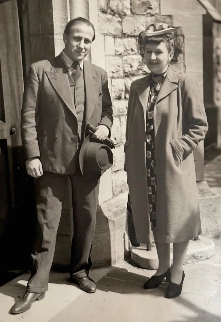
For this week's column I wrote about great artist couple, Margaret and Berthold Wolpe, their first joint exhibition @winterbournehg, and the idea that creativity flourishes through collaboration https://t.co/cXSOsFdKcP
Good piece by Ruth Millington on the Berthold Wolpe and Margaret Wolpe exhibition at the University of Birmingham's Winterbourne House. @ruth_millington@philcleaver@winterbournehg @lee_hale17
https://t.co/j4SjMzCX6I
Don't judge a book by its cover? Settling down to write about the delightful Margaret and Berthold Wolpe exhibition, which features this fantastic design @winterbournehg
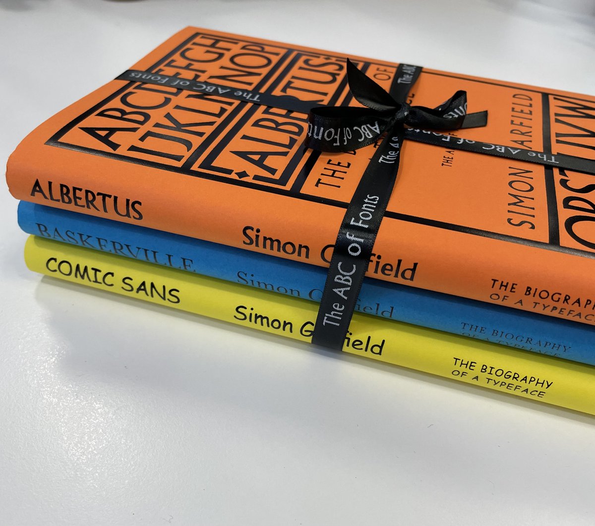
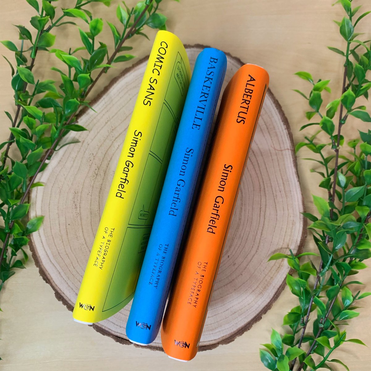
I think these might be the most handsome books I've ever published
Stories of the fonts that shape our world by Simon Garfield
ALBERTUS
BASKERVILLE
COMIC SANS
The ABC of Fonts series launches tomorrow @wnbooks
The ABC of Fonts: Albertus, Baskerville and Comic Sans
Written by Simon Garfield and publsihed by @wnbooks
One of the most beautiful handcrafted typefaces in the world, Albertus is also one of the most enduring.
Calligrapher, typographer, book designer and illustrator Berthold Wolpe was born OTD in 1905. He created the Albertus typeface and used it often at Faber & Faber, for which he designed over 1,500 covers and jackets. Albertus is also used for City of London signs.
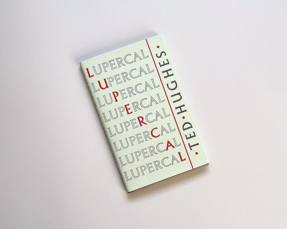
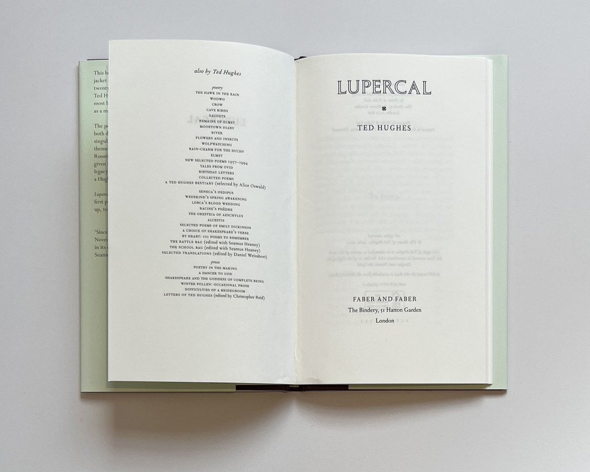
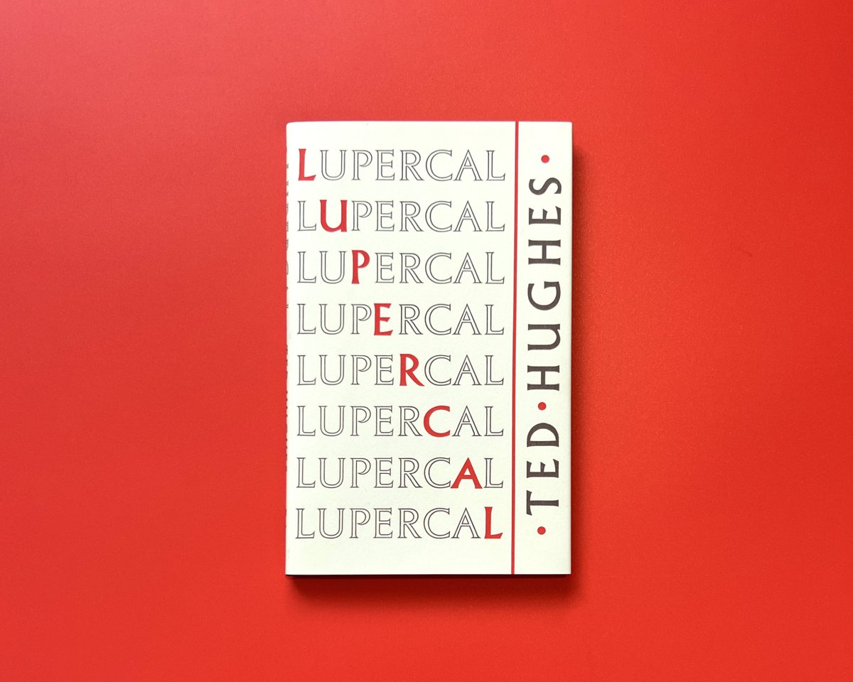
Introducing the Heritage Edition of Ted Hughes’s extraordinary second collection, Lupercal, featuring its glorious original Berthold Wolpe jacket.
We have 75 advance copies available for Faber Members ahead of the official publication later this month.
https://t.co/KVw7ERsviu
I was there a couple of days ago and can attest to how great the exhibition was—and Winterbourne House, too, to be completely honest, what a magical garden. A fascinating glimpse into the work of Margaret Wolpe, alongside her husband. Highly recommended.
Berthold and Margaret Wolpe: New exhibition at the University of Birmingham's Winterbourne House featuring their fine art, design, and typography. https://t.co/O1YKugvmqx
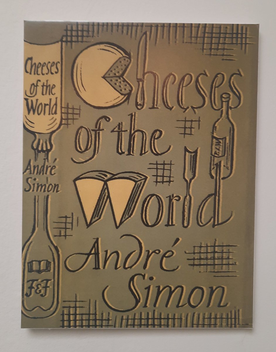
Berthold Wolpe created the Albertus typeface in the 1930s for the British branch of Monotype and named it after German philosopher and theologian Albertus Magnus. He often used it when designing jackets for Faber. My guess is he did this beauty. @Wolpe