Day 30/60 wrap.
Simplified the Home Screen.
Less clutter. Faster read.
Also added customization: users can pick a background wallpaper pulled from the Unsplash API.
Day 29/60 recap.
Asset overview is getting smarter.
We’re using Grok to generate fast, readable summaries so users understand what they’re looking at before they hit Long/Short.
Day 28/60 recap.
Perps terminals can overwhelm new users. So we added an asset overview layer.
Price, change, context, then action.
Quick trade buttons remain for power users.
Day 27/60 wrap.
Nearly done with the new onboarding + agent creation flow.
Now consistent on both breakpoints (mobile + desktop).
Same steps. Same vibe.
Day 24/60.
Spent today adapting onboarding from mobile to desktop.
Not new steps, just better structure.
Mobile-first principles stayed.
Desktop experience finally feels intentional.
Day 23/60 wrap.
We added deeper avatar customization.
Software is getting quicker and easier to build.
The real differentiators are quality and personalization.
We’re doubling down on the parts users actually feel.
Day 21/60 wrap.
We started animating the agent avatar using WebGL.
More motion, more personality.
It already feels less like UI and more like a presence.
Excited to see how it evolves as the agent gets smarter.
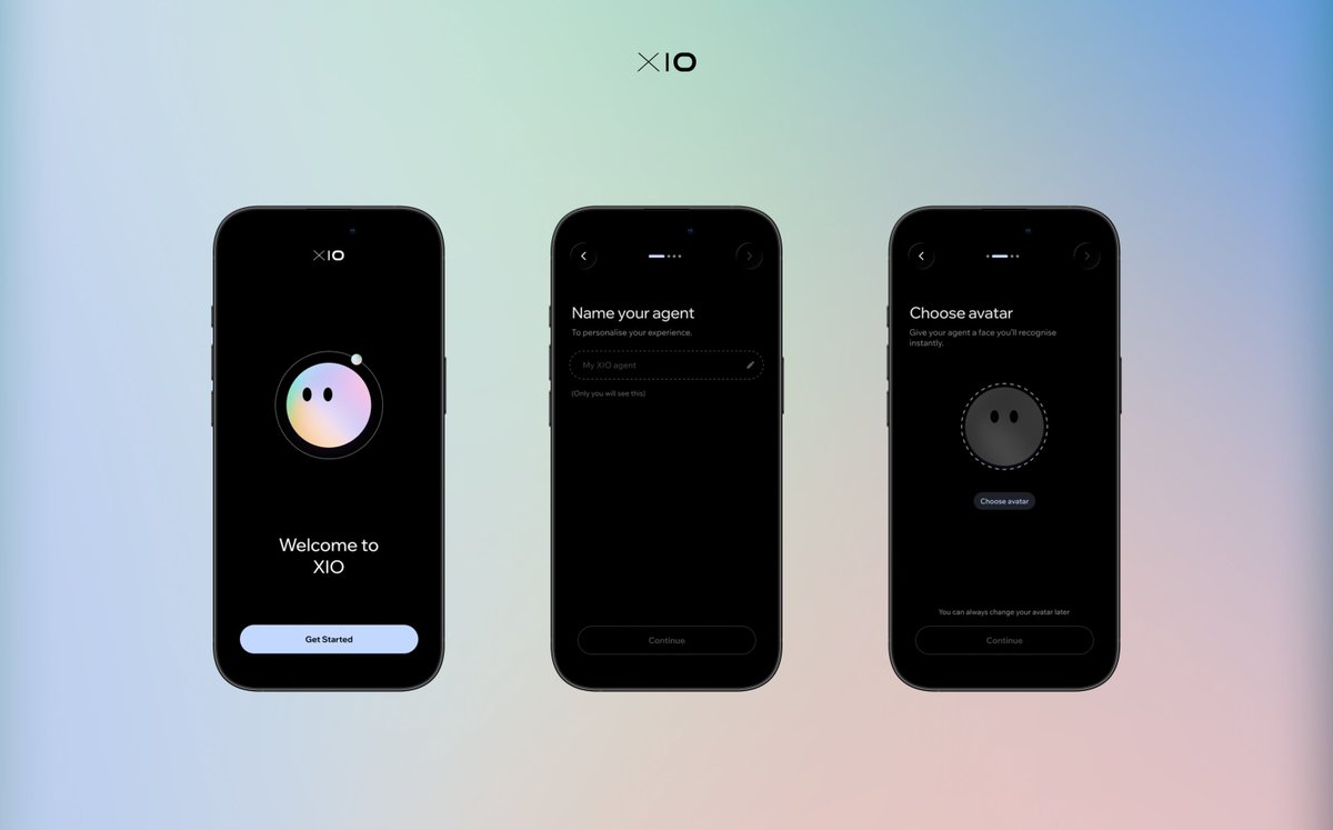
Day 20/60.
We rebuilt onboarding around the agent, not the wallet.
Name it. Give it a face. Then fund it.
Wallet is plumbing. The agent is the interface.
2/ Also redesigned the app icon.
The old mark disappeared on the home screen. Hard to read.
The new one is 6 dots for 6 specialist agents you get out of the box.
Day 16/60
Spent today custom-building the WalletConnect connect/select flow so it matches XIO UX.
White-label was functional, but it didn’t feel integrated.