The left one is like $12/mo/employee and comes with sso, takeover employee accounts, data retention, ldap. You get everything included and it’s all cohesively integrated into a single suite of tools
the right one is like… fucken… $50/mo/employee all in. and has useless AI features built in because the founders need the ai usage metrics to play into the ai hypecycle narrative to pump their val (email support to opt out)
ALSO: No SSO or ability to transfer terminated employees’ pages unless you pay for the insane enterprise tier (!!!!!!) (“Contact sales for pricing” bullshit)
and is fucking SLOW and eats 200MB of ram. and 50% chance doesnt work on linux
and impossible to switch off of because xDdd data moat and process moat
I regret switching to Notion from Google Docs every day at work
15 years ago, I helped design Google Maps.
I still use it everyday.
Last week, the team dramatically changed the map’s visual design.
I don’t love it.
It feels colder, less accurate and less human.
But more importantly, they missed a key opportunity to simplify and scale.
–––
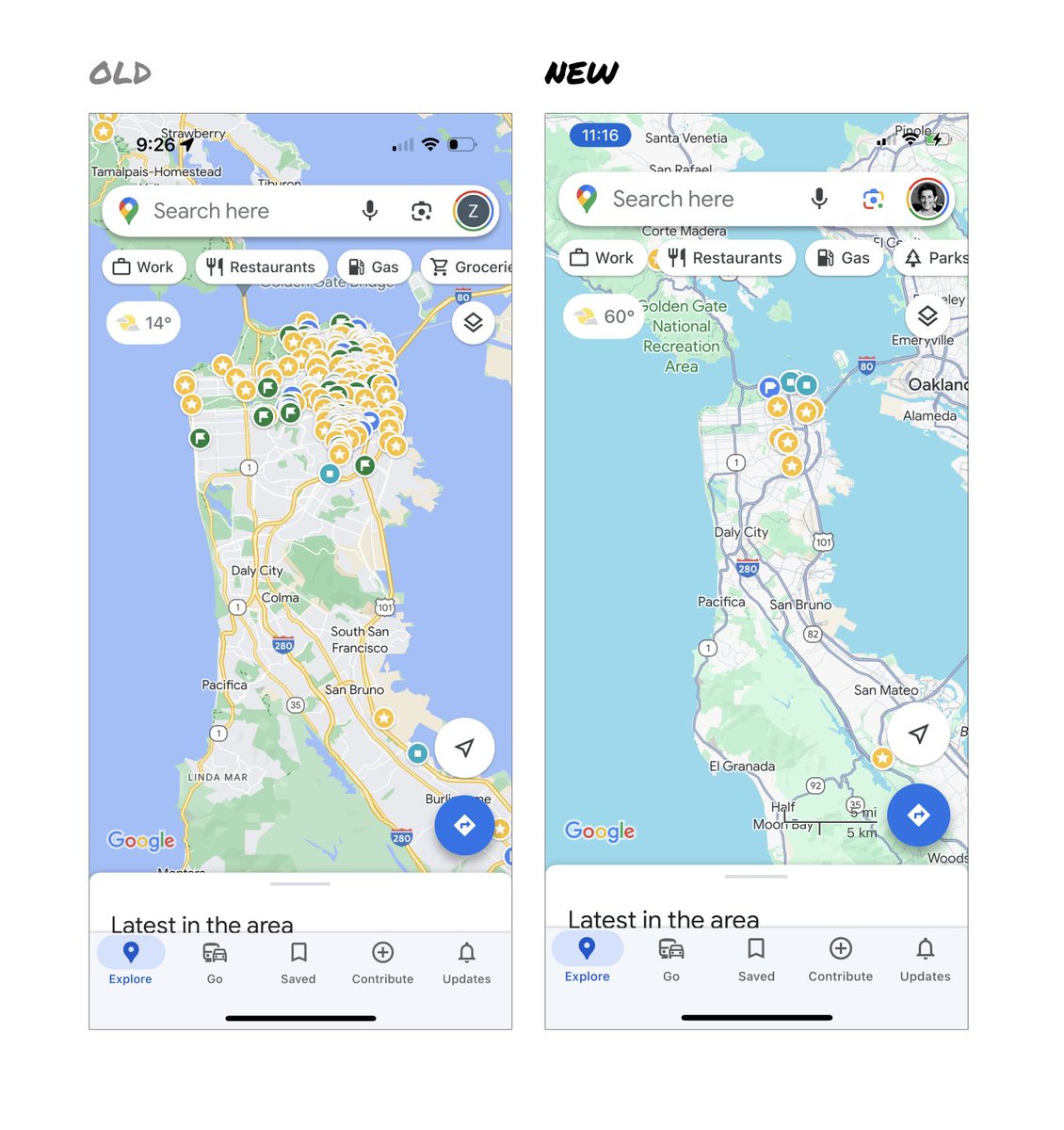
Google Maps has started to widely roll out updated map colors:
- All roads are now gray
- Water changed from blue to teal
- Parks and open spaces are now mint green
It seems the goal was to improve usability and make the maps more readable.
Admittedly, I do think major roads, traffic, and trails stand out more now.
But the colors of water and parks/open spaces blend together.
And to me, the palette feels colder and more computer generated.
But color choices aside…
If the goal was better usability, the team missed a big opportunity:
Google Maps should have cleaned up the crud overlaying the map.
–––
So much stuff has accumulated on top of the map.
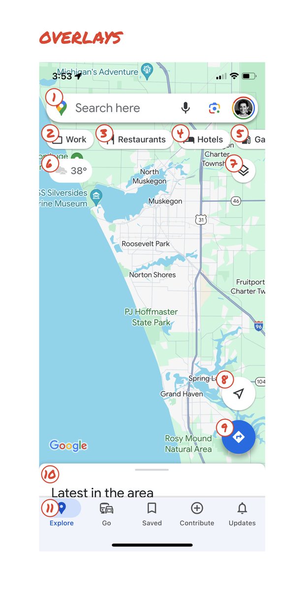
Currently there are ~11 different elements obscuring it:
- Search box
- 8 pills overlayed in 4 rows
- A peeking card for “latest in the area”
- A bottom nav bar
(Personally, I would LOVE to see usage metrics for all these overlays.)
The map should be sacred real estate.
Only things that are highly useful to many people should obscure it.
There should be a very limited number of features that can cover the map view.
And there are multiple ways to add new features without overlaying them directly on the map.
–––
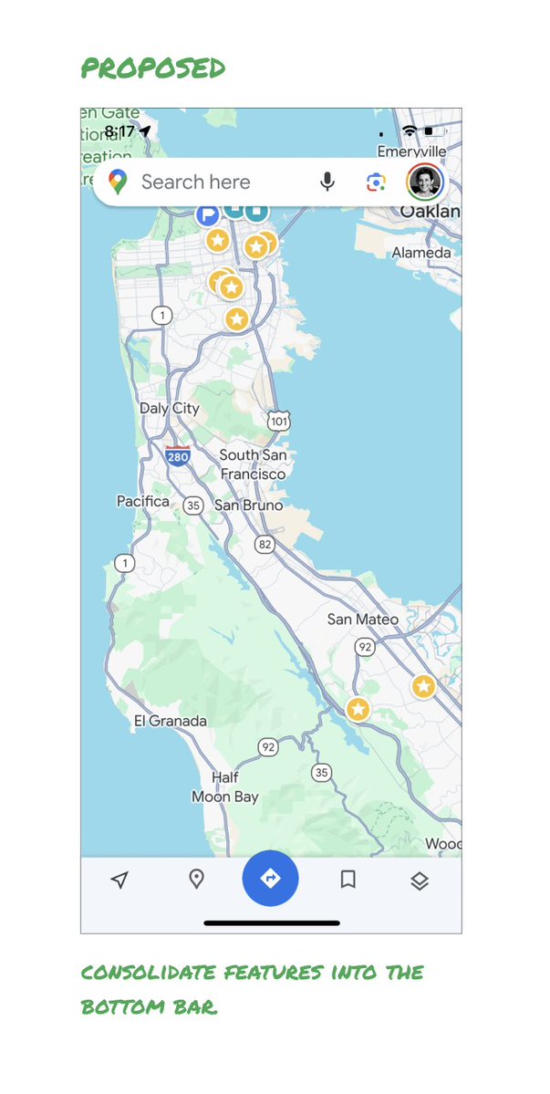
Here’s how it could look:
- Keep the search box
- Keep the bottom bar
- Remove everything else from the map
- Roll the most used features into the bottom bar
- Bury the less used features elsewhere in the app
I assume the search box and directions are top priority and should remain prominent.
My Location and map layers (satellite, traffic, etc.) could move to the bottom bar.
The explore overlays (restaurants, gas, etc.) could live in the bottom bar in “Explore” and open as cards.
The additional space in the bottom bar could be used for Saved, as a “More” option, or could be removed entirely.
There are many variations of how features could be arranged.
But the key points are:
- Dramatically simplify
- Strongly prioritize map visibility
- Bury legacy and low use features
–––
It’s normal for products to accumulate features over time.
But it’s also super important to stay vigilant and continually clean them up.
In many ways, it’s interesting to see history repeating itself.
In 2007, I was 1 of 2 designers on Google Maps.
At that time, Maps had already become a cluttered mess.
We were wedging new features into any space we could find in the UI.
The user experience was suffering and the product was growing increasingly complicated.
We had to rethink the app to be simple and scale for the future.
It seems like it’s time for Google Maps to do this again…
–––
For more on design + tips for early stage founders, follow me on X: @elizlaraki
(Again:) Write. Because writing is not just to communicate your work to others. Writing is how you interact with your own thoughts.
Writing can help excavate concepts and links in your understanding which you did not realize you had in your brain. So, write.
Found it in my notes, it was probably @visakanv who said it
""There is no point trying to force yourself to do something that you don’t find compelling. Because even if you succeed, you end up teaching yourself that success requires misery.""
🤌❤️
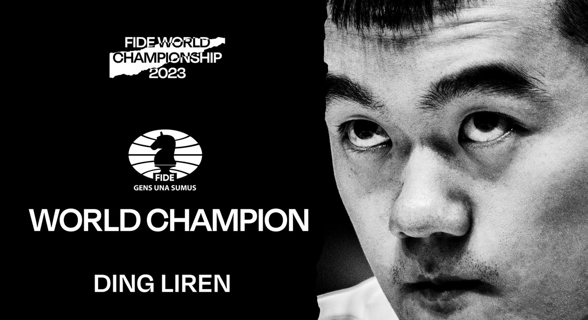
Ding Liren is the 2023 FIDE World Champion! 🏆♟️👏
Ding prevailed over Ian Nepomniachtchi in the last rapid tie-break game of one of the most exciting and dramatic matches in chess history. #NepoDing