Kuwait moves to further amend its Nationality Law. What could the proposed changes mean for citizenship, naturalised citizens and nationality records? Key points to know.
here's exact DESIGN.md file you can use with your ai agents for designing it.
Create a single-page interactive web application that visually and behaviorally reproduces a compact retro digital handheld device.
This is NOT a creative interpretation.
This is NOT a redesign.
This is NOT an approximation.
Treat every value, dimension, color, interaction, animation, state, and visual effect in this specification as intentional and immutable.
The finished result should look like a professionally rendered physical retro electronic device sitting in the center of a nearly black screen.
The application must feel like real hardware implemented as a web interface.
0. ABSOLUTE PRIORITY
When implementing this application, follow this priority order:
Exact geometry
Exact proportions
Exact colors
Exact typography
Exact shadows / gradients / lighting
Exact pixel graphics
Exact interactions
Exact animation timing
Responsive behavior
Code cleanliness
If clean code conflicts with visual accuracy, choose visual accuracy.
If conventional UX conflicts with the specification, choose the specification.
Do not add anything that is not explicitly requested.
1. TECHNOLOGY
Build using:
React
JavaScript
CSS
HTML
SVG where explicitly specified
Web Audio API for sound effects
browser Date API for the clock
requestAnimationFrame() for stopwatch animation
Open-Meteo API for weather
Do not use a heavy UI framework.
Do not use an icon library.
Do not use an external component library.
Do not use image assets for the pixel-art graphics.
The device must be constructed using HTML/CSS/SVG and generated pixel elements.
2. PAGE / ENVIRONMENT
The entire browser viewport is the stage.
There is no:
navbar
header
footer
sidebar
page title
card wrapper
menu
additional content
The page is almost completely black.
Use:
html,
body,
# root {
width: 100%;
min-height: 100%;
}
body {
margin: 0;
padding: 0;
background: # 0c0c0e;
color: # f5f5f5;
overflow: hidden;
}
The device is centered horizontally and vertically.
Use a centered flex layout:
body {
display: flex;
align-items: center;
justify-content: center;
}
The user should immediately see the device as the sole visual object.
3. GLOBAL DESIGN LANGUAGE
The device is a fictional Japanese retro digital instrument.
Visual characteristics:
late-1990s / early-2000s portable electronics
industrial gray plastic
black recessed screen
subtle CRT characteristics
orange-red accent
monochrome pixel graphics
physical buttons
tiny technical typography
Japanese product branding
realistic plastic highlights
realistic inset shadows
subtle ambient shadow
The design must NOT look like:
a modern smartwatch
a modern dashboard
a generic calculator
a glassmorphism UI
a flat UI kit
a neumorphic web card
an iOS interface
a generic retro website
It must look like a physical object.
4. GLOBAL COLORS
Use these exact colors.
PAGE
# 0c0c0e
CHASSIS LIGHT
# a4a09c
CHASSIS MID
# 8c8884
CHASSIS DARK
# 787571
CHASSIS BORDER
# 5a5856
SCREEN
# 0a0a0d
SCREEN BORDER
# 1c1c20
DARK UI
# 121316
DARK UI BORDER
# 1e2025
DISPLAY BRIGHT
# edf0f2
DISPLAY DARK PIXEL
# 181a1d
SECONDARY DISPLAY TEXT
# 585e68
ORANGE ACCENT
# d85a38
ORANGE BRIGHT
# ee6842
ORANGE DARK
# ba4525
ORANGE BORDER
# 8e3218
CONTROL DARK
# 43403d
CONTROL MID
# 676461
HARDWARE TEXT
# 2d2b28
SEPARATOR
# 4e4b48
Do not substitute visually similar colors.
5. FONTS
Load these exact Google Fonts:
Space Mono
Silkscreen
Chakra Petch
Noto Sans JP
Use them as follows:
font-family: "Space Mono", monospace;
for general technical/monospaced content.
font-family: "Silkscreen", monospace;
for:
display labels
mode tabs
small technical UI text
font-family: "Chakra Petch", sans-serif;
for physical hardware labels such as:
MODE
font-family: "Noto Sans JP", sans-serif;
for:
マスタ��
Do not replace these with fallback fonts if the Google Fonts load successfully.
6. MAIN DEVICE GEOMETRY
The entire device is one physical chassis.
Desktop / base size
width: 340px
height: 480px
border-radius: 38px
padding: 16px
Larger screens
At approximately 640px+ viewport width:
width: 410px
height: 560px
border-radius: 44px
padding: 20px
The device must remain centered.
Use:
width: 340px;
height: 480px;
and:
@ media (min-width: 640px) {
width: 410px;
height: 560px;
}
Do not arbitrarily scale the entire device with transform: scale().
The actual dimensions should change at the breakpoint.
7. CHASSIS
The chassis is a rounded industrial plastic body.
Use:
background:
linear-gradient(
to bottom,
# a4a09c,
# 8c8884,
# 787571
);
Border:
border: 1px solid # 5a5856;
Main chassis shadow:
box-shadow:
0 30px 60px rgba(0,0,0,0.85),
inset 0 2px 2px rgba(255,255,255,0.7),
inset 0 -3px 4px rgba(0,0,0,0.5);
The chassis should have subtle physical depth.
Do not use a flat gray background.
8. DEVICE INTERNAL LAYOUT
Inside the chassis there are exactly two major columns:
┌──────────────────────────────┐
�� │
│ SCREEN CONTROLS│
│ │
│ SCREEN CONTROLS│
│ │
│ SCREEN CONTROLS│
│ │
└──────────────────────────────┘
Screen area:
63%
Controls area:
33%
The remaining space is the intentional gap/padding.
The controls column sits on the right.
The screen occupies almost the full vertical height.
9. SCREEN BEZEL
The screen is a deeply recessed black area.
Use:
width: 63%;
height: 100%;
Border radius:
28px
At the larger breakpoint:
32px
Padding:
12px
At larger breakpoint:
16px
Background:
# 0a0a0d
Border:
1px solid # 1c1c20
Shadow:
inset 0 4px 12px rgba(0,0,0,0.95),
inset 0 -2px 4px rgba(255,255,255,0.05),
0 2px 4px rgba(0,0,0,0.4)
The screen must look physically recessed into the chassis.
10. CRT EFFECT
Place two non-interactive overlays over the entire screen.
Scanline layer
position: absolute;
inset: 0;
pointer-events: none;
z-index: 10;
opacity: 0.70;
background-image:
repeating-linear-gradient(
to bottom,
transparent 0px,
transparent 2px,
rgba(0,0,0,0.5) 3px,
rgba(0,0,0,0.5) 4px
);
background-size: 100% 4px;
Vignette layer
position: absolute;
inset: 0;
pointer-events: none;
z-index: 10;
opacity: 0.50;
background:
radial-gradient(
circle at center,
transparent 65%,
rgba(0,0,0,0.8) 100%
);
These overlays must remain above the screen content.
11. SCREEN BRIGHTNESS
The actual screen content lives inside a brightness-controlled container.
Brightness levels:
const BRIGHTNESS_LEVELS = [100, 65, 35, 12];
Every press of the physical PWR button advances:
100 → 65 → 35 → 12 → 100
Screen opacity:
opacity: brightness / 100;
When brightness is 35 or lower:
filter: contrast(1.1) brightness(0.85);
Transition:
transition:
opacity 0.22s ease-out,
filter 0.22s ease-out;
12. LEFT POWER BUTTON
Attach a narrow physical button to the left side of the chassis.
Base dimensions:
width: 10px
height: 64px
Larger breakpoint:
width: 12px
height: 72px
Position:
left: -10px
top: 145px
Larger:
left: -12px
top: 170px
Shape:
rounded left corners
Use a horizontal metallic gradient:
linear-gradient(
to right,
# 4d4a47,
# 7d7975,
# 605d5a
)
Add:
box-shadow:
-3px 4px 10px rgba(0,0,0,0.7),
inset 0 1px 1px rgba(255,255,255,0.4);
It contains:
tiny status LED
three tiny horizontal marks
vertically rotated PWR label
LED states:
100% → green # 4ade80
65% → yellow # facc15
35% → orange # fb923c
12% → slate # 64748b
Pressing it moves the button approximately:
transform: translateX(2px);
13. POWER TOAST
When brightness changes, display a tiny pill at the top of the screen.
Background:
rgba(24,25,30,0.90)
Border:
rgba(216,90,56,0.60)
Small orange pulsing dot.
Text uses Silkscreen.
Exact messages:
PWR: HIGH 100%
PWR: MED 65%
PWR: ECO 35%
PWR: STBY 12%
Toast disappears after:
1300ms
Do not add a permanent battery indicator.
14. SCREEN CONTENT STRUCTURE
Inside the screen:
┌─────────────────────┐
│ │
│ GRAPHIC │
│ │
│ STATUS INFORMATION │
│ │
│ 00:00 │
│ │
│ DATE / HELP │
│ │
│ CLK TMR STP ALM │
│ │
└─────────────────────┘
Use a vertical flex layout:
display: flex;
flex-direction: column;
justify-content: space-between;
15. FOUR MODES
The device has exactly four operating modes:
clock
timer
stopwatch
alarm
Initial state:
clock
Mode cycle:
clock
↓
timer
↓
stopwatch
↓
alarm
↓
clock
There are three ways to change mode:
MODE hardware button
pixel brandmark
bottom mode tab
All three must trigger the same mode-changing behavior and mode sound.
16. CLOCK MODE
Clock uses browser local time.
Update every second.
Get:
const now = new Date();
Hours:
String(now.getHours()).padStart(2, "0")
Minutes:
String(now.getMinutes()).padStart(2, "0")
Seconds:
String(now.getSeconds()).padStart(2, "0")
Main display:
HH:MM
Date:
DAY MM.DD
Day abbreviations:
[
"SUN",
"MON",
"TUE",
"WED",
"THU",
"FRI",
"SAT"
]
Example:
WED 08.26
17. WEATHER
Use Open-Meteo.
Request current:
temperature_2m
is_day
weather_code
Use automatic timezone.
Refresh:
every 600000ms
= 10 minutes.
Initial fallback:
{
temp: 22,
condition: "CLEAR",
category: "sun",
isDay: true
}
Map weather codes:
if (code === 0)
return isDay
? { text: "CLEAR", category: "sun" }
: { text: "NIGHT", category: "night" };
if (code === 1 || code === 2)
return isDay
? { text: "FAIR", category: "sun" }
: { text: "CLEAR", category: "night" };
if (code === 3)
return { text: "CLOUDY", category: "cloud" };
return {
text: "CLOUDY",
category: "cloud"
};
Clock status line:
22°C • CLEAR
The temperature should be rounded to an integer.
18. PIXEL DIGIT SYSTEM
DO NOT use a digital font.
Create each number from a 5×7 matrix.
Use these exact matrices:
const DIGITS = {
"0": [
[0,1,1,1,0],
[1,0,0,1,1],
[1,0,1,0,1],
[1,1,0,0,1],
[1,0,0,0,1],
[1,0,0,0,1],
[0,1,1,1,0]
],
"1": [
[0,0,1,0,0],
[0,1,1,0,0],
[0,0,1,0,0],
[0,0,1,0,0],
[0,0,1,0,0],
[0,0,1,0,0],
[0,1,1,1,0]
],
"2": [
[0,1,1,1,0],
[1,0,0,0,1],
[0,0,0,0,1],
[0,0,1,1,0],
[0,1,0,0,0],
[1,0,0,0,0],
[1,1,1,1,1]
],
"3": [
[0,1,1,1,0],
[1,0,0,0,1],
[0,0,0,0,1],
[0,0,1,1,0],
[0,0,0,0,1],
[1,0,0,0,1],
[0,1,1,1,0]
],
"4": [
[0,0,0,1,0],
[0,0,1,1,0],
[0,1,0,1,0],
[1,0,0,1,0],
[1,1,1,1,1],
[0,0,0,1,0],
[0,0,0,1,0]
],
"5": [
[1,1,1,1,1],
[1,0,0,0,0],
[1,1,1,1,0],
[0,0,0,0,1],
[0,0,0,0,1],
[1,0,0,0,1],
[0,1,1,1,0]
],
"6": [
[0,1,1,1,0],
[1,0,0,0,0],
[1,1,1,1,0],
[1,0,0,0,1],
[1,0,0,0,1],
[1,0,0,0,1],
[0,1,1,1,0]
],
"7": [
[1,1,1,1,1],
[0,0,0,0,1],
[0,0,0,1,0],
[0,0,1,0,0],
[0,0,1,0,0],
[0,0,1,0,0],
[0,0,1,0,0]
],
"8": [
[0,1,1,1,0],
[1,0,0,0,1],
[1,0,0,0,1],
[0,1,1,1,0],
[1,0,0,0,1],
[1,0,0,0,1],
[0,1,1,1,0]
],
"9": [
[0,1,1,1,0],
[1,0,0,0,1],
[1,0,0,0,1],
[0,1,1,1,1],
[0,0,0,0,1],
[0,0,0,0,1],
[0,1,1,1,0]
]
};
Colon:
const COLON = [
[0],
[1],
[1],
[0],
[1],
[1],
[0]
];
Dot:
const DOT = [
[0],
[0],
[0],
[0],
[0],
[1],
[1]
];
19. PIXEL DIMENSIONS
Normal pixels:
4.5px × 4.5px
At larger screens:
5.5px × 5.5px
Pixel gap:
2.5px
Larger:
3px
Active pixel:
background: # edf0f2;
box-shadow:
0 0 4px rgba(237,240,242,0.6);
Inactive pixel:
background: rgba(24,26,29,0.40);
Corners:
approximately 1px
20. WEATHER PIXEL ART
SUN
Use a 7×7 core:
[
[0,0,1,1,1,0,0],
[0,1,1,1,1,1,0],
[1,1,1,1,1,1,1],
[1,1,1,1,1,1,1],
[1,1,1,1,1,1,1],
[0,1,1,1,1,1,0],
[0,0,1,1,1,0,0]
]
Add eight tiny rays at:
0°
45°
90°
135°
180°
225°
270°
315°
Ray distance from center:
32px
Ray size:
3px × 3px
Ray color:
# d0d4d8
Ray glow:
0 0 3px rgba(208,212,216,0.8)
21. MOON
Use this exact 7×7 matrix:
[
[0,0,0,1,1,0,0],
[0,0,1,1,0,0,0],
[0,1,1,0,0,0,0],
[0,1,1,0,0,0,0],
[0,1,1,0,0,0,0],
[0,0,1,1,0,0,0],
[0,0,0,1,1,0,0]
]
Add four tiny stars.
Positions:
20%, 14%
78%, 22%
72%, 75%
22%, 68%
Star dimensions:
2.5px × 2.5px
Color:
# cbd3dc
Glow:
0 0 4px rgba(203,211,220,0.9)
22. CLOUD
Use this exact matrix:
[
[0,0,1,1,1,0,0,0,0],
[0,1,1,1,1,1,1,0,0],
[1,1,1,1,1,1,1,1,1],
[1,1,1,1,1,1,1,1,1],
[0,1,1,1,1,1,1,1,0]
]
Pixel dimensions:
3.5px × 3.5px
Gap:
approximately 2.8px
Active color:
# edf0f2
Glow:
0 0 3px rgba(237,240,242,0.8)
23. TIMER GRAPHIC
In timer mode, replace the weather graphic with a circular progress indicator.
Use SVG.
<svg viewBox="0 0 80 80">
<circle
cx="40"
cy="40"
r="32"
stroke="# 1f2228"
stroke-width="4"
fill="none"
stroke-dasharray="3 4"
/>
<circle
cx="40"
cy="40"
r="32"
stroke="# d85a38"
stroke-width="4"
fill="none"
stroke-linecap="round"
/>
</svg>
Rotate the SVG:
transform: rotate(-90deg);
Progress:
strokeDashoffset =
201 * (1 - timerSecondsLeft / timerInitialSeconds);
Transition:
transition: stroke-dashoffset 0.5s linear;
Center label:
RUN
SET
END
depending on state.
24. STOPWATCH GRAPHIC
Stopwatch graphic is a dashed circular outline.
Outer dimensions:
56px × 56px
Larger:
64px × 64px
Border:
# d85a38hed # 2d3139;
Inside it is an orange hand.
Hand:
6px × 28px
Larger:
6px × 28px
Rotation:
((stopwatchMs % 60000) / 60000) * 360
Use:
transform-origin: bottom;
Glow:
box-shadow: 0 0 6px rgba(216,90,56,0.8);
25. ALARM GRAPHIC
Display a small alarm-clock graphic at the top.
Use the visual appearance of:
⏰
with:
font-size: 26px
This is the ONLY emoji allowed in the application.
Do not introduce any other emoji.
26. MIDDLE SCREEN TEXT
Every mode has a tiny orange status line.
Use:
font-family: Silkscreen
font-size: 9px
approximately.
Orange:
# d85a38
Letter spacing:
wide / tracking
Clock:
{temperature}°C • {condition}
Timer:
TIMER RUNNING
or:
TIMER PAUSED
Stopwatch:
SPLIT .XX
Alarm:
ALARM RINGING!
ALARM ARMED
ALARM OFF
27. MAIN DISPLAY
The main numeric display must be centered.
Clock:
HH:MM
Timer:
MM:SS
Stopwatch:
MM:SS
Alarm:
HH:MM
Each character is rendered using the pixel-matrix system.
Do not render the whole string as normal text.
28. BOTTOM INSTRUCTION TEXT
Use tiny muted Silkscreen text.
Clock:
WED 08.26
Timer:
When running:
PRESS ✓ PAUSE
When paused:
PRESS ✓ START
Stopwatch while running:
▲ LAP • ▼ RESET
Stopped:
TAP ✓ TO START
Alarm:
▲ HR • ▼ MIN
Color:
background: # 121316;
border: 1px solid
29. MODE TABS
At the bottom of the screen place a small dark rounded tab container.
Container:
background: #121316;
border: 1px solid # 1e2025;
border-radius: 6px;
padding: 4px;
Four buttons:
CLK
TMR
STP
ALM
Each button:
8.5px
larger:
9.5px
Silkscreen font.
Active mode:
# a0a6b0und: # d85a38;
color: # 120a07;
font-weight: bold;
box-shadow:
0 0 6px rgba(216,90,56,0.7);
Inactive:
#626872
Hover:
#a0a6b0
30. RIGHT CONTROL PANEL
Right control area:
width: 33%;
height: 100%;
Padding-left:
12px
Larger:
16px
It contains:
top pixel brandmark
MODE button
rocker
confirmation button
Japanese branding
31. CONTROL PANEL SEPARATORS
Two horizontal lines.
First:
top: 80px
Larger:
top: 96px
Second:
bottom: 80px
Larger:
bottom: 96px
Height:
1.5px
Color:
# 4e4b48
Shadow:
0 1px 0 rgba(255,255,255,0.22)
32. PIXEL BRANDMARK
At the top-right of the control panel create a tiny 2×4 pixel logo.
Use:
■ ■ ■ ■
■ ■ ■
More precisely:
[
[1,1,1,1],
[0,1,1,1]
]
Pixel dimensions:
4.5px × 4.5px
Larger:
5.5px × 5.5px
Gap:
2.5px
One selected pixel is orange:
# d85a38
with:
0 0 4px rgba(216,90,56,0.6)
Clicking the brandmark cycles mode.
33. MODE HARDWARE BUTTON
Dimensions:
Base:
52px × 24px
Larger:
60px × 27px
Border radius:
12px
Larger:
14px
Gradient:
linear-gradient(
to bottom,
# ded9d1,
# c8c3bb,
# b4afaa
)
Border:
1px solid # 5d5a57
Shadow:
0 4px 8px rgba(0,0,0,0.35),
inset 0 1.5px 1px rgba(255,255,255,0.85),
inset 0 -1px 1.5px rgba(0,0,0,0.3)
Contains:
tiny orange LED
MODE text
MODE text:
Chakra Petch
10px
bold
Larger:
11px
Letter spacing:
0.14em
Text shadow:
0 1px 0 rgba(255,255,255,0.6)
34. ROCKER CONTROL
Overall:
50px × 86px
Larger:
58px × 100px
Outer background:
#676461
Border radius:
25px
Larger:
29px
Padding:
2.5px
Shadow:
0 8px 16px rgba(0,0,0,0.4),
inset 0 1px 1px rgba(0,0,0,0.5),
0 1px 0 rgba(255,255,255,0.2)
Split into two buttons.
UP occupies:
48%
DOWN occupies:
48%
with a:
1.5px
dark divider.
Use simple SVG chevrons.
UP:
<path
d="M1.5 6.5L6 2L10.5 6.5"
stroke="currentColor"
stroke-width="2.4"
stroke-linecap="round"
stroke-linejoin="round"
/>
DOWN:
<path
d="M1.5 1.5L6 6L10.5 1.5"
stroke="currentColor"
stroke-width="2.4"
stroke-linecap="round"
stroke-linejoin="round"
/>
35. ORANGE CONFIRM BUTTON
Circular.
Base:
52px × 52px
Larger:
60px × 60px
Radial gradient:
radial-gradient(
circle at 35% 30%,
# ee6842 0%,
# db5b39 50%,
# ba4525 100%
)
Border:
1px solid # 8e3218
Shadow:
0 8px 18px rgba(0,0,0,0.5),
inset 0 2px 2px rgba(255,255,255,0.45),
inset 0 -3px 4px rgba(0,0,0,0.5),
0 1px 0 rgba(255,255,255,0.2)
Press:
transform: scale(0.95);
Center contains a dark checkmark SVG:
<path
d="M2 7.5L6 11.5L14 2.5"
stroke="currentColor"
stroke-width="3.2"
stroke-linecap="round"
stroke-linejoin="round"
/>
36. JAPANESE BRANDING
At the bottom center of the controls:
マスター
Use:
Noto Sans JP
Base size:
13px
Large:
15px
Weight:
bold
Letter spacing:
0.18em
Color:
# 3c3a37
Text shadow:
0 1px 0 rgba(255,255,255,0.2),
0 -1px 0 rgba(0,0,0,0.3)
Clicking it cycles mode.
37. TIMER STATE MACHINE
Initial:
timerInitialSeconds = 300;
timerSecondsLeft = 300;
isTimerRunning = false;
UP:
next = Math.min(3599, current + 60);
DOWN:
next = Math.max(60, current - 60);
When running:
setInterval(..., 1000)
Each second:
remaining -= 1
When:
remaining <= 1
set:
running = false
remaining = 0
and play alarm.
Every time remaining is divisible by 10:
play tick
CONFIRM:
If remaining is 0:
remaining = initial
Otherwise:
running = !running
38. STOPWATCH STATE MACHINE
State:
stopwatchMs = 0;
isStopwatchRunning = false;
laps = [];
Use:
https://t.co/nGC339coXb()
for timing.
When starting:
stopwatchStartRef.current = https://t.co/nGC339coXb();
Every animation frame:
stopwatchMs =
stopwatchAccumRef.current +
(https://t.co/nGC339coXb() - stopwatchStartRef.current);
When pausing:
stopwatchAccumRef.current = stopwatchMs;
UP while running:
Create lap string:
MM:https://t.co/8fZbswINW8
Keep maximum four laps.
DOWN:
running = false
stopwatchMs = 0
accumulated = 0
laps = []
39. ALARM STATE MACHINE
Initial:
alarmHour = 7;
alarmMinute = 30;
isAlarmArmed = false;
isAlarmTriggered = false;
UP:
hour = (hour + 1) % 24;
DOWN:
minute = (minute + 5) % 60;
CONFIRM:
isAlarmArmed = !isAlarmArmed;
Every second check:
if (
isAlarmArmed &&
!isAlarmTriggered &&
now.getHours() === alarmHour &&
now.getMinutes() === alarmMinute &&
now.getSeconds() === 0
) {
isAlarmTriggered = true;
}
When triggered:
play alarm immediately
repeat alarm approximately every 1200ms
CONFIRM while ringing:
isAlarmTriggered = false
40. AUDIO SYSTEM
Create a small SoundFX class using Web Audio API.
Initialize lazily on interaction.
The sound design must be synthetic and extremely short.
POWER
sine
620Hz → 260Hz
45ms
gain 0.20
ROCKER
triangle
1200Hz → 320Hz
35ms
gain 0.14
CONFIRM
sine
380Hz → 160Hz
50ms
gain 0.22
MODE
Two tones:
1050Hz
1580Hz
separated by:
40ms
Each:
35ms
gain 0.10
LAP
sine
920Hz → 1200Hz
40ms
gain 0.12
TICK
sine
750Hz → 500Hz
15ms
gain 0.035
ALARM
Three square-wave pulses:
2048Hz
at:
0ms
80ms
160ms
Each approximately:
60ms
gain 0.15
If AudioContext is unavailable, fail silently.
41. HARDWARE SOUNDS
Every physical interaction should produce the appropriate sound.
PWR → power
MODE → mode
UP/DOWN → rocker
CONFIRM → confirm
LAP → lap
TIMER → tick
ALARM → alarm
Do not play unnecessary sounds.
42. KEYBOARD CONTROL
Implement:
ArrowUp → UP
ArrowDown → DOWN
Space → CONFIRM
Enter → CONFIRM
M → MODE
P → POWER
Prevent default behavior for these keys.
Keyboard behavior must call the same handlers as physical buttons.
Do not duplicate the logic.
43. INTERACTION PHILOSOPHY
Every physical control must visually respond to pressing.
Use subtle:
active:translate-y-[1px]
or:
active:scale-95
depending on the control.
The interaction must feel tactile but restrained.
No bounce animations.
No excessive spring physics.
No flashy transitions.
44. ANIMATION RULES
Animations should be subtle.
Allowed:
button press
screen brightness transition
toast appearance/disappearance
timer progress
stopwatch hand movement
LED pulse
pixel glow
Do NOT add:
floating particles
background animation
device rotation
3D camera movement
screen shake
flashy transitions
parallax
excessive glow
45. RESPONSIVE BEHAVIOR
At smaller viewport widths, maintain the same device design.
Do not redesign the device for mobile.
Use the smaller:
340 × 480
configuration.
At:
min-width: 640px
use:
410 × 560
configuration.
The internal proportions must remain identical.
46. TOUCH SUPPORT
All physical buttons must be clickable/tappable.
Avoid accidental text selection.
Use:
user-select: none;
-webkit-user-select: none;
Controls should have:
cursor: pointer
where appropriate.
47. ACCESSIBILITY WITHOUT CHANGING VISUALS
Buttons should have meaningful accessible labels.
Examples:
Power / Brightness
Cycle Mode
Up
Down
Start / Pause / Confirm
Use title attributes where useful.
Do NOT introduce visible accessibility UI.
48. ERROR / NETWORK FALLBACKS
Weather failure must not break the device.
Keep the fallback:
22°C • CLEAR
until fresh weather is available.
No error modal.
No toast saying “API failed.”
No broken state.
Audio failure must also be silent.
49. COMPONENT ARCHITECTURE
Use logical React components similar to:
DigitalDevice
├── Screen
│ ├── PixelWeatherGraphics
│ ├── TimerGraphic
│ ├── StopwatchGraphic
│ ├── PixelDisplay
│ └── ModeTabs
│
└── ControlsPanel
├── Brandmark
├── ModeButton
├── Rocker
├── ConfirmButton
└── JapaneseBrand
You may name components differently, but preserve this conceptual separation.
50. IMPORTANT: NO DESIGN DRIFT
The following are explicitly forbidden:
DO NOT make the device wider.
DO NOT make the device thinner.
DO NOT make the screen larger.
DO NOT make the buttons more modern.
DO NOT make the orange brighter.
DO NOT make the shadows softer.
DO NOT add glass effects.
DO NOT add gradients to the page background.
DO NOT add texture to the chassis.
DO NOT add extra labels.
DO NOT replace pixel digits with text.
DO NOT replace the pixel weather icons with SVG icons.
DO NOT replace hardware controls with generic HTML controls.
DO NOT add a title above the device.
DO NOT add a footer.
DO NOT add a settings panel.
DO NOT add extra modes.
DO NOT add extra functionality.
51. FINAL VISUAL TARGET
The final browser viewport should essentially communicate:
BLACK BACKGROUND
┌────────────────────��───┐
│ │
│ ┌──────────────┐ │
│ │ │ │
│ │ PIXEL │ MODE │
│ │ GRAPHIC │ │
│ │ │ ▲ │
│ │ 12:34 │ │
│ │ │ ▼ │
│ │ WED 08.26 │ │
│ │ CLK TMR STP │ ● │
│ └──────────────┘ │
│ │
│ マスター │
└────────────────────────┘
The device must feel like a real object,
not a website pretending to be one.
The ASCII diagram above is only conceptual.
All exact dimensions and styling values in this specification take precedence over the diagram.
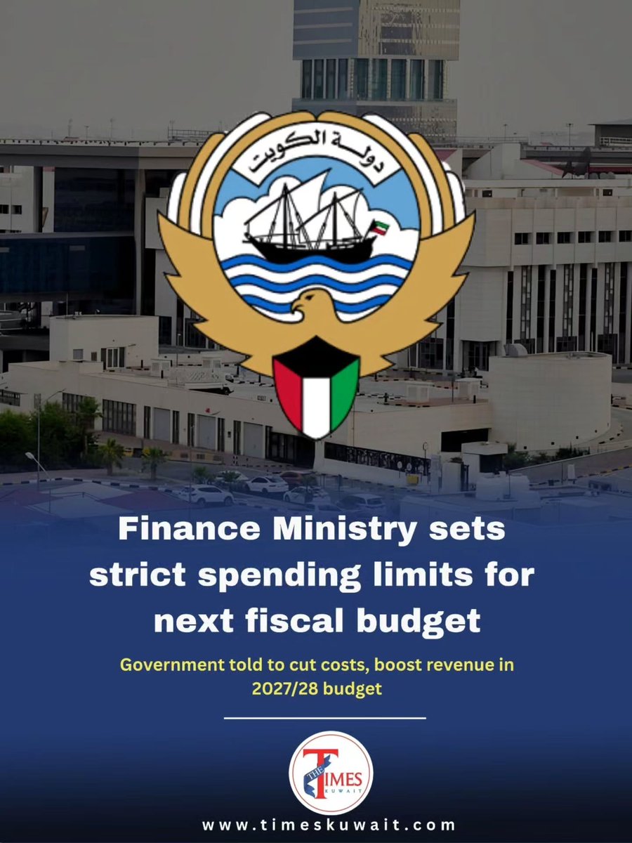
Finance issues 2027/28 budget guidelines, requiring agencies to stay within spending ceilings, curb waste, boost revenue, and prioritize essential services and national projects.
Jahra patrols arrested a man in his 30s in Al-Qasr after he allegedly appeared under the influence of drugs. Officers reportedly found narcotics and drug paraphernalia during a precautionary search.
Some things never go out of style. Elegance, quality, and craftsmanship are always in fashion. A luxurious expression for those who appreciate timeless beauty and sophistication. Ships worldwide for free.
عيد الحب! يمكن لكل من يحب، ومن أخفق، أن يقطف هنا زهرة لحبيبه أو حبيبته. ومن يريد المزيد، يمكنه التسوق بخصم 6% للمناسبات الأخرى. ويمكنكم ترك زهرة لي في التعليقات.
كيف تتخيلون الشخص المهووس بالتقنية؟ مع جيسيكا فريتز، مهندسة علوم الحاسوب والمتخصصة في المعلومات الموثوقة وأدوات التزييف بالذكاء الاصطناعي والأمن السيبراني. محاضرتها 12 مايو 2023، 19:00: «المعلومات الموثوقة مقابل الأخبار المزيفة بالذكاء الاصطناعي».