Day 5 of building in public and we’re working with Touchland.
This company is trying to do the impossible…make hand sanitizer something people actually want to buy.
Because let’s be real, hand sanitizer is a category where most people are perfectly fine grabbing whatever is cheapest or closest to them.
So Touchland has to give people a reason to give a shit.
Being clean is something everyone strives for…or at least I hope that’s the case.
But being clean while also making it feel fun? That’s the needle Touchland is trying to thread, and that’s what I wanted this ad to hit on.
Once again, the creative isn’t winning any design awards. This is also a brand where pretty product shots can only take you so far.
The copy is where I wanted to set it apart.
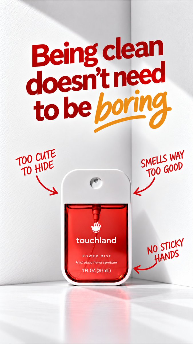
“Being clean doesn’t need to be boring.”
That gets basically the entire idea behind the brand down to one sentence.
Then instead of just saying it and hoping you believe me, the three callouts underneath give you reasons why:
Too cute to hide. Actually smells good. No sticky hands.
Looks better. Smells better. Feels better.
Turns out hand sanitizer doesn’t have to feel like something you stole from the front desk of a doctor’s office.
Five days in and I think I’m slowly learning to stop trying to make ads pretty and start trying to make them make sense.
Progress!
Day 5 in the books. See you tomorrow.
Day 5 of building in public and we’re working with Touchland.
This company is trying to do the impossible…make hand sanitizer something people actually want to buy.
Because let’s be real, hand sanitizer is a category where most people are perfectly fine grabbing whatever is cheapest or closest to them.
So Touchland has to give people a reason to give a shit.
Being clean is something everyone strives for…or at least I hope that’s the case.
But being clean while also making it feel fun? That’s the needle Touchland is trying to thread, and that’s what I wanted this ad to hit on.
Once again, the creative isn’t winning any design awards. This is also a brand where pretty product shots can only take you so far.
The copy is where I wanted to set it apart.
“Being clean doesn’t need to be boring.”
That gets basically the entire idea behind the brand down to one sentence.
Then instead of just saying it and hoping you believe me, the three callouts underneath give you reasons why:
Too cute to hide. Actually smells good. No sticky hands.
Looks better. Smells better. Feels better.
Turns out hand sanitizer doesn’t have to feel like something you stole from the front desk of a doctor’s office.
Five days in and I think I’m slowly learning to stop trying to make ads pretty and start trying to make them make sense.
Progress!
Day 5 in the books. See you tomorrow.
First time dipping my toe into the video lane and am I happy with the results…. Fuck no.
Am I still gonna post it? Of course.
Lesson from this one: the model matters. I’m using the shittiest version available on Higgsfield with the lowest tier plan, and you can definitely tell.
Once I start seeing some improvement, I’ll invest in a better plan where I can actually use the better models and tools. But I’m not there yet.
For now… enjoy.
Or at least try to, because this one is a hard watch.
Day 4 of building in public led me to Oasis. No, not the greatest band of all time (which I won’t debate), but the lighting company.
Oasis sells lights that let you change the feel of a room…warmer, cooler, or somewhere in between…with basically the flip of a switch.
The product is stupidly simple, so I figured the advertising didn’t need to be all that complicated either.
While looking through their Meta Ad Library, I found an image they’re already using that I really liked.
It shows the product in action and gives you a pretty good idea of what it is and what it does within about a second of looking at it.
So instead of reinventing the wheel, I used that as my starting point.
I kept the image, product, and overall layout the same and focused the test on one thing: the messaging.
The first angle, “Lighting That Sets the Mood,” is the broadest of the three. It sells the idea that lighting can completely change the atmosphere of a room. Relaxing, cozy, romantic, whatever you want it to be.
The second, “Fall Starts With the Right Lighting,” leans directly into the season. Days are getting shorter, nights are getting colder, and people are spending more time inside. The idea is pretty simple: if it’s starting to feel like fall outside, make it feel like fall inside too.
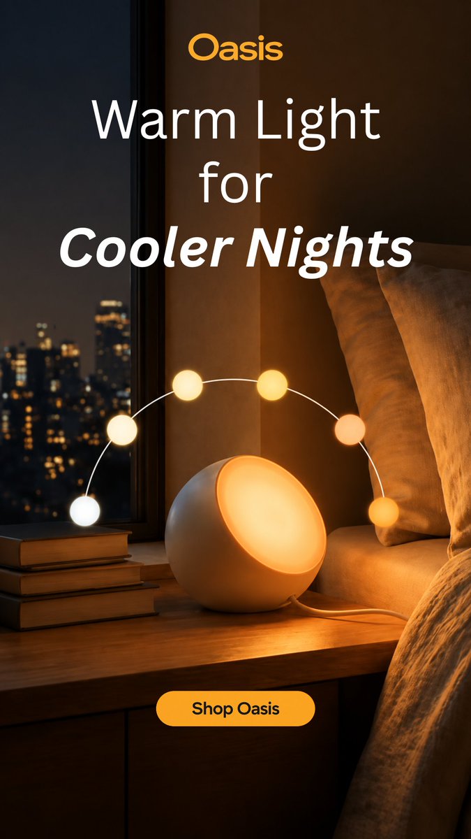
The last, and probably my favorite, was “Warm Light for Cooler Nights.” Instead of just selling the lighting itself, this one is more about comfort. It’s getting colder and darker outside, while your space stays warm and inviting.
So you essentially have three different ways of selling the exact same product: Control the atmosphere. Embrace the season. Create comfort.
Nothing revolutionary here. No crazy redesign or overly complicated concept. Just a good image, a simple product, and three different ways to give someone a reason to care.
Sometimes that’s really all an ad needs to be.
Day 4 in the books.
Sometimes you look at an ad and think to yourself… something looks off.
Well, that just happened to me.
Maybe it was the morning fog, but I looked back at today's ads and immediately thought, that headline should look better.
So here’s doing a quick fix of that with the help of AI.
Small change, but I think the ads look sooo much better now.
Day 4 of building in public led me to Oasis. No, not the greatest band of all time (which I won’t debate), but the lighting company.
Oasis sells lights that let you change the feel of a room…warmer, cooler, or somewhere in between…with basically the flip of a switch.
The product is stupidly simple, so I figured the advertising didn’t need to be all that complicated either.
While looking through their Meta Ad Library, I found an image they’re already using that I really liked.
It shows the product in action and gives you a pretty good idea of what it is and what it does within about a second of looking at it.
So instead of reinventing the wheel, I used that as my starting point.
I kept the image, product, and overall layout the same and focused the test on one thing: the messaging.
The first angle, “Lighting That Sets the Mood,” is the broadest of the three. It sells the idea that lighting can completely change the atmosphere of a room. Relaxing, cozy, romantic, whatever you want it to be.
The second, “Fall Starts With the Right Lighting,” leans directly into the season. Days are getting shorter, nights are getting colder, and people are spending more time inside. The idea is pretty simple: if it’s starting to feel like fall outside, make it feel like fall inside too.
The last, and probably my favorite, was “Warm Light for Cooler Nights.” Instead of just selling the lighting itself, this one is more about comfort. It’s getting colder and darker outside, while your space stays warm and inviting.
So you essentially have three different ways of selling the exact same product: Control the atmosphere. Embrace the season. Create comfort.
Nothing revolutionary here. No crazy redesign or overly complicated concept. Just a good image, a simple product, and three different ways to give someone a reason to care.
Sometimes that’s really all an ad needs to be.
Day 4 in the books.
Day 4 of building in public led me to Oasis. No, not the greatest band of all time (which I won’t debate), but the lighting company.
Oasis sells lights that let you change the feel of a room…warmer, cooler, or somewhere in between…with basically the flip of a switch.
The product is stupidly simple, so I figured the advertising didn’t need to be all that complicated either.
While looking through their Meta Ad Library, I found an image they’re already using that I really liked.
It shows the product in action and gives you a pretty good idea of what it is and what it does within about a second of looking at it.
So instead of reinventing the wheel, I used that as my starting point.
I kept the image, product, and overall layout the same and focused the test on one thing: the messaging.
The first angle, “Lighting That Sets the Mood,” is the broadest of the three. It sells the idea that lighting can completely change the atmosphere of a room. Relaxing, cozy, romantic, whatever you want it to be.
The second, “Fall Starts With the Right Lighting,” leans directly into the season. Days are getting shorter, nights are getting colder, and people are spending more time inside. The idea is pretty simple: if it’s starting to feel like fall outside, make it feel like fall inside too.
The last, and probably my favorite, was “Warm Light for Cooler Nights.” Instead of just selling the lighting itself, this one is more about comfort. It’s getting colder and darker outside, while your space stays warm and inviting.
So you essentially have three different ways of selling the exact same product: Control the atmosphere. Embrace the season. Create comfort.
Nothing revolutionary here. No crazy redesign or overly complicated concept. Just a good image, a simple product, and three different ways to give someone a reason to care.
Sometimes that’s really all an ad needs to be.
Day 4 in the books.
Day 3 of building a creative agency in public.
Today I took on MUD/WTR.
I made 3 static ad concepts testing different ways to sell the same idea, and broke down the thinking behind each one ↓
Today I took on the lovely company MUD/WTR for Day 3 of building in public, and I had a bit of a revelation while making these spec ads:
I’m not trying to win design awards with my ads. I want people to buy the shit the company is selling.
The last two days, I think I was trying to make ads that could be hung up next to the Mona Lisa. And while good design is obviously important, you can’t lose the basics of advertising in hopes that a pretty ad will save you.
An ad still needs to give someone a reason to stop, care, and eventually buy.
With that in mind, I took on MUD/WTR. They’re actually a pretty sick company. They make coffee and supplements positioned as healthier alternatives to the stuff a lot of us already consume, with products built around things like energy, focus, recovery, and overall wellness.
This isn’t an investment page, though, so that’s about as deep as I’ll go into the company.
While scrolling through their website, I noticed something they came back to over and over again: their coffee is positioned around avoiding a lot of the bullshit that comes with regular coffee.
The jitters. The energy crash. Feeling like you need another cup a few hours later. All that fun stuff.
And that gave me the pain point I wanted to build the ads around.
Instead of trying to make something beautiful first, I started with the problem.
Say goodbye to…
That became the anchor for the entire concept.
There are a bunch of different ways MUD/WTR can attack the same basic problem, so rather than picking one and calling it a day, I wanted to turn it into a test.
Same design. Same product. Same supporting copy. Different hook.
I landed on three:
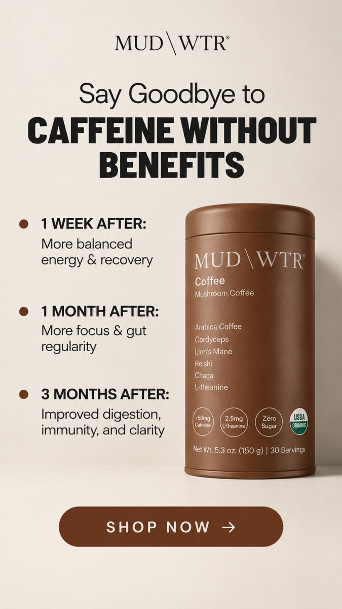
Say Goodbye to Caffeine Without Benefits
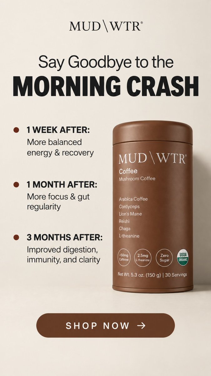
Say Goodbye to the Morning Crash
Say Goodbye to Coffee as Usual
Each one comes at the product from a slightly different angle.
One questions what you’re actually getting from your caffeine.
One attacks a specific pain point.
And one challenges regular coffee altogether.
Once the headline gets your attention, the rest of the ad has one job: back it up.
The timeline shows what MUD/WTR says customers can expect after one week, one month, and three months of drinking it. Instead of throwing a bunch of random benefits onto the ad, those benefits become the proof behind the headline.
And now you have an actual test: which reason to switch gets someone to care?
The bottom of the ad keeps things simple with a Shop Now CTA. In an ideal world, once we found which headline was actually getting people to click, we could run another test on the CTA itself.
Shop Now. Try MUD/WTR. Make the Switch. See What’s Different.
Small change, but that’s the point. If we change everything at once, we learn nothing.
And I think that was my biggest takeaway from Day 3.
The goal isn’t to make the coolest ad. It’s to make an ad that gives us something to learn from and ultimately, something that sells.
Today I took on the lovely company MUD/WTR for Day 3 of building in public, and I had a bit of a revelation while making these spec ads:
I’m not trying to win design awards with my ads. I want people to buy the shit the company is selling.
The last two days, I think I was trying to make ads that could be hung up next to the Mona Lisa. And while good design is obviously important, you can’t lose the basics of advertising in hopes that a pretty ad will save you.
An ad still needs to give someone a reason to stop, care, and eventually buy.
With that in mind, I took on MUD/WTR. They’re actually a pretty sick company. They make coffee and supplements positioned as healthier alternatives to the stuff a lot of us already consume, with products built around things like energy, focus, recovery, and overall wellness.
This isn’t an investment page, though, so that’s about as deep as I’ll go into the company.
While scrolling through their website, I noticed something they came back to over and over again: their coffee is positioned around avoiding a lot of the bullshit that comes with regular coffee.
The jitters. The energy crash. Feeling like you need another cup a few hours later. All that fun stuff.
And that gave me the pain point I wanted to build the ads around.
Instead of trying to make something beautiful first, I started with the problem.
Say goodbye to…
That became the anchor for the entire concept.
There are a bunch of different ways MUD/WTR can attack the same basic problem, so rather than picking one and calling it a day, I wanted to turn it into a test.
Same design. Same product. Same supporting copy. Different hook.
I landed on three:
Say Goodbye to Caffeine Without Benefits
Say Goodbye to the Morning Crash
Say Goodbye to Coffee as Usual
Each one comes at the product from a slightly different angle.
One questions what you’re actually getting from your caffeine.
One attacks a specific pain point.
And one challenges regular coffee altogether.
Once the headline gets your attention, the rest of the ad has one job: back it up.
The timeline shows what MUD/WTR says customers can expect after one week, one month, and three months of drinking it. Instead of throwing a bunch of random benefits onto the ad, those benefits become the proof behind the headline.
And now you have an actual test: which reason to switch gets someone to care?
The bottom of the ad keeps things simple with a Shop Now CTA. In an ideal world, once we found which headline was actually getting people to click, we could run another test on the CTA itself.
Shop Now. Try MUD/WTR. Make the Switch. See What’s Different.
Small change, but that’s the point. If we change everything at once, we learn nothing.
And I think that was my biggest takeaway from Day 3.
The goal isn’t to make the coolest ad. It’s to make an ad that gives us something to learn from and ultimately, something that sells.
Day 2 of building a creative agency in public.
Today I took on Boy Smells.
I made 2 retargeting ad concepts and broke down the thinking behind each one ↓
While looking for brands to use for Day 2 of building in public, I came across Boy Smells.
What pulled me in was the name. “Boy Smells” can mean a lot of things. Personally, I think of a gym locker room. But this fragrance company flips that idea on its head, selling high-end candles and fragrances.
So I did some digging.
I started with a quick analysis of who the company targets.
There are a few different audience segments, but I think the core audience can be boiled down pretty simply: Gen Z and millennials who are fashion and culture-driven, care about the products they surround themselves with, and are willing to spend $40+ on a candle.
With the audience established, I took a look at their current Meta Ad Library.
They’re running a lot of what you’d expect from a healthy account: UGC, product shots, lifestyle creative, creator content, and plenty of variations across products.
For this project, though, I wanted to approach the ads a little differently.
I designed these with retargeting in mind.
Assuming Boy Smells has a pixel set up on its site, we could build an audience of people who have already visited, browsed a product, or otherwise shown interest in the brand.
That changes the job of the creative.
We don’t necessarily need to hammer home what Boy Smells is or explain the product from scratch. These people have already been introduced to the brand.
Now we need to give them another reason to want it.
I went back to what pulled me into the brand in the first place: the name. I wanted the ads to lean into the genius of “Boy Smells” while giving it a seasonal angle.
With fall approaching, that became the basis of the campaign:
“Fall smells like boy.”
There’s some intentional ambiguity there. “Fall smells like boy” can mean different things to different people.
Maybe it brings you back to being a kid and the smells you associate with fall. Maybe it’s leaves changing, cold air, wood, smoke, or whatever else comes to mind when you think about the season.
The exact association isn't really the point. The goal is to connect those feelings and memories with Boy Smells.
From there, the rest of the ad stays simple.
The subheadline gives a quick description of the scent, helping someone understand what they can expect without overexplaining it.
The creative itself puts the Boy Smells candle front and center, surrounded by ingredients and objects associated with the scent.
The idea is show, don’t tell.
You can't actually smell a candle through an ad, but you can give someone enough visual cues to start imagining what it might smell like.
And if we can get them to do that, we've already done a lot of the work.
I also wanted the concept to be repeatable.
“Fall smells like boy” acts as the constant across the campaign, while the product, subheadline, and objects surrounding it change depending on the scent.
That gives us room to test multiple products without making every ad feel like a completely different campaign. We keep the same recognizable idea while giving people different versions of what “fall” could smell like.
It also gives us something more interesting to learn from. Does one scent get significantly more clicks? Do certain visual ingredients get more attention? Does a darker, woodier version of fall outperform something sweeter?
Instead of testing random creative against random creative, we're changing specific pieces within the same system.
I wouldn't want someone to click one of these ads and immediately lose the idea that got them there.
Instead of sending everyone to a generic candle collection page, I'd build a simple “Fall smells like boy” landing experience around the same concept.
The scent someone clicked would be featured first, with the same imagery and language from the ad carried onto the page. From there, they could explore the other scents in the campaign and find the version of fall that fits them.
That creates a much cleaner path:
See the scent → imagine the scent → click → experience the same world → buy the scent.
Because these are retargeting ads, I'm less interested in whether they generate cheap attention and more interested in whether they bring people who already know Boy Smells closer to buying.
I'd test these against a more traditional product-focused retargeting ad and look at CTR, add-to-cart rate, conversion rate, CPA, and ROAS.
The real question isn't whether “Fall smells like boy” looks better.
It's whether giving the product a seasonal feeling and identity gives someone a stronger reason to finally buy it.
While looking for brands to use for Day 2 of building in public, I came across Boy Smells.
What pulled me in was the name. “Boy Smells” can mean a lot of things. Personally, I think of a gym locker room. But this fragrance company flips that idea on its head, selling high-end candles and fragrances.
So I did some digging.
I started with a quick analysis of who the company targets.
There are a few different audience segments, but I think the core audience can be boiled down pretty simply: Gen Z and millennials who are fashion and culture-driven, care about the products they surround themselves with, and are willing to spend $40+ on a candle.
With the audience established, I took a look at their current Meta Ad Library.
They’re running a lot of what you’d expect from a healthy account: UGC, product shots, lifestyle creative, creator content, and plenty of variations across products.
For this project, though, I wanted to approach the ads a little differently.
I designed these with retargeting in mind.
Assuming Boy Smells has a pixel set up on its site, we could build an audience of people who have already visited, browsed a product, or otherwise shown interest in the brand.
That changes the job of the creative.
We don’t necessarily need to hammer home what Boy Smells is or explain the product from scratch. These people have already been introduced to the brand.
Now we need to give them another reason to want it.
I went back to what pulled me into the brand in the first place: the name. I wanted the ads to lean into the genius of “Boy Smells” while giving it a seasonal angle.
With fall approaching, that became the basis of the campaign:
“Fall smells like boy.”
There’s some intentional ambiguity there. “Fall smells like boy” can mean different things to different people.
Maybe it brings you back to being a kid and the smells you associate with fall. Maybe it’s leaves changing, cold air, wood, smoke, or whatever else comes to mind when you think about the season.
The exact association isn't really the point. The goal is to connect those feelings and memories with Boy Smells.
From there, the rest of the ad stays simple.
The subheadline gives a quick description of the scent, helping someone understand what they can expect without overexplaining it.
The creative itself puts the Boy Smells candle front and center, surrounded by ingredients and objects associated with the scent.
The idea is show, don’t tell.
You can't actually smell a candle through an ad, but you can give someone enough visual cues to start imagining what it might smell like.
And if we can get them to do that, we've already done a lot of the work.
I also wanted the concept to be repeatable.
“Fall smells like boy” acts as the constant across the campaign, while the product, subheadline, and objects surrounding it change depending on the scent.
That gives us room to test multiple products without making every ad feel like a completely different campaign. We keep the same recognizable idea while giving people different versions of what “fall” could smell like.
It also gives us something more interesting to learn from. Does one scent get significantly more clicks? Do certain visual ingredients get more attention? Does a darker, woodier version of fall outperform something sweeter?
Instead of testing random creative against random creative, we're changing specific pieces within the same system.
I wouldn't want someone to click one of these ads and immediately lose the idea that got them there.
Instead of sending everyone to a generic candle collection page, I'd build a simple “Fall smells like boy” landing experience around the same concept.
The scent someone clicked would be featured first, with the same imagery and language from the ad carried onto the page. From there, they could explore the other scents in the campaign and find the version of fall that fits them.
That creates a much cleaner path:
See the scent → imagine the scent → click → experience the same world → buy the scent.
Because these are retargeting ads, I'm less interested in whether they generate cheap attention and more interested in whether they bring people who already know Boy Smells closer to buying.
I'd test these against a more traditional product-focused retargeting ad and look at CTR, add-to-cart rate, conversion rate, CPA, and ROAS.
The real question isn't whether “Fall smells like boy” looks better.
It's whether giving the product a seasonal feeling and identity gives someone a stronger reason to finally buy it.