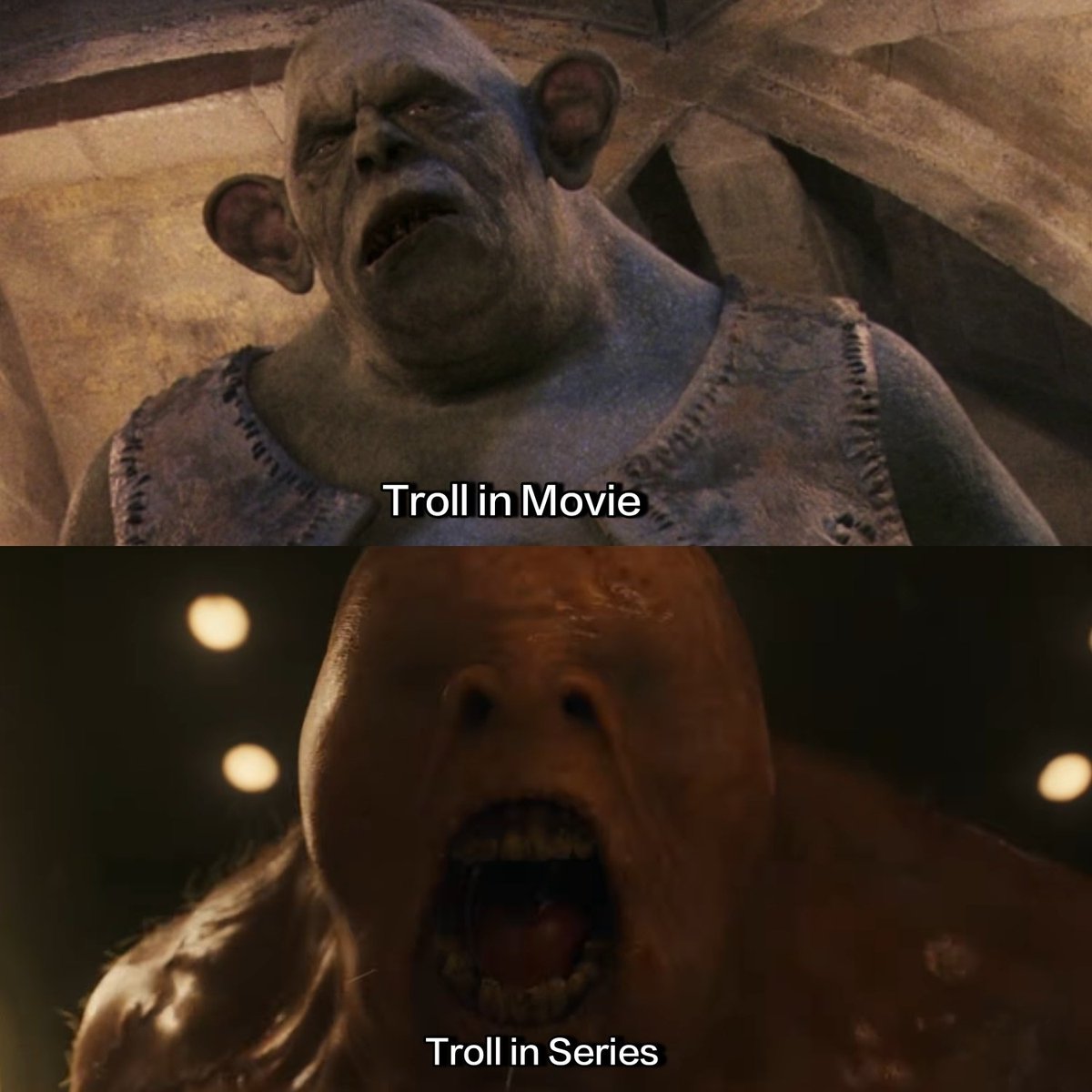
- too blue
- too much backlight washes out important details
- centered instead of using thirds
- no contrast between subject's outfit and the background to emphasize the entire point of the effect
the first two movies had vibrant color grading to capture the magic of hogwarts. as the kids started dealing with serious threats like voldemort, the color grading progressively desaturated. the show is only on the first book and it already looks depressing.
Me hace gracia que comparen escenas pero nadie se fije en la tristeza cromática de absolutamente toda la adaptación en serie.
Los colores eran parte de la magia ahora es todo otra vez oscuro y triste, como a partir del Cáliz de Fuego.
Ludzie nie mają uszu że im się to podoba? xd jakieś randomowe dziecko ma lepszy od od hermiony snape musi uratować night city a mcgonagall ma głos jakiś taki za młody… albo źle zagrany https://t.co/8gqQp3p2Ie