@zazzygfx No. Why would it be?
I know people that can’t read the coca-cola logo but know what the logo represents and I know people that don’t know what the starbucks logo is other than a feminine face.
What people want is recognizability, and readability can help, but it’s not mandatory
Explore the great design work Peter Megert (1937-2022) at a dedicated exhibition, currently on display at the Hopkins Hall Gallery, The Ohio State University, through November 8, 2024. For more information, visit: https://t.co/YWtUdYfh9a
'The exhibition is co-curated by Oscar Fernández, Paul Nini, Mary Ann Beecher, and seven Visual Communication Design alumni for the Department of Design. It will present design artifacts representing the life and career of Peter Megert—including his early international award-winning professional work as Studio M in Berne, Switzerland. It will also feature his corporate design work alongside legendary American designer Paul Rand for the Westinghouse Corporate Design Center, and the graphic and wayfinding systems Megert developed as principal of Visual Syntax Design in Columbus, Ohio. Unique artifacts illustrating his groundbreaking design pedagogy that inspired two decades of Visual Communication Design students, and select ceramic designs by Ursula Megert, Peter’s constant companion and supportive partner, will also be included.
The exhibition’s design reflects how Megert’s Modernist Swiss education, early practice and design philosophies grounded his future activities as a professor and designer. The design of its panels and overall layout by former students and peers invokes the International and Swiss design principles that guided Megert’s graphics and spatial designs and familiarizes visitors with modern exhibition and graphic design principles. Personal artifacts and student and peer reminiscences highlight how the Megerts’ lives were infused with wit-filled wisdom and joy, and the impact they both had on the students and colleagues with whom they formed lasting relationships.'
@zazzygfx I would argue color is more important. This color has a lot of character and personality, and a lot of that is thanks to the colors. If you take away its cool colors, it's not as interesting. Also consider Apple, would the logo be as iconic if we had never seen the rainbow first?
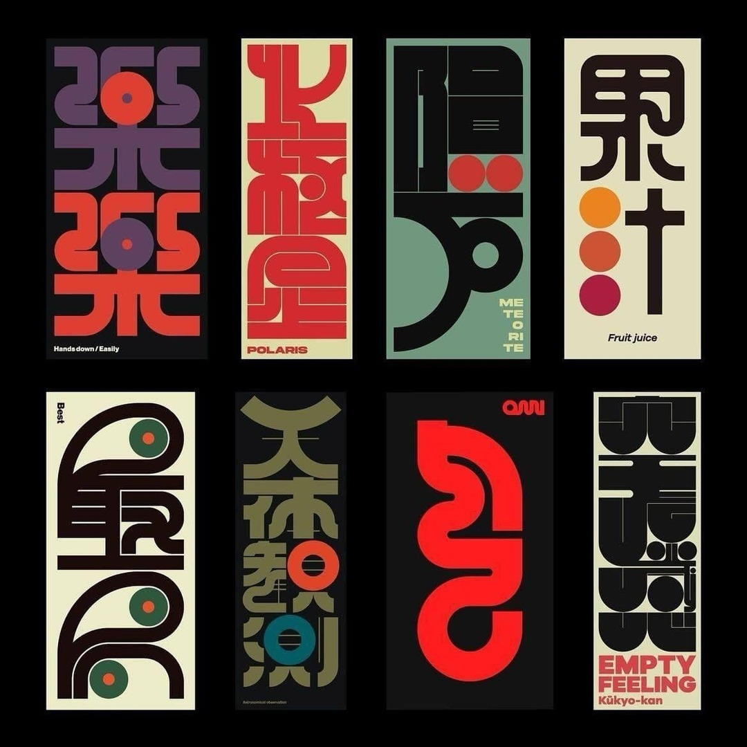
Daily Poster #8
Just wanted to completely destroy some Futura type. Inspired by low hearing ability and high visual interest
#posterdesign#poster#futura#graphicdesign
Daily Poster #7
Consumerism has a hold on us. And sometimes we may want things we don't need. That's totally okay, But having 30 different tote bags isn't. That's too many. (I personally have 34)
#graphicdesign#posterdesign#dailyposter
My old priorities as a designer were to learn cool Photoshop effects, how to use Adobe illustrator, and how to create graphics.
My new priorities are to learn how to communicate, how to create trust, how to present myself and my work, and how to show the power of transformation.
Daily Poster #6
Was interested in doing a more graphic poster today. I love working with type, but sometimes it's fun to just create visuals.
#graphicdesign#dailyposter#stars
Daily poster #5
I'm a bit of a night owl, and I've been thinking a lot about coffee, texture, and transformations. I combined these ideas into today's post (that feeling of having your morning coffee)!
Thank you to @pietrobaudin for the type pairing!
#GraphicDesign#posterdesign