LO:TECH has raised $12m in a Series A led by @MMC_Ventures, with @FactionVC, @13bookscapital and @atkaincubator
This funds our expansion into the US and Asia-Pacific, starting with New York and Singapore, and our execution services, which launch today.
https://t.co/LR2qxkzShV
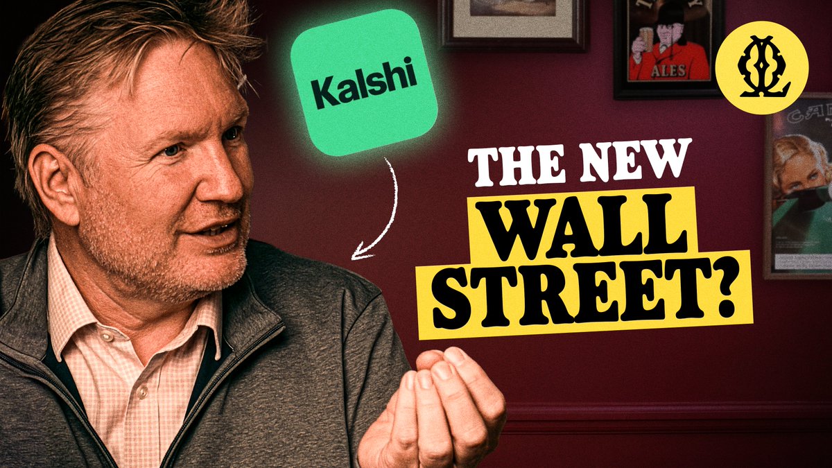
The most requested market on @Kalshi isn't about sport, politics or crypto.
Andy Ross, Head of institutional at @Kalshi sat down with @TimMeggs in The Local and told us what it is.
As always, links below ↓
Designing a new trading dashboard for @lo_tech is testing all my natural creative instincts. the UX discovery sessions have show traders want maximum info available "at all times"
It reminds me of the information-dense design of sites and newspapers in Japan.
Western design principles often revolve around reducing friction, creating hierarchy, using lots of white-space.
Earning trust by lowering mental effort (i.e. progressive disclosure)
In Japan it's the opposite. Trust is earned through completeness, which leads to crazy high density in layouts. All specifics are revealed up-front, and the presence of lots of detail functions as proof that nothing is being hidden.
To the untrained eye it can feel noisy and hard to navigate (I found it mega jarring and chaotic when i was in Tokyo.) Yet in Japan, mainstream print has long trained people to scan packed layouts quickly and treat density as normal.
Most Western product UX is optimised to reduce decision making and cognitive load, apart from situations like dashboard design where you're actually trying to increase cognitive grip.
Consumer UX often comforts by removing (guided simplicity)
Trading UX often comforts by exposing (total situational awareness)
It's been a good exercise in balancing my inherent pre-dispositions and listening to what end-users actually want, even if it goes against my better-judgement.
There's also a good video on japanese web design I'll link to in a follow up here, deffo worth a watch.
Arigato.