@mds yeh - also picked out some things you won't see like -Search focus: hid popular locations while searching, restoring them when the search is cleared.
Search recovery: added a clear button and guidance for short queries, no results and errors.
@aaron_epstein@MSchwaibold I built a carousel after being inspired by your convo - https://t.co/d0OF8LftjM would be great if you could take a look and let me know your thoughts, it was trying to solve an issue that came up on one of your site reviews...
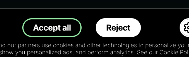
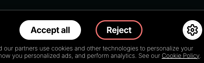
@disco_lu what I found interesting about this having looked at it when researching cookie banners, is the very subtle use of coloured strokes on hover on what is otherwise 2 equally balanced cta's to perhaps slyly encourage accepts and discourage rejects... ?!
✨ Designers → I built a feature into UI Goodies that I think you’re going to love. A daily feed of inspirational designs, tools, websites, and side projects, curated from across the internet. Link 👇🏼
Design is full of codewords. Knowing them changes what you can ask for, and what you can get back, whether you're working with devs, or an AI.
“tint this neutral color”, “fix this widow”, “nudge it to the optical center”
I wrote them down: https://t.co/aFyd5avj9o
inspired by some of the conversations I've heard @ridd_design have on portfolios and adding little interactive touches, working on a portfolio bio that adapts its tone using a slider (casual → formal). prototyped in @figma make.
Melvin, a long-standing visually impaired Bees fan, shares how our audio commentary helps him experience matches at the Gtech 🎧🐝
Unite For Access is @lpftweets annual campaign promoting accessibility and ensuring disabled fans enjoy matchdays the same way as everyone else ❤️⚽