@RobertAllison__ The trick to cracking visual recipes is going to be finding a way to relate visual representations of ingredients that can be portrayed by a 2D figure (small amounts of powder, like Bo's pumpkin spice!) to those that require 3D measures (liquids, large volumes of powder).
Loving the visualization of ingredients! Could pie charts and bar graphs be the new "cups and spoons"? Makes me want to create a whole series of visual recipes . . .
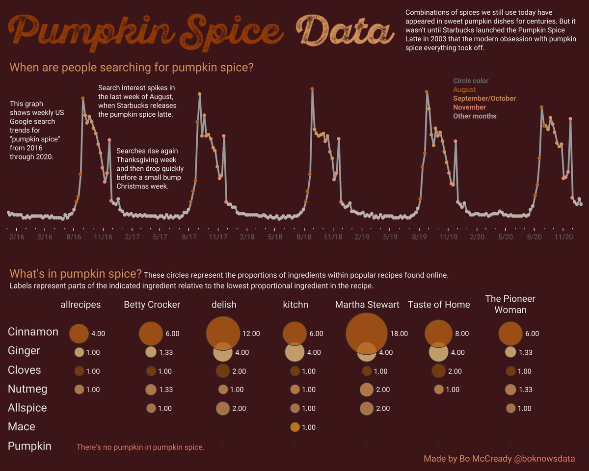
We're in the heart of pumpkin spice season, so to get in the spirit, here's some pumpkin spice data.
See America's seasonal obsession with the #pumpkinspicelatte and everything else #pumpkinspice in this mini @tableaupublic#dataviz:
https://t.co/8zNLCx7P7C
@RobertAllison__ I was envisioning a ratio system: shake out a circle of cinnamon of this size relative to a circle of salt that size. It works as long as the ingredients are proportional to each other. I'm stuck on liquids. Much tougher to pour out a circle of melted butter onto a cutting board!
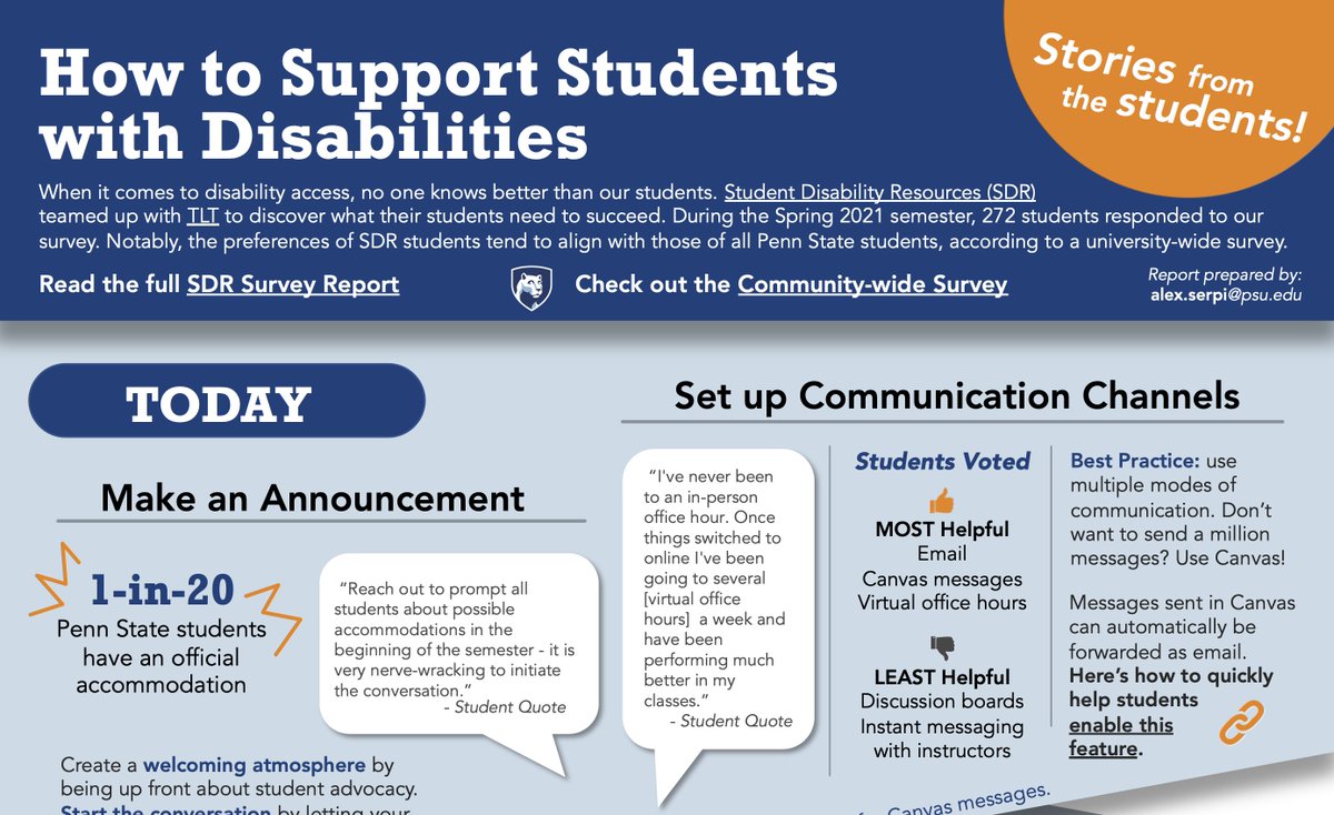
Hot off the presses! Here's the infographic we created in partnership with Penn State Student Disability Resources. We asked students what they needed and compiled this top list of ways instructors can help! Full version: https://t.co/FkV0TWA7Xt
Survey data collected by our team always shows that ALL students (not just students who need accommodations!) crave the "consistent organization of files" as mention by Dr. Robinson. Lots of other good ideas in this thread!
@ashleya_f Actually, it's something I'm just diving into! I can do the data viz directly or I can teach others how to do it for themselves. https://t.co/mjwRlLbuBT
Mark your calendars @penn_state! The 2022 TLT Symposium is set for Saturday, March 19, 2022. Bookmark the Symposium website to keep up with the most current information. https://t.co/6tIJce1nTn
Makeover Monday: Here's some a little different! This week I'm "making over" a traditional report into an infographic with highlights from the data. Stay turned to see the final result!
Getting back to basics is refreshing. Just had a great chat on the basics of data storytelling and graphing essentials. Who knew baby squirrels liked eating food more than finding food?
@ScottSidler Great summary of all the stripping methods. And now I don't feel so guilty for not wanting to strip the miles and miles of intricate moldings in my house!
Pandemic silver linings: Remote learning exposed more people to digital tools that support diverse student needs. Read about our students' experiences here! https://t.co/mSIdyfg8gH
Monday Makeover: The original combined values for a man, woman, 8 year old, and 6 year old ($193/week). Not useful for most families! This is also a good example of donuts warping data. The men's values LOOK smaller, but are actually bigger! Data: https://t.co/tMyQs5sKAw