Some good news to share....
I've won the Charles H. Dow Award. I'm extremely honored to have received this award from the @CMTAssociation for the second time.
https://t.co/DVyCMR65sc
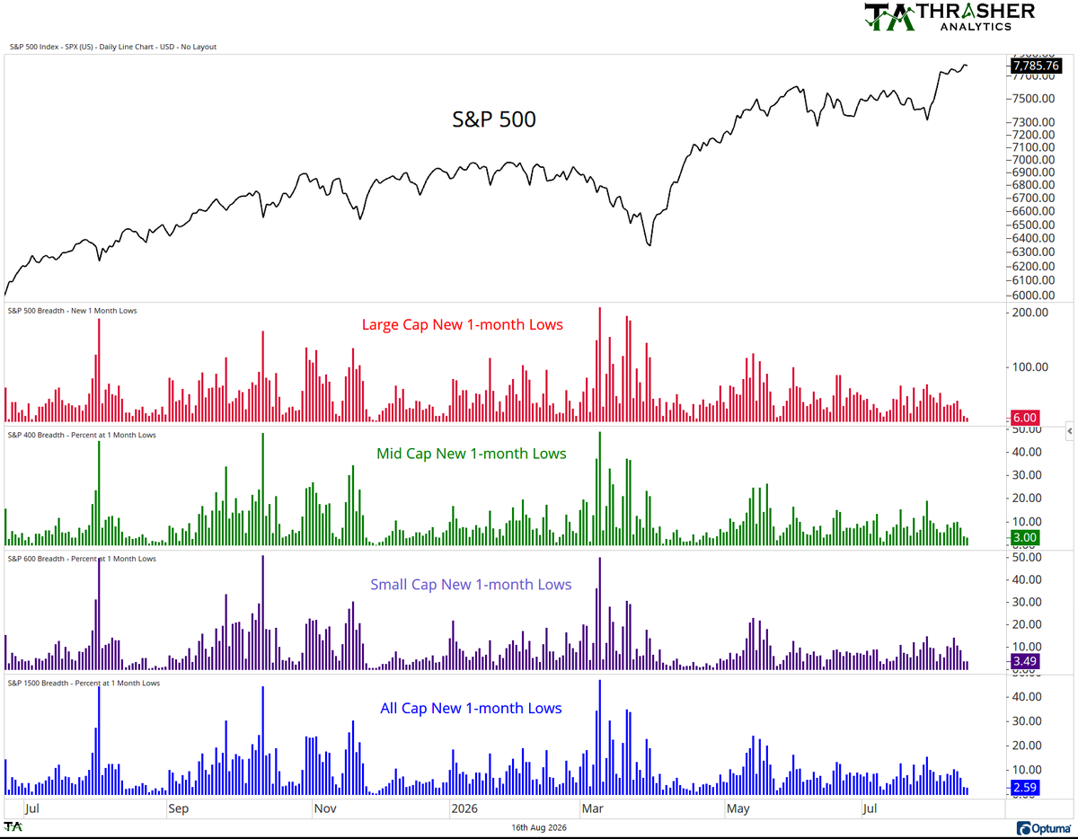
"The general theme persists regardless of index - hardly any stocks are moving materially lower. In fact, for the S&P 500, 400, 600, and 1500, the number of stocks at a 1-month low has been steadily declining as the market moves higher."
@AndrewThrasher
BofA Bull/Bear hitting some pretty high levels. Report also shows fund cash at 3.5%, the 6th lowest since 1998. Survey showed 55% of funds are overweight equities, the highest since 2021.
FLASH FLOODING: This is River Road near the Fashion Mall on the north side of #Indianapolis. Flash Flooding ongoing. Dangerous stuff here. Credit: Tommy VerBrugge #INwx@FOX59@NWSIndianapolis
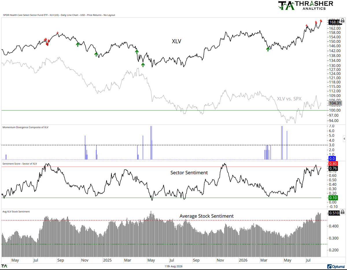
Chart of The Day: Healthcare Sector Sentiment Gets Frothy @AndrewThrasher
“Healthcare sector sentiment getting quite high. Sector has the highest sentiment score of the S&P sectors, and its individual stocks have a very high reading as well. Last time both stocks and sector were this high was in Aug. ‘24.
Run in $XLV over the last several months comes after 7 bullish momentum divergences hit the chart back in April and sentiment washed out in the low teens.”
Still very early in the month but upside vs downside realized vol is off the charts for August, McElligott of Nomura charts below. He notes that there's been an "under positioned buy-side" chase.
Healthcare sector sentiment getting quite high. Sector has the highest sentiment score of the S&P sectors, and its individual stocks have a very high reading as well. Last time both stocks and sector were this high was in Aug. '24.
Run in $XLV over the last several months comes after 7 bullish momentum divergences hit the chart back in April and sentiment washed out in the low teens.
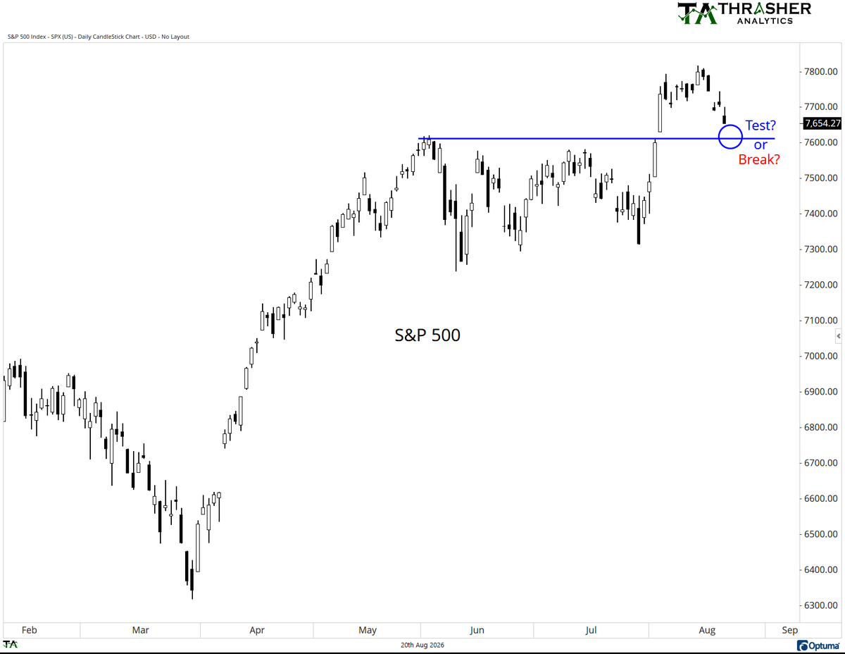
65% of large caps declining today with 6 of the 11 sectors in the red. Strong tech day with $MSFT and $MU alone contributing over half (53%) of the S&P 500 gain so far today.
$SPX
@BergMilton@GroupFinom@TexasOncologist@BruniCharting@CMTAssociation correct. it will not decline. I hear your comments. As I said earlier, it's not a critical chart for me. it's simply one piece of data among a massive amount that I review each day/week. By no means is it one of the top charts I look to for breadth or market health.
@justheartoread2@BergMilton@BruniCharting@CMTAssociation Yes. It’s simply counting how many stocks have made a new high at different points in time. It’s just one chart. One piece of data. By no means the only thing as a technician I look at. Wouldn’t even be in my top 20 charts of importance.
@justheartoread2@BergMilton@BruniCharting@CMTAssociation Yes. It’s simply counting how many stocks have made a new high at different points in time. It’s just one chart. One piece of data. By no means the only thing as a technician I look at. Wouldn’t even be in my top 20 charts of importance.
Thank you Seth, that's very kind of you. Really appreciate that.
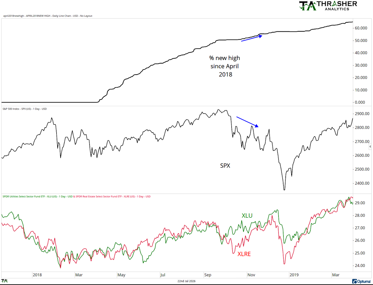
Milton, here's how this kind of data can be used.... I'll use 2018 as an example. this cumulative list went flat for a period in Sept. and then began rising again in late Oct/early Nov. why? because we saw rotation. Look how XLU and XLRE performed during that time. Both hit new highs in early Dec.
When the market is moving lower and this list is expanding, it can be a result of rotation, like we've seen in the market currently with strength is non-tech sectors.
It can also be useful when this figure is very low despite the market hitting new highs. If we see just one-third of stocks having hit a new high for instance and the SPX is continuedly hitting new highs, it shows a narrow leadership.
Milton, instead of just classifying a chart as misleading, just ask. Like you, I'm here to learn but that's hard when stones are thrown before questions asked.
Thank you Seth, that's very kind of you. Really appreciate that.
Milton, here's how this kind of data can be used.... I'll use 2018 as an example. this cumulative list went flat for a period in Sept. and then began rising again in late Oct/early Nov. why? because we saw rotation. Look how XLU and XLRE performed during that time. Both hit new highs in early Dec.
When the market is moving lower and this list is expanding, it can be a result of rotation, like we've seen in the market currently with strength is non-tech sectors.
It can also be useful when this figure is very low despite the market hitting new highs. If we see just one-third of stocks having hit a new high for instance and the SPX is continuedly hitting new highs, it shows a narrow leadership.
Milton, instead of just classifying a chart as misleading, just ask. Like you, I'm here to learn but that's hard when stones are thrown before questions asked.
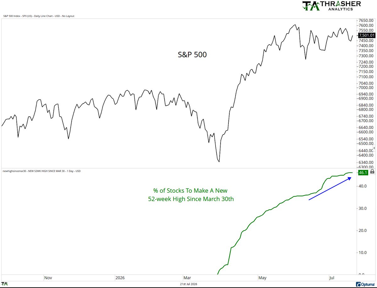
@BergMilton@BruniCharting@CMTAssociation It’s cumulative since March 30th. You don’t see significance because you clearly dont understand the data but thats fine, youre free to ignore it.
While the S&P 500 has consolidated, the percentage of stocks to make a new 52-week high since March has continued to expand, rising from 35% at SPX last high to 46%.
$SPX $SPY
@JC_ParetsX@carlquintanilla Haha. True and it’s been badly overused for sure. But if looking at margin debt, comparing one amount of money to the pool of all money isn’t the worst lens to use.
@JC_ParetsX@carlquintanilla There’s a version of this chart that’s margin debt to money supply which is a little better a comparison and way to normalize the data. It shows a stretched condition as well but yeah, GDP is a poor denominator.