⚠️ $SPY gapped up 2.5% this morning but finished the day up just 1.6% as momentum faded.
What does today’s gap-and-fade mean for stocks?
📊 Sector movers: $TSLA $NVDA $AMZN
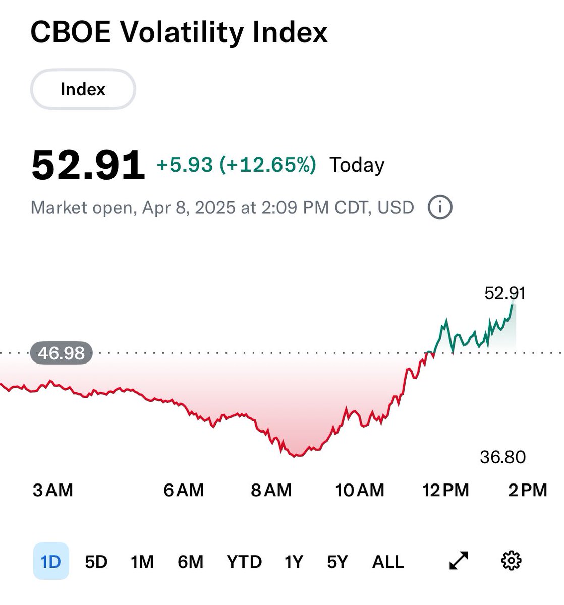
📉 VIX drops, but is risk really off the table?
🎥 Full breakdown + trade review:
🔗 https://t.co/QG3dUNefnc
#MarketOutlook #SPY #Stocks #TechnicalAnalysis #MarketScholars
Unreal. Sentiment is god-awful. Often, this can be a short-term contrarian indicator as stocks get “flushed” and sold indiscriminately. Will be interesting to see how it plays out this time around, given the severity of our current news flow.
My older brother is a huge fan of history, he's read so many books on modern and ancient civilizations.
I talked to him yesterday, and he mentioned that a very common thread is the countries that trade the most are the wealthiest. The countries that hermit in, or view trade as unfair to one party, have wealth decline.
You can verify this for yourself, Just punch it into any LLM. Google it. Do 10 minutes of research. History is incredibly consistent on this.
I mentioned to my class on Monday how difficult it was to find stocks trading above their 30 day moving averages… let alone their 200 day moving averages.
In early November, nearly 4 of 5 stocks were above their 200 DMAs.
In early April, less than 1 of 5 can make that claim.
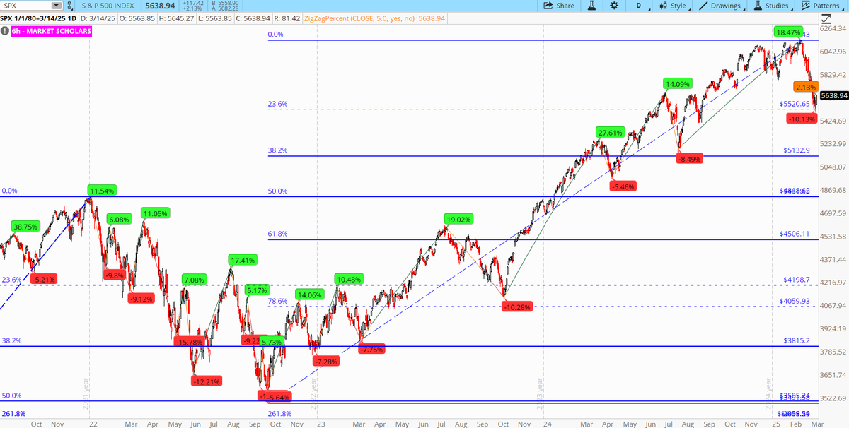
There have been 34 red tags, including the current one, since the last bear market low in March 2009 that could have started another bear market process.
9 stages of a bear market: https://t.co/iJ3pExP3Iu
That means 34 times, $SPX has dropped 5% or more on a closing basis. Only 6 of them failed in their pullback bounce, dropped back below the 200-DAY SMA to new lows and moved into "correction territory".
None of those 6 got past stage 4 and ALL the correction bounces off the 200-WEEK SMA got back ABOVE 30-week/50-week SMAs.
The average decline in the 6 initial Stage 1 red tags that eventually turned into corrections was: 11.8%
The average decline for the 27 Stage 1 red tags that immediately bounced up to new highs was: 7.34%
Day One for Stage 2 (Pullback bounce) started today. Strong runaway opening gap. 2% closing gain. Strong short-term pattern on Market Forecast.
Between the 2001-02 bear market and 2008 bear market, there were only 9 Stage 1 red tags and none of them formed a correction until the 10th one that ultimately led to the first post tech-bubble correction and, subsequently, the 2008 bear market.
So, that means in over 20 years, there have been 43 times that we got a Stage 1 pullback of 5% or more. 7 of them failed to bounce to new highs and formed corrections. 1 of those 7 failed to bounce to new highs and turned into a full-fledged bear market.
So, the odds in the past 20+ years of a pullback going NUTS was 1 in 43, or 2.3%. The odds of one of those pullbacks turning into a correction was 7 in 43, or 16.3%. The odds of one of these corrections turning into a bear market is 1 in 7, or 14.3%.
Interested in online investor education? Check out our Trading Rooms schedule. These classes can sharpen your skills by teaching you how to apply trading knowledge alongside a like-minded community of self-directed investors. Become a Market Scholar today!
https://t.co/xET5YIk5Hh
This is why Friday was so important. Barring an unlikely significant reversal today, that extremely bullish momentum line led to a strong finish (so far) for the near-term line today. This is a STRONG short-term pattern. This DOES NOT guarantee this Stage 2 bounce will not fail. But, it does help with what I was saying all last week: we will get a 5% green tag on $SPX BEFORE March opex.
9 stages of a bear market: https://t.co/iJ3pExP3Iu
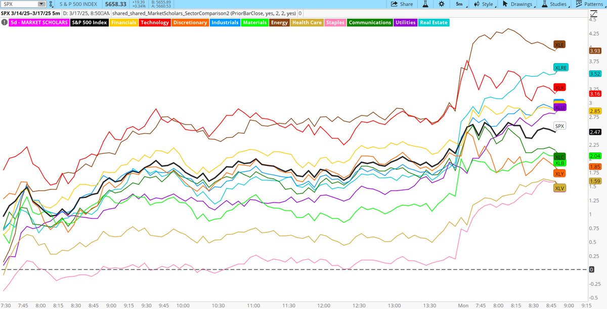
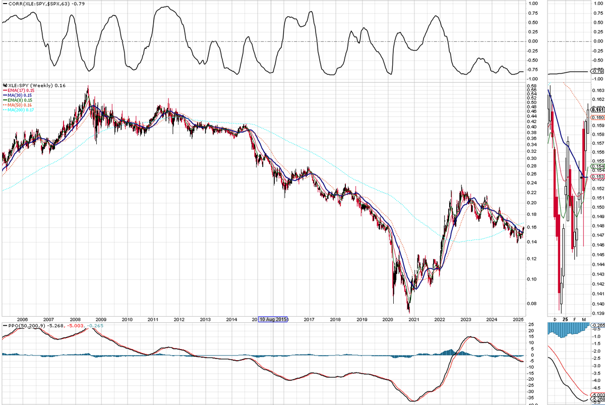
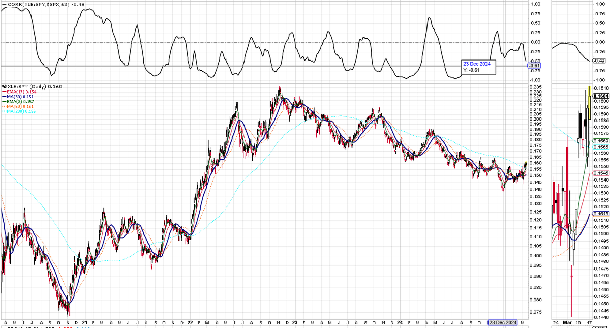
This is NOT the bounce that we want to see in $SPX. We do NOT want $XLE to outperform on the way up and $XLY and $XLC to underperform. As you can see in the 2nd chart, the ratio chart of $XLE to $SPY is inversely correlated with $SPX. The ratio is breaking above the 200-day SMA for the 3rd time since the post-2022 correction low (2023 pullback and 2024 pullback). Would love to see it break back down below that level as $SPX makes its way to a green tag and the 30-day/50-day SMAs
Since March 2003, there have been 7 "corrections" in 22 years (a sustained move below the 200-day SMA) or just under 1 every 3 years. We DO NOT get 1-2 every year as was just said by @michaelsantoli on @CNBC. The rally from each correction low to the next pre-correction peak on $SPX was:
Mar 2008 to May 2008: +12.04% (the only correction bounce that failed and turned into bear market)
July 2010 to July 2011: +33.35%
Oct 2011 to May 2015: +93.85%
Feb 2016 to Sept 2018: +60.23%
Dec 2018 to Feb 2020: +44.02%
Mar 2020 to Jan 2022: +114.38%
Oct 2022 to Feb 2025: +71.77%
The average move on the 6 non-failed bounces was 25.7 months long for a return of 69.6%.
We are NOT going to get a multi-year return of 70% off this low before the next break of the 200-day SMA
After a 2-year decline back below the 200-week SMA, the ratio of $XLE to $SPY has bounced back up ABOVE its 50-week SMA and money is rotating into the sector on a long-term basis (@RRGresearch). This ratio has a NEGATIVE correlation with $SPX so a rebound into this space out of $XLK is NOT a bullish scenario