Compare and contrast.
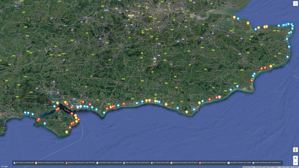
Remember when @SouthernWater changed the icons on their sewage dumping map, to make them look more palatable, smaller, to confuse and befuddle the viewer.
Today's example. SW's version & mine. Both showing where SW have dumped sewage in the last 72 hours
@anon_opin Everyone treated by the NHS or others should also receive a breakdown of their treatment costs showing the profits of private providers and service suppliers. To see exactly what could be saved if an efficient redistributive tax system were publicly funding all their healthcare