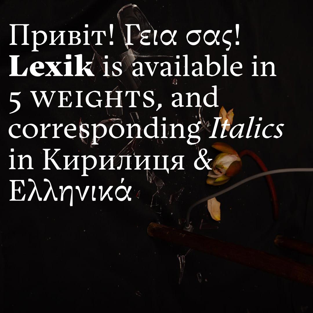
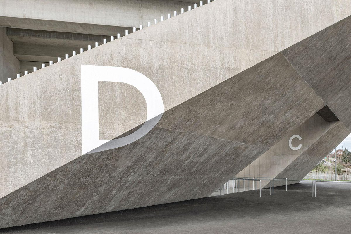
We released Lexik with #greek and #cyrillic extensions. Thanks to @irene_vlachou for the Greek supervision and @cyrillicsly for great workshops! Image by Pascal Petignat.
And similar in @kulturagenda
1 (cover):
Signage: https://t.co/6ziloLxZYi and https://t.co/zxYaFPqdlz
Photo: Simon von Gunten
Typeface: FRAC by Binnenland
2 (last page)
Signage: https://t.co/rHdMBTgYdd
Photo: Simon von Gunten
Typeface: FRAC by Binnenland
We want to put some things right that were mistakenly not mentioned in the news:
Credits for Lonza Arena:
Signage by https://t.co/1rqVnwuaQP and https://t.co/QiMQoS0SAK
Photo by Simon von Gunten
Typeface FRAC by Binnenland
@derbund
We are very pleased to announce that Binnenland has been awarded this year's Design Preis by Berner Design Stiftung.
Opening and award ceremony: Thursday, 23.3.2023, 7pm, #Kornhausforum#BESTFORM Exhibition: 24.3. to 30.4.2023
Info on: https://t.co/UN7FWWd7Kf
#BernerDesignPreis
@mekkablue@rafaelnepo All the info should be on our website, including updates: https://t.co/Z6QQLKdiGw
Please get in touch by email for specific questions.
Please support this campaign for a new typographic palette by @pylallaizon | un nuancier typo 🇨🇭 a typographic palette @Kickstarter https://t.co/Ozkn7bDypr
Our new TypeTester offers the option to examine our fonts by random or by comparable text as well as in various sizes and lengths.
#binnenland#typefoundry#typetester
In case you missed our newsletter last week, read it here https://t.co/ZjEwKdigF9 or sign up for future issues on our website https://t.co/gV9tPLvMZ2
#binnenland#newwebsite#newsletter
The centerpiece of our new website is the typeface menu. It provides an overview of our library and leads you directly to the TypeTester or to our shop.
(And by the way, we offer trial fonts for all our typefaces...) #typefoundry#newwebsite#binnenland
Tomorrows afterwork lecture by Laura Csocsán will be held physically @hkb_bfh but we strongly recommend to participate via zoom. https://t.co/brixIOnkMj
https://t.co/gWrflLzvrT
A situation where the calligraphic influence of the typeface appears is the transition of a stroke. Where the broad nib is applied, the round shapes are given a bend and the result is a shift between form and counter form.
I compiled a blog post about the characteristics of my new serif typeface Lexik. Here are some of the characteristic letters, read the full story here: https://t.co/dBgYxgEB3O