I’m sorry i #musk go. I have to leave #Twitter, in other words #X. If you are interested in further updates please visit https://t.co/iLnf5cLiYj or https://t.co/rQ224zqWcD. 👋🏼 #eXit
In eigener Sache: Grosse Freude! Über den Preis und vor allem auch über die Aufmerksamkeit für das lange vernachlässigte Thema der fürsorgerischen Zwangsmassnahmen @srfnews#srfzeitblende https://t.co/cLUdiyvmI6
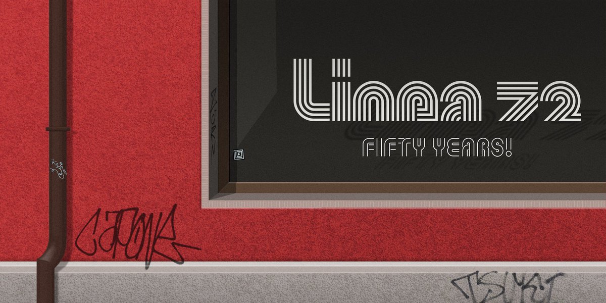
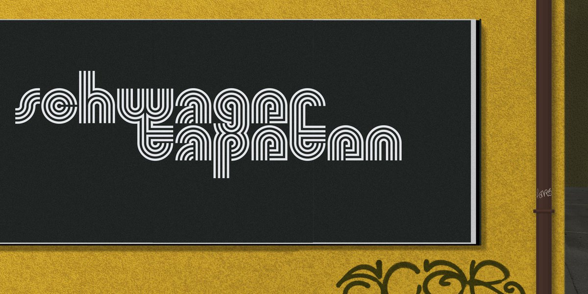
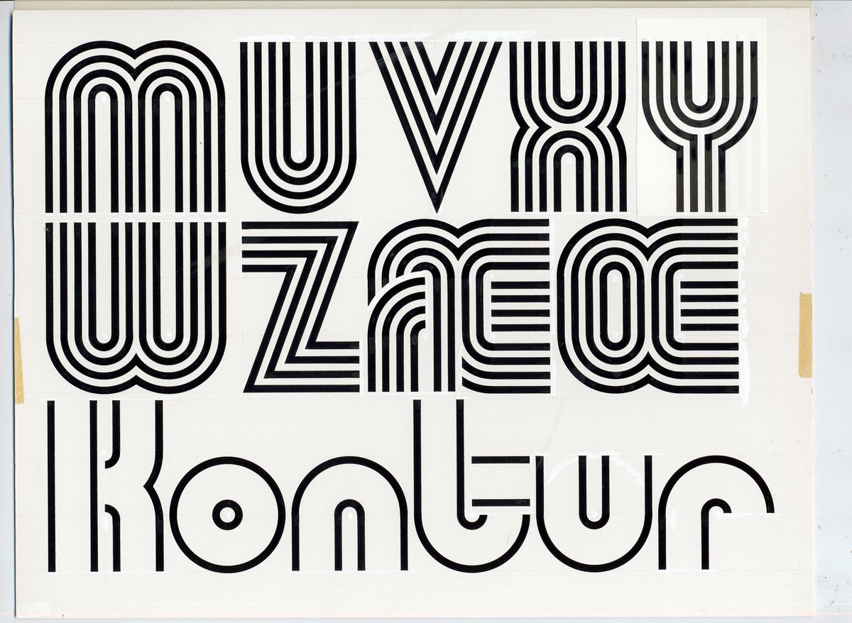
While some typefaces can be considered timeless, the term is not appropriate for Linea 72. With its four lines and the geometric construction it is a typical seventies typeface, inspired by the 1968 Mexico Olympics logo.
https://t.co/fZX0zRdPkv #1970s#typedesign#Linea72
Buildings need to be maintained and renovated from time to time – and so do fonts. Initially drawn by hand for phototypesetting, Linea 72 was now completely redrawn and extended with all the advantages of the digital era, including different stylistic alternates.
Buchstaben aus der Berner Schriftschmiede: Michael Mischler und Nik Thönen werden mit dem Design-Preis ausgezeichnet, weil sie Architektur und Grafik näher zusammenrücken. https://t.co/VsHm8TPVN8
We are very pleased to announce that Binnenland has been awarded this year's Design Preis by Berner Design Stiftung.
Opening and award ceremony: Thursday, 23.3.2023, 7pm, #Kornhausforum#BESTFORM Exhibition: 24.3. to 30.4.2023
Info on: https://t.co/UN7FWWd7Kf
#BernerDesignPreis
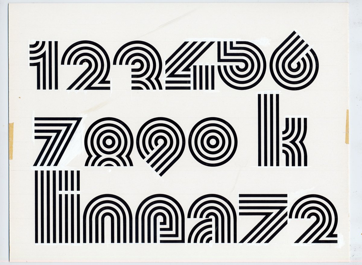
Original drawings of Linea 72 by Roland Hirter in 1972. Available now with 10 stylistic sets for print and web on https://t.co/fZX0zRena3
#newfont#typerelease#Linea72#seventies
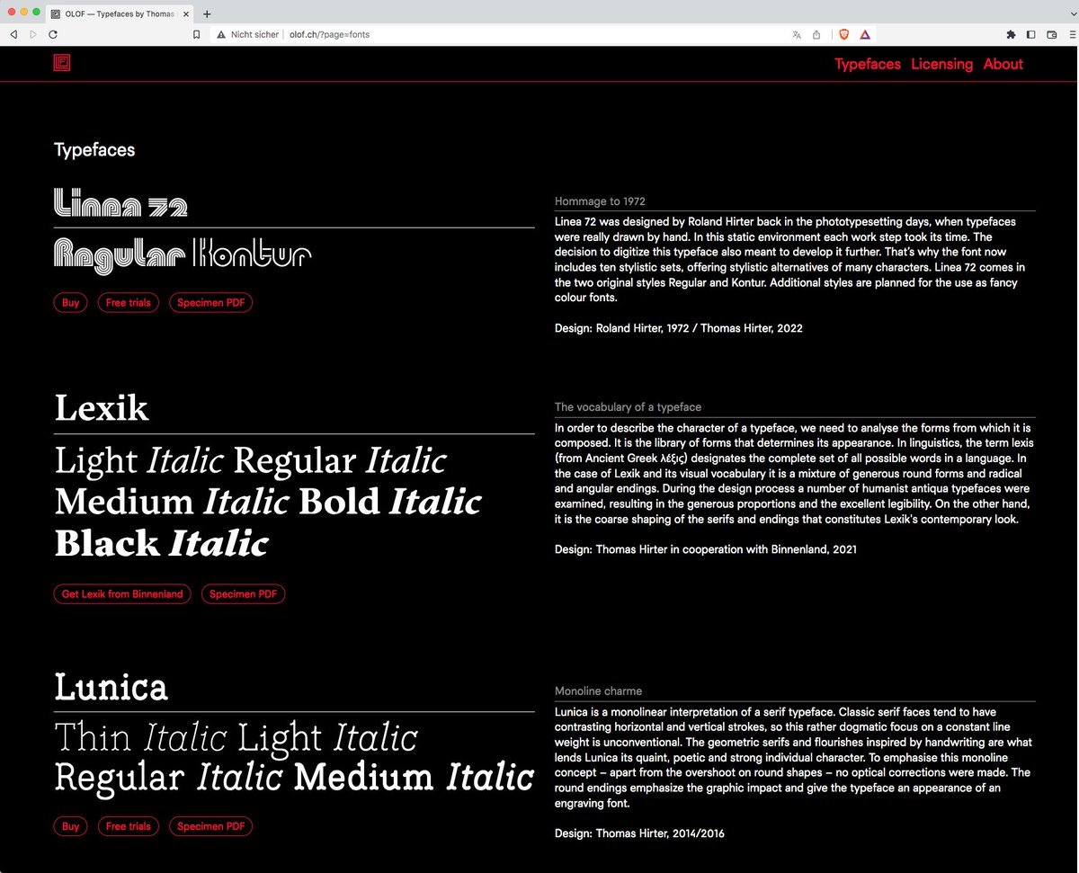
New website online!
And new lines on the web!
Check out this new old font by my father Roland Hirter (1972) and me (2022)
https://t.co/fZX0zRdPkv @typecache
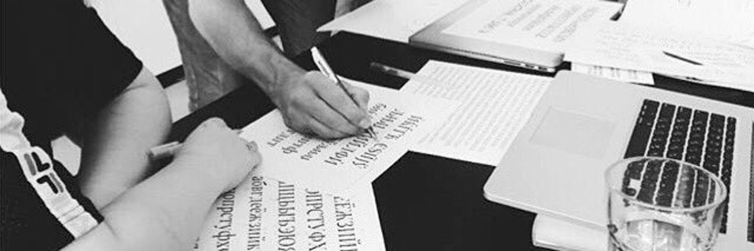
Interested in learning or improving your skills in Type Design? Here is an opportunity for part-time studies: https://t.co/LRBvaYCUCe
#typedesign#typography