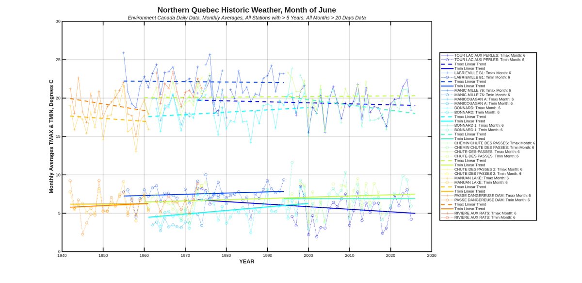
Here's June for the same area. The wiggles kind of match between the raw data and the reanalysis but for the trends, the match is not so good. It looks like the reanalysis algorithm picked one station (Bonnard) and ignored the data with cooler trends (Manic Mille & Chute Des Passes). You could argue that these latter 2 stations are not in the GHCN database, but that raises the question of how and who makes these choices.
Are the instrumental global surface temperature reconstructions accurate? I made a tool over the weekend to plot up raw data from Environment Canada historical weather stations within user a defined search area, and decided to compare the ERA5 reanalysis in the same area to the trends in the weather data, month by month.
Here's one example, June in Northern Quebec. Do you think the ERA5 reanalysis is "overwarming" the trend in this area? I do. Only one station (the cyanish color) seems to match the ERA5 trend for this month in this area (NOTE: the ERA5 gridded data are for TAVG, which should plot between the TMAX and TMIN data for the weather stations).
Yes. And to be fair some months for this area look good. The year to year wiggles in in the ERA5 reanalysis data match the year to year wiggles in the weather stations in the same area (as it should of course). And the trend in the ERA5 2 meter temperature seems to match trends showing in the weather stations (as it should). See December below......but....not all months look this good.
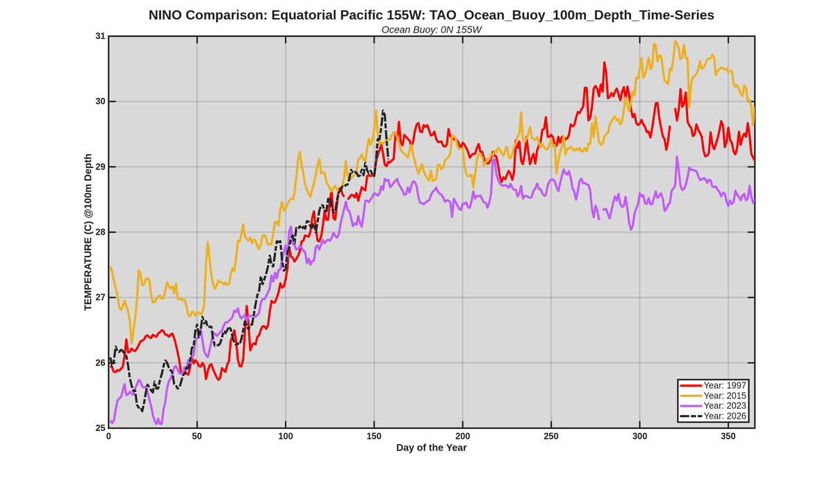
@BenNollWeather I also looked at the ocean subsurface temperatures daily data from the TAO buoys. However there are a lot of gaps in the data from some buoys. Here's the best series to compare El Ninos, the depth at 100 m from the 0N, 155W buoy (2026 temperatures vs 3 prior El Ninos):
As a final comment on Ottawa weather trends, here is the Tmax/Tmin by month of the year in GIF format for Ottawa area historical weather stations. Sure it shows winter/spring/fall warming, but not summer, except maybe at night, which I think is a symptom of the heat sink effect.
Ask yourself why the urban area of Ottawa shows warming, where stations only a few hundred kms north in the Quebec wilderness do not for the same season.
"...something about how we can’t trust gridded products..."
I have zero problems with gridded products, I just want there to be inputs to the grid nodes that are temporally continuous and reasonably close. That's true for the most of the satellite data, but for historical instrumental data, it's not. The instrumental database is a mess of no data, discontinuous data, contaminated data, and low density data. I'm not sure why I'm delving into it, but I have some ideas I want to try using the metric of warming rates by grid node by time period (instead of what everyone else uses which is temperature anomalies by grid node by time period.
"Warm season heat waves are increasing:"
From 1961 to 2020 this is true, but not if you extend the trend period to start in 1900. the 1961 start misses the warm 20s, 30s and 40s.
Anyway, here's all the months for the Northern Quebec stations dataset in convenient GIF format. Comments (be your own judge if you don't like my conclusions):
1. No systematic warming at all in summer, Tmax or Tmin
2. Warming in fall and early winter
3. Slight cooling Feb/March/April
To back up the urban heat island warming theory, here's some stations from Northern Quebec, within a 200 km radius of Bonnard. It would be hard to put together an ensemble time series of Tmax or Tmin in this area given the patchy nature of the data, but do you see warming here since 1940? I don't.
The physics is pretty simple. Grass and trees are not a significant heat sinks but asphalt and concrete are. The heat sink radiates this heat back into the air, especially on still nights. So did the area of heat sink material in the vicinity of the weather station, that is parking lots, runways, freeways, sidewalks, metal buildings, etc. change from 1937 to 1961, or 1961 to 2026? And was the research farm surrounded by as much heat sink material in summer, or sources of heat like buildings, freeways, in winter? The exhaust of a jet engine is about 650C, so small volumes of this gas diluting the air in the vicinity of the airport contaminate the temperature if the amount of jet traffic is on the rise.
Wind obviously dilutes heat sources and spreads the excess heat in urban areas, contaminating to a degree "rural areas" nearby.
Anyway, over the weekend I built a tool to look at the raw weather data, tmax and tmin to start; it's still a work in progress but I pick a Lat/Long center point and the program grabs all Environment Canada weather data from stations in a user-defined radius. I'm thinking how to plot decadal scale trend lines on the individual series, so I can better visually compare data, but here some preliminary plots for the Ottawa area (June, July, August and a location map).
@ryankatzrosene Right of course, and the number of 737s taking off and landing at the Ottawa airport in 1937 was the same as 2026. All the concrete heat sink that is at the airport now is exactly the same as 1937 too.
I'm not sure what you're referring to in 2017. My graph is about El Ninos. There was no El Nino in 2017, the El Nino was 2015 to 2016. My graph shows the observations to date compared historical El Ninos in the ramp year. Technically it's not a predictor of anything, but obviously you can infer what you want from it about the future.
This is a red herring comment. The backbone of the ocean temperature data used for subsurface temperatures in the equatorial Pacific east of 180 (my are of averaging, and down to my depth limit of averaging) is the TAO moored buoy network which has been in place since 1994. So the key data source for this has not changed since then. As climate data go this is a relatively reliable, consistent, and objective dataset.
Climate science has degenerated into a series of moral panics. Case in point: "The Atlantic overturning circulation will stop!" However, when you take the time to look at the actual data, you see negligible evidence of this happening any time soon.
https://t.co/WMoXY5ljDA
A quick look back at 2025 regarding the instability risk of the Atlantic Ocean circulation #AMOC.
Some bad, some positive news.
A meta-analysis of 768 runs with 38 CMIP6 climate models shows an #AMOC shutdown is not a low-probability event any more. 1/6 https://t.co/af1PkR293R
@ABDanielleSmith@paulbrandt I'm skeptical on the pipelines moving forward claim. But even they do move forward, at what cost? Carbon capture will go down in history as the mother of all wasteful boondoggles, but politicians in Ottawa are telling Albertans no pipeline for you unless by our rules.