A year ago today, I started my internship with the CBJ’s Creative Services. It still doesn’t feel real. Working Draft Night & seeing my own graphic go live. Drinking from souvenir cups I designed. Every item I delivered coming to life. I wouldn’t trade for the world! 1/3
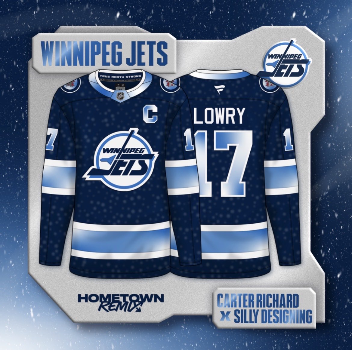
DAY THIRTY TWO: WINNIPEG JETS
Camps are open, preseason starts tomorrow & the Hometeam Remix Collab’s finale is here! Concept Cup Finalists @carterrichardd & @Silly_Designing team up for an out of this world concept, with the night sky & blue-white gradients on the 90s template!
DAY THIRTY ONE: WASHINGTON CAPITALS
Our penultimate concept in this community project belongs to @IvanGajduko and the Washington Capitals! The Screagle jerseys get remixed with a steel blue base, navy striping, and cherry blossom accents and captain's patch for a classy look.
DAY TWENTY NINE: VANCOUVER CANUCKS
PNW part 2 brought to you by Brendan from BW Hockey on Instagram. He takes the Canucks’ modern colors and put them on their 1997-2007 template for a classy combination of eras. What yall think?
DAY TWENTY EIGHT: UTAH MAMMOTH
Utah is a state of incredible scenic beauty, and @ts20designs takes full advantage of that with this HTRC entry. Sandstone inspired striping, an entirely new red-tone color scheme, and the state outline on full display bringing it all together.
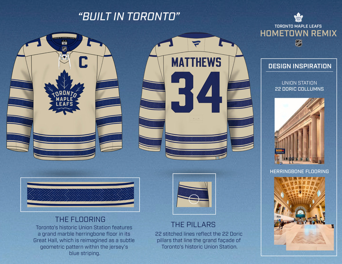
DAY TWENTY SEVEN: TORONTO MAPLE LEAFS
Nikhiel Tejani does the Leaves for the HTRC! Inspired by Toronto Union Station, with the Great Hall’s herringbone floor pattern embossed in the stripes, & 22 stitched hem lines referencing the 22 Doric columns along the Front Street entrance
DAY TWENTY FOUR: SEATTLE KRAKEN
LJ Bachenheimer (@leajamieb) is repping all of Seattle in the HTRC, adding the Mariners’ silver & teal to the Kraken’s navy & light blue. The patterns from the Seattle city flag double as tentacle-like detailing, finished off with the anchor logo.
DAY TWENTY THREE: SAN JOSE SHARKS
Mix of old & new by @Puckguy14! Stripes combine many SJ unis, angled like the OG black alt, plus circuits from the Stealth alt. The 2007-13 yokes return, now pointed like the primary logo. The Shark head they skate out of is made the front crest
DAY TWENTY TWO: PITTSBURGH PENGUINS
Our PENultimate Nerd in the HTRC gives us this beauty of a Pens concept! @BRND_Studios takes inspiration from the Roberto Clemente bridge and steel industry of Pittsburgh. Plus, the scarfed skating Penguin finally breaks free from his roundel.
DAY TWENTY ONE: PHILADELPHIA FLYERS
Kyle from @KNJerseys comes through with his HTRC concept inspired by the grit of Philadelphia. With a brick pattern in the striping, stars in the collar, and dates important to the city and franchise on the hem. Plus the keystone C returns!
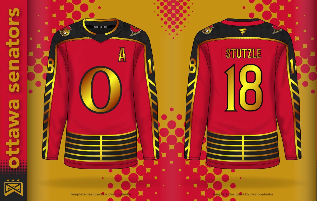
DAY TWENTY: OTTAWA SENATORS
Our own @balkocreative takes on his hometown Sens! The arm chevrons are for the 8 downtown locks of the Rideau Canal, while the hem stripes mimic the wooden design of the lock doors. Plus metallic gold detailing throughout!
This is a horrible tragedy, absolute bullshit, fuck Michigan, yadda yadda yadda
What the fuck is that font?? Why are you using a blue serif font on a black background for your statements?
DAY NINETEEN: NEW YORK RANGERS
We have @ct95designs pinch hitting for the Rangers here, with an adjustment on their leaked design. The Lady Liberty logo and her iconic green take center stage, with other elements inspired by art deco design. What do we think?
DAY EIGHTEEN: NEW YORK ISLANDERS
Longtime Jersey Nerd/HJC contributor Phil Beck brings us this Islanders concept, as a blackout version of the Fisherman design that uses the striping of the lighthouse logo on the hems and arms. A real fun take on the Isles!
DAY FOURTEEN: MINNESOTA WILD
Here we have @A_R_Hey giving his take on the rumored “Night Sky” direction the Wild are taking, using a fun black, silver, green, and white scheme. Plus the stars from the logo on the arms and hem, and the return of the 2000s fur font!
DAY THIRTEEN: LOS ANGELES KINGS
We have an expert in the field today, as Taylor from @KingsUniHistory adds one to their history. Infusing black into their 80s look, plus taking inspiration from the Hollywood Walk of Fame to honor past players, for a great combination honoring LA
DAY TWELVE: FLORIDA PANTHERS
John Dalton on Instagram takes the “Jet Blue” alt’s striping as a basis, and then pulls colors from a beach sunrise to tie to the shores of South Florida and the city of Sunrise. He also adds the wave design from the city seal to the front logo.