The first time I designed a poster, I spent minutes staring at it. I was trying to figure out what was wrong.
The colors were nice and the fonts were clean. Everything looked "correct" on the surface, yet it still did not feel right.
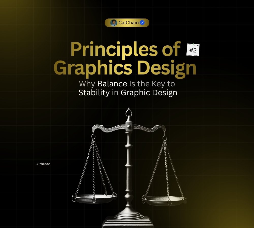
The layout felt shaky, almost like a table with one leg shorter than the rest. It could not decide where it wanted to sit.
I eventually realized the problem was not my tools or my colors. It was the 𝗯𝗮𝗹𝗮𝗻𝗰𝗲.
Over the past few months I have learned that good design is not always about perfect symmetry or being "flawless."
It is about how you distribute visual weight.
------------------
Why your design might feel "off"
𝗕𝗹𝗮𝗻𝗰𝗲 is what makes a design feel stable and grounded. It is how you distribute that weight across the layout
The text, images, color and empty space all working as a team.
When one side of your design feels way heavier than the other, the eye struggles to find a resting place. It feels like the design is about to tip over.
When elements pull in different directions without a plan, your message loses its focus entirely.
---------------------
Two ways to find that balance:
Symmetrical Balance: This is the "classic" look. You mirror elements on both sides of a central axis. It feels very formal, stable and organized. It is great for wedding invitations or high end luxury brands.
Asymmetrical Balance: This is where the magic happens. You balance a large, "heavy" element on one side with several smaller, "lighter" elements on the other. It feels more modern, energetic and interesting to the eyes
------------------------
Balanced designs feel calm. They feel like they were made with a specific purpose.
Next time you are working, try squinting your eyes at your screen. If one side looks like a dark blob and the other side looks empty
you know exactly what you need to fix. (BALANCE)
We built BlinkHost to remove deployment friction for developers and digital agencies.
Instead of wrestling with servers and complex cloud setups, developers can deploy scalable business applications in seconds from one unified platform.
Safe design is boring design. Period.
If your designs feel a bit "flat" or look like a blurry soup where nothing stands out, you’re likely missing one major ingredient:
CONTRAST.
Contrast is the secret sauce that prevents your work from looking mid. It’s the visual friction that creates excitement.
When two elements on a page are different, they shouldn't just be slightly different... they need to look like they belong to two completely different worlds.
If there’s no conflict, there’s no interest.
Here is how you inject heavy contrast into your layouts without ruining the vibe:
Light vs. Dark: The classic. Stop putting dark gray text on a light gray background, it’s a vibe killer and hard to read. Go for a clean pitch black on pure white, or slap a bright neon element onto a dark mode background so it instantly jumps out.
Big vs. Small: Don't make all your text the same size. Make your main headline massive and heavy, then make your secondary info small and clean with a bit of breathing room. That huge difference instantly makes it look like a high end magazine layout.
Rough vs. Smooth: Mix up your styles. Try throwing a rough, gritty texture or a wavy, fluid shape right behind a perfectly straight, sharp box. Putting something messy next to something clean always looks amazing (If creatively done).
NOTE:
Don’t be timid.
If you're going to create contrast, make it obvious. If it’s only a little bit different, it just looks like a mistake. Make it intentional.
Contrast is just one piece of the puzzle 🧩
Next post, I’ll break down another core principle of design.
See you there 💙🏌🏼♂️
🚨 Building on Base is not a sprint
It’s a massive structural construction 💎
While others play games, we pour real concrete
and set up automated weekly rewards for our top builders
Transparency is our foundation
The blueprint is solid
The contract is locked
The active crew is growing every day
We are not here for a quick flip
We are here to construct a high-tech digital skyscraper
Floor by floor 🏗️🟦
Join us, you are needed here 🤝
#VIBOB #Base #Zora #WeRiseTogether #Skyscraper