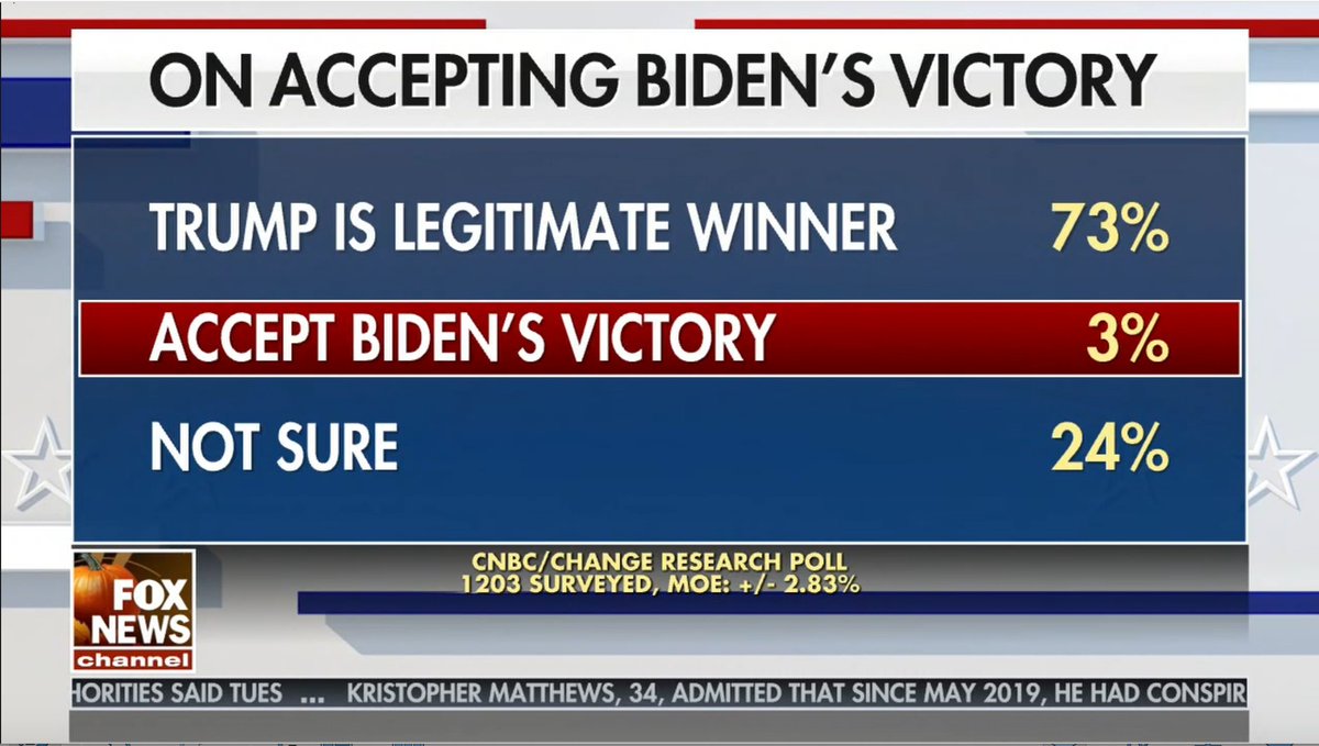
What key piece of polling information do you see missing from this Bad @FoxFriendsFirst Graphic?
(Hint: these are not 1203 random voters)
🤦♀️ @jillianmele@GriffJenkins
https://t.co/88RbAsbM0Y
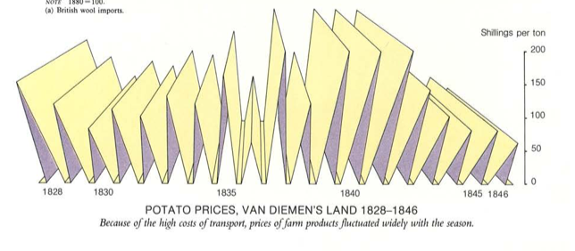
A thread of mystifying and hilarious data visualisations from the "Australians" books, published in 1987 by the Australian Government. (ht @mikejbeggs) #ausecon#chartcrimes#dataviz
1. Spikes
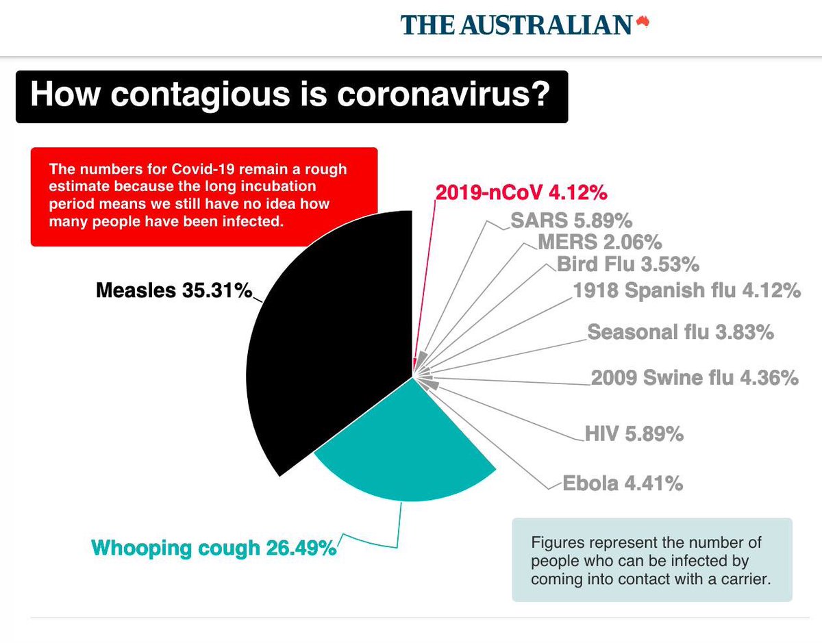
Shoutout to The Australian for the worst pie chart ever. To save you all time, I checked to make sure these percentages added up to 100%. I guess that means if you meet someone carrying all these diseases there's a 100% chance of being infected?
As an Indian woman, I can confirm that too much of my time is spent hiding behind a rock praying the terrifying gang of international giant ladies and their Latvian general don't find me