https://t.co/iKB45Ymqws
Watch this video! It explains the importance of Visual Advertising. It also explains more about the career if you are interested! #Su2412#marketing#careers#future
Fort Fitness!! This is one of the images for my Holiday Campaign! Use Forte to stay on top of your fitness and health goals! #Fitness#Su2412#Holidays 🎄🎄🎄🎄
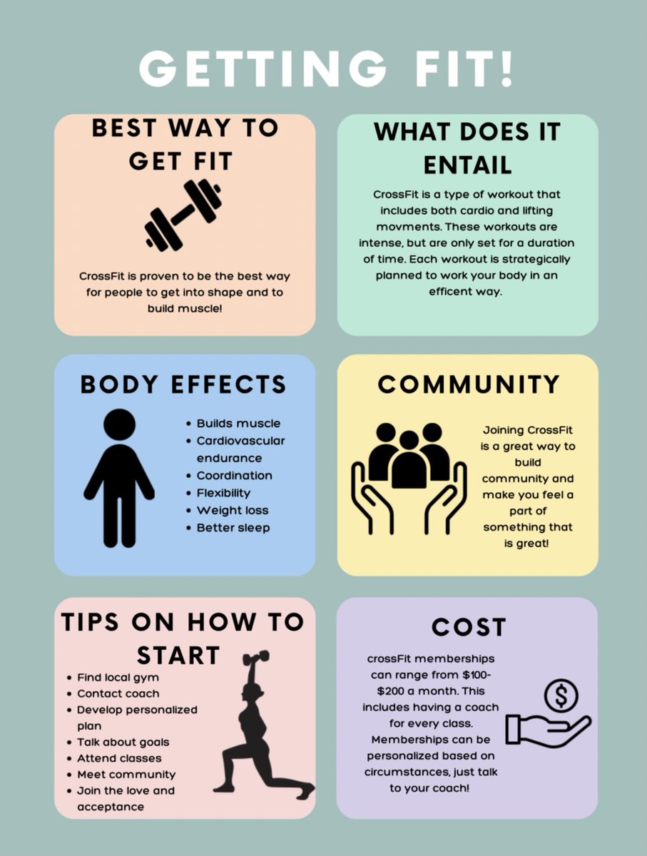
Here is my Company Campaign. My company is Forte, which is a CrossFit gym. Our goals are to keep you healthy and to set personal goals. Let's work together to stay fit this holiday season, while having fun! 🎄🎅🎁🕎🦃👨👩👧👦 #SU2412#Holidays#Health#Fitness
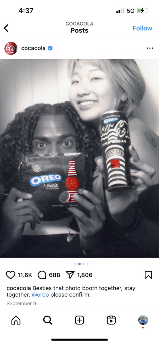
The marketing campaign that I chose is the one for the Oreo/Coca-Cola collaboration. My favorite aspect of this particular image for the campaign is the contrast of the colorless background to the colorful brand names to make them stick out.
#su2412#oreo#cocacola
@Reebok https://t.co/BjgpeIUoPo
I decided to share this post that Reebok posted on X. This ad is empowering, but also informative. It implies that Reebok is an affordable brand that can be a part of your fitness journey. I love the bold lettering. #SU2414#GetFit#yourpower
In my flier I used alignment in my flier when placing the text in the center of the page in align with one another. I also feel like the color choice adds contrast and does catch the viewer's eyes. #su2414#fitness #alignment#OrangeContrast