@ilyamiskov How you approach the stage of the design process where you are turning design requirements into something visual. Initial concepts I guess you’d call it.
@va_experience@edgarasben Always interesting to hear how people are using this tech as there isn’t really a clear market consensus on which are better at specific use cases.
They are all still very “trial and error” products
@CrispyUX First one for me. I like the idea of the more colorful background but it takes away from the impact of the colors in the graphs/metrics somehow it think.
@hobdaydesign This case is a challenge because the context has 3 elements:
Title, above button with trail icon above, button with leadicon (and no BG)
This makes it hard to distinguish interactive elements.
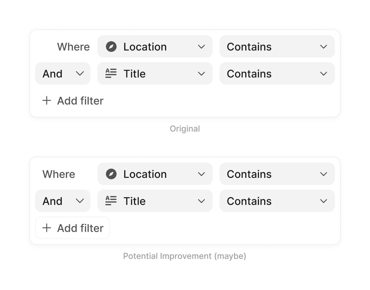
This might be an option - make the “Add”
button more differentiated.