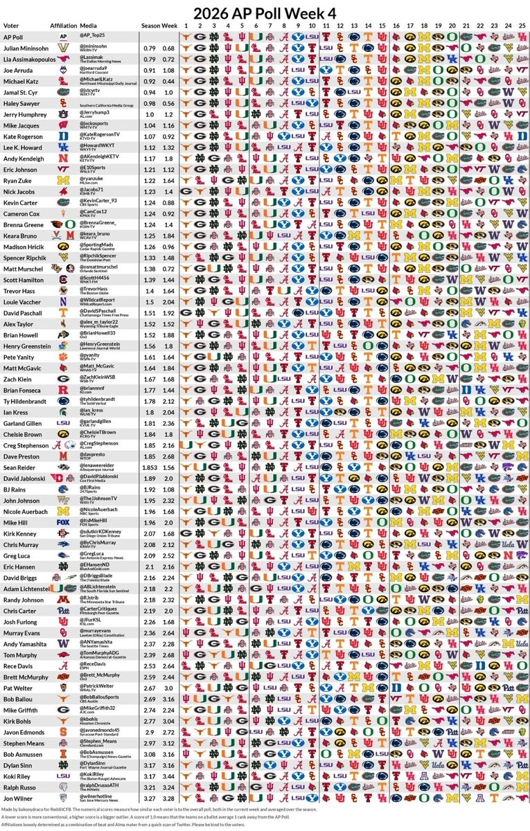
I see this graphic all the time on social media.
It contains a lot of data, and one thing that often gets lost is the conference affiliation of the writers being polled.
So I made a cleaner graphic that just shows the writer affiliations.
This is who holds the votes.