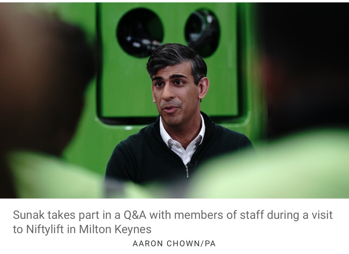
Thanks for all the kind comments on my BBC speech yesterday. Here from the @RestIsPolitics live show is the speech I would like @Keir_Starmer to make on Brexit
A few weeks ago, I got a message on social media suggesting we do a Drum& Bass remix of the BBC News theme for the set I’m doing at Glastonbury. There’s an idea, I thought. First, I messaged @davidlowemusic2. Then @crissycriss. To my delight, both said yes…
Those asking if ‘The Thick of It’ is writing this election may want to note that today’s Tory immigration plan -shunt it off to an independent body to decide, so ministers can avoid talking specifics in interviews- is the main plot of 2009’s special ‘The Rise of the Nutters.’
@iRobot_UK trying to purchase a replacement cleaning head module for a J7+ Combo. Seemingly impossible. Please could you find a solution and contact me?
15 years ago, I helped design Google Maps.
I still use it everyday.
Last week, the team dramatically changed the map’s visual design.
I don’t love it.
It feels colder, less accurate and less human.
But more importantly, they missed a key opportunity to simplify and scale.
–––
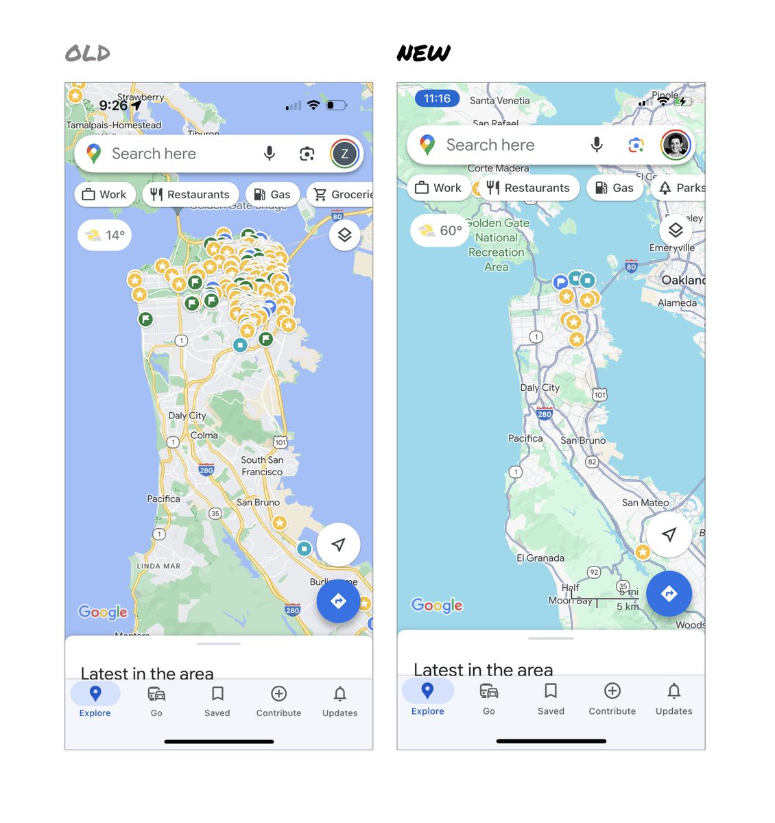
Google Maps has started to widely roll out updated map colors:
- All roads are now gray
- Water changed from blue to teal
- Parks and open spaces are now mint green
It seems the goal was to improve usability and make the maps more readable.
Admittedly, I do think major roads, traffic, and trails stand out more now.
But the colors of water and parks/open spaces blend together.
And to me, the palette feels colder and more computer generated.
But color choices aside…
If the goal was better usability, the team missed a big opportunity:
Google Maps should have cleaned up the crud overlaying the map.
–––
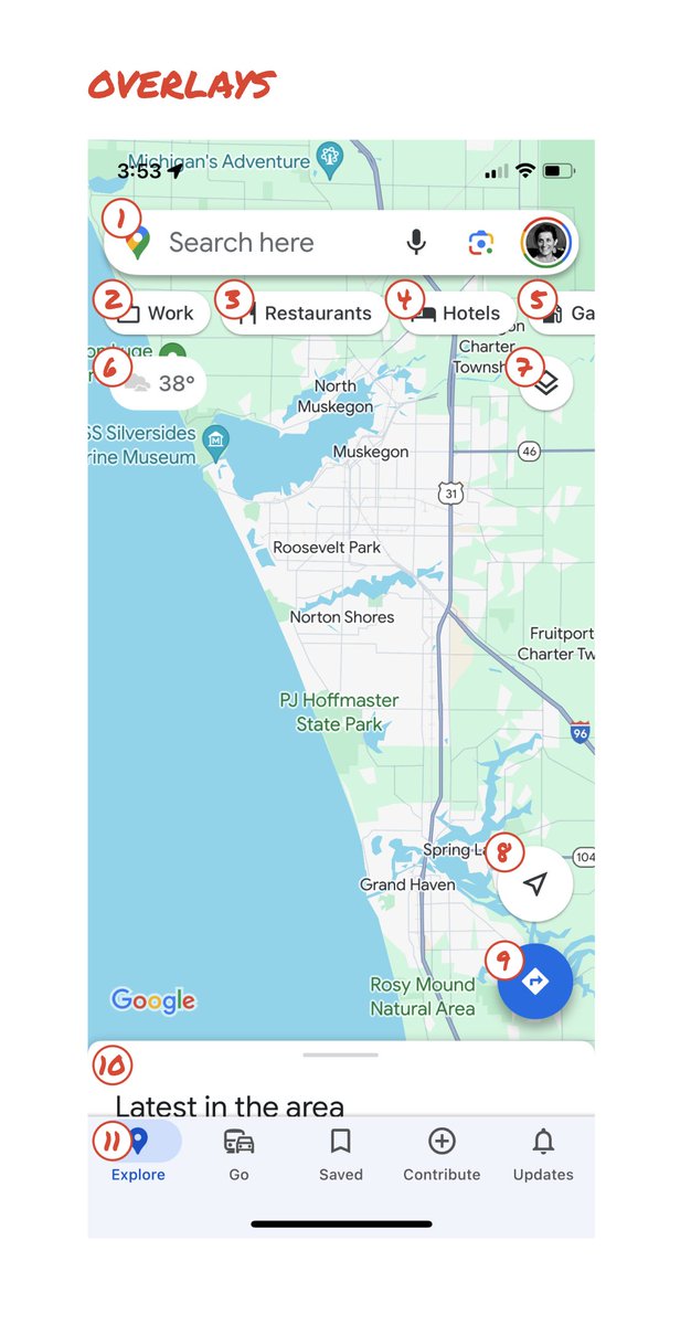
So much stuff has accumulated on top of the map.
Currently there are ~11 different elements obscuring it:
- Search box
- 8 pills overlayed in 4 rows
- A peeking card for “latest in the area”
- A bottom nav bar
(Personally, I would LOVE to see usage metrics for all these overlays.)
The map should be sacred real estate.
Only things that are highly useful to many people should obscure it.
There should be a very limited number of features that can cover the map view.
And there are multiple ways to add new features without overlaying them directly on the map.
–––
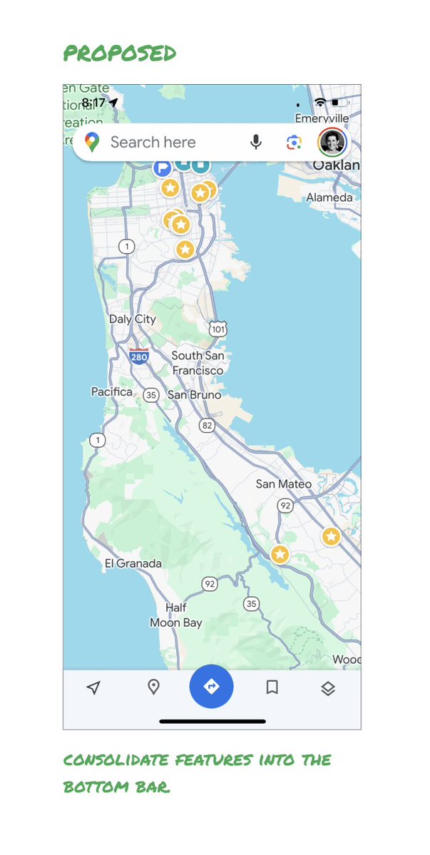
Here’s how it could look:
- Keep the search box
- Keep the bottom bar
- Remove everything else from the map
- Roll the most used features into the bottom bar
- Bury the less used features elsewhere in the app
I assume the search box and directions are top priority and should remain prominent.
My Location and map layers (satellite, traffic, etc.) could move to the bottom bar.
The explore overlays (restaurants, gas, etc.) could live in the bottom bar in “Explore” and open as cards.
The additional space in the bottom bar could be used for Saved, as a “More” option, or could be removed entirely.
There are many variations of how features could be arranged.
But the key points are:
- Dramatically simplify
- Strongly prioritize map visibility
- Bury legacy and low use features
–––
It’s normal for products to accumulate features over time.
But it’s also super important to stay vigilant and continually clean them up.
In many ways, it’s interesting to see history repeating itself.
In 2007, I was 1 of 2 designers on Google Maps.
At that time, Maps had already become a cluttered mess.
We were wedging new features into any space we could find in the UI.
The user experience was suffering and the product was growing increasingly complicated.
We had to rethink the app to be simple and scale for the future.
It seems like it’s time for Google Maps to do this again…
–––
For more on design + tips for early stage founders, follow me on X: @elizlaraki
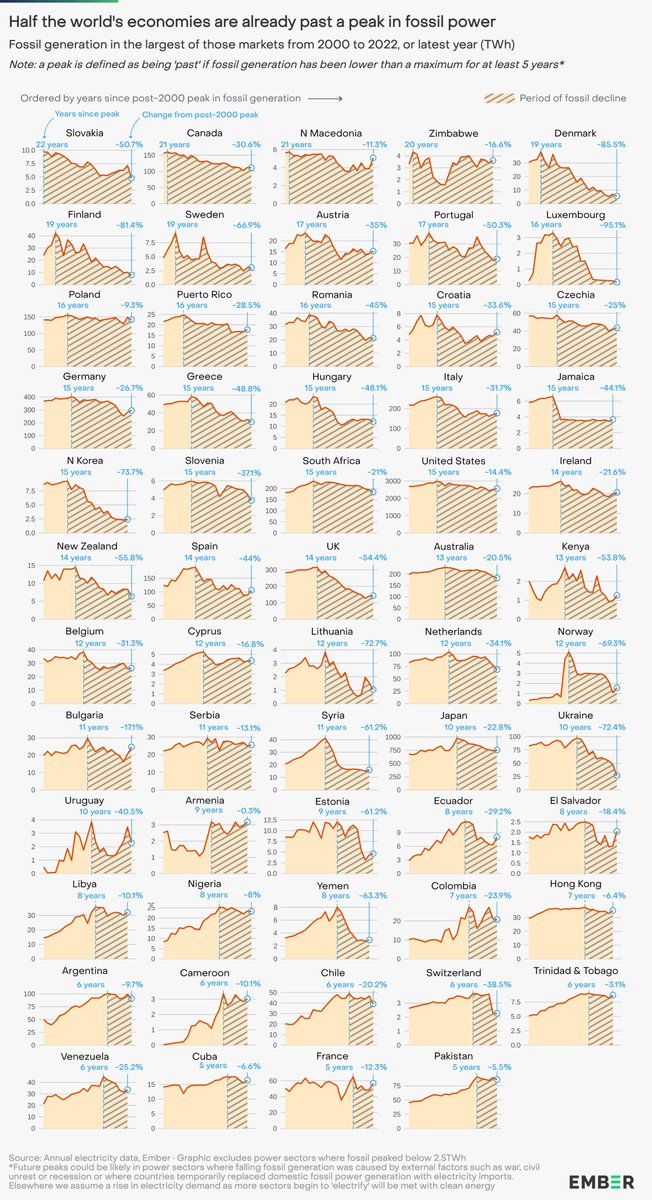
I made a giant graphic this week... to highlight just how many countries are already well into a period of fossil fuel decline in their power sectors.
Half of the world's economies (107!) are already five years past a peak in fossil power generation.
https://t.co/EpTW5cKGzj
People who have turned to X for breaking news about the Israel-Hamas conflict are being hit with old videos, fake photos, & video game footage at a level researchers have never seen.
The Israel-Hamas War Is Drowning X in Disinformation https://t.co/8KIPvjcDGR via @daithaigilbert
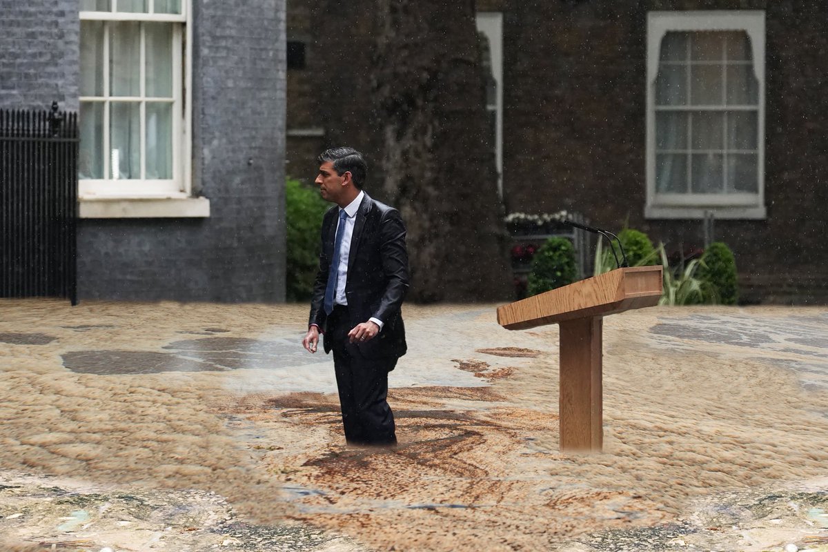
Sunak didn’t just cancel HS2…
He authorised the sale of the land that would form part of the cancelled route
So no other leader could reverse his decision.
This major decision
One he took unilaterally
Without consulting parliament
…without anyone having voted for him.
@gmail Submitted feedback. Reminder @Google's mission is "to organise the world's information & make it universally accessible & useful". You've managed to make the organisation of the information tedious & time intensive. It's useful & universally accessible via immense frustration.
@gmail for the app....I mean....come on....#selectall#selectmultiple just make it so you select one mail then drag your finger to select more or have a select all function. It's 2023. This is crazy. Crazy I tell you. It's madness. Why haven't you done this.
@gmail I have a feeling based on just a few searches on @Google, within the support pages, Reddit, other forums et al that this issue has persisted since 2012! I find this truly baffling....
“You were told that it would be pain-free. You were told that it would all be upsides, no downsides”
Former No 10 Press Secretary Alastair Campbell claims the British public were “lied to” and calls for Boris Johnson to be held accountable
#bbcqt https://t.co/Si2VWgjgt1
Gavin Newsom’s recent appearance on Hannity is a masterclass in communication and debate. A must-watch for all leaders — no matter what field you’re in or what party you belong to.
How Newsom took on Hannity, a thread🧵