We help organisations to bring their data to life. We do this by using data journalism, visualisations and engaging storytelling to make data impactful
For a data storytelling to be engaging, it needs you to ask the right questions first and then to follow few simple steps. Here is the third one: time! #datacrunchies#datastorytelling#storytellingwithdata… https://t.co/bZWuFZNhi3
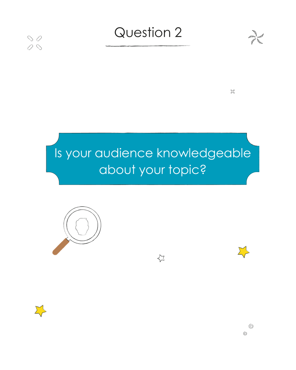
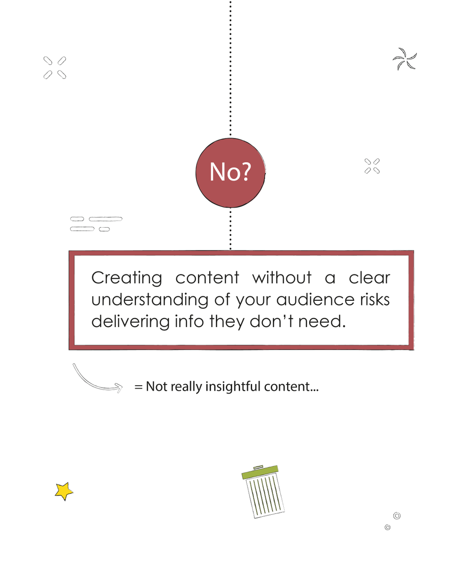
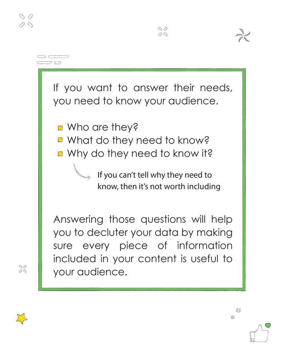
To create a great #datastorytelling and select the right data for the right audience, you need to ask yourself few questions, starting with ‘what does my audience really need to know?’, followed by ‘will they understand my point?’
#datacrunchies#datastories#datavisualisation
Did you know that that more than one third of all trips made by Europeans were visits to friends and relatives ❓ 👨👩👧👦
Do you want to know more ❓🏖️ #AskEurostat
➡️ Check our data visualisation #Estatspotlight with some interesting facts on tourism: https://t.co/LaAPPVzz4l
A lifetime of saving on your commuting cost could get you some very nice things indeed - such as a house in Bali! @datacrunchies produced this online calculator for @forduk to help visualise the saving https://t.co/PS1p4r7Btf #DataScience#Datavisualization#storytelling
Mandatory trainings don’t have to be boring! Sometimes a nice #infographic is what it takes to make your content appealing again. Full infographic @ https://t.co/8xYDMfJGcY #datacrunchies#datavisualisation
Tired of snoozing through yet another deep dive data presentation? Worried that your business investments in data are not delivering value? Perhaps you should consider how @DataCrunchies can help you to bridge the gap. #datajournalism#storytelling
https://t.co/Jp5sPKCNuK
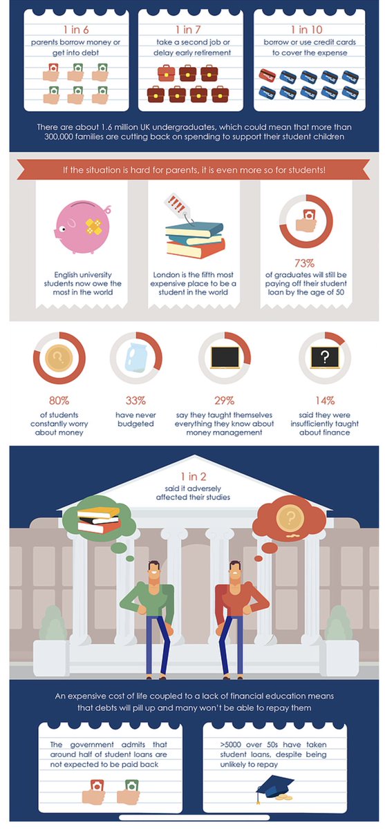
London is the 5th most expensive city to be a student in the world. In the UK 73% of graduates will still be paying off theoir loan when they are 50! @DataCrunchies#infographic#storytime#TruthMatters
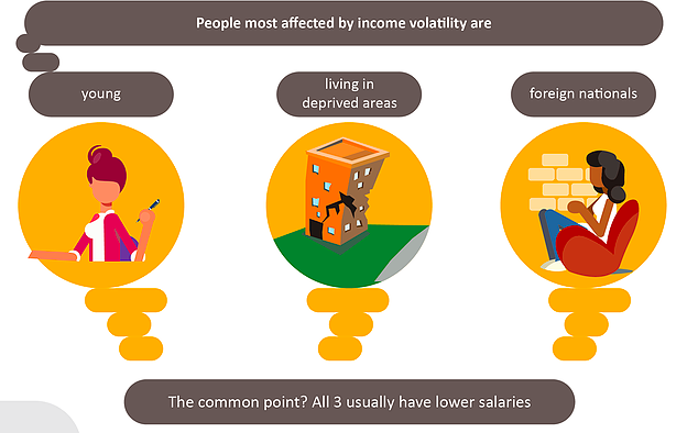
People of low incomes experience more pay changes, and the variation is two times that of high earners. This can lead to an inability to plan for the future, inability to pay for necessities, exposure to financial uncertainty...#INFOGRAPHICS#storytelling#inequality
Living on a roller coaster income. Did you know that the lowest paid workers see their wage fluctuate the most? The typical worker sees their pay change 5 times in a year. This is called income volatility...@DataCrunchies#datavisualisation#mentalhealth#income
Emailing all day long may be bad for our mental well being...but did you know it is also bad for the planet? Check out our CO2 calculator that we, at DataCrunchies, have created for #CWjobsWant#datavisualisation? Check us out @ https://t.co/y9wEE4pPFT
https://t.co/mnMAR2Rp3U
Want to know the secret to crafting engaging storytelling from your data? Check out our practical steps guide #datavisualisation#datajournalism#storytelling https://t.co/03WLNdNCag
The importance of the last mile in any data science operation. We must lead with the business context, visualise effectively and tell the story of your data insights to actually drive value for companies
https://t.co/Kj6HsDCMqS