Originally an unreleased dub from 2017 but decided to let this one off Dub Styling is out now to stream and download
CLICK THIS LINK: https://t.co/2C44ADsQud
Some of you aren't going to want to hear this on May the 4th, but Star Wars is awful. The original three where watchable I suppose, but revisiting them, they still aren't even good, never mind great.
This message brought to you by Frodo and the Shire Boys.
Every sports fan deserves to die LOL I’m not joking either. It’s not a joke I’m really very serious, extremely. No joke. Actually serious. They are one of the absolute main reasons why the world is a prison and quality is life is raped up it’s own arse.
@goodcharls@vintagepuro@JustinWhang Reminder that 99.9% of all recorded "music" of the past 100 years ("popular" or "alternative") is subversive mind control
@TheLaurenChen The CIA Financed Hip Hop for Social Engineering, to ‘Corrupt American Youth’ and to Covertly Destabilize and Sow Division in America, Admits Ex-CIA agent
CIA's MK-Ultra Infiltration of Media
https://t.co/aRmHjx0Y6l
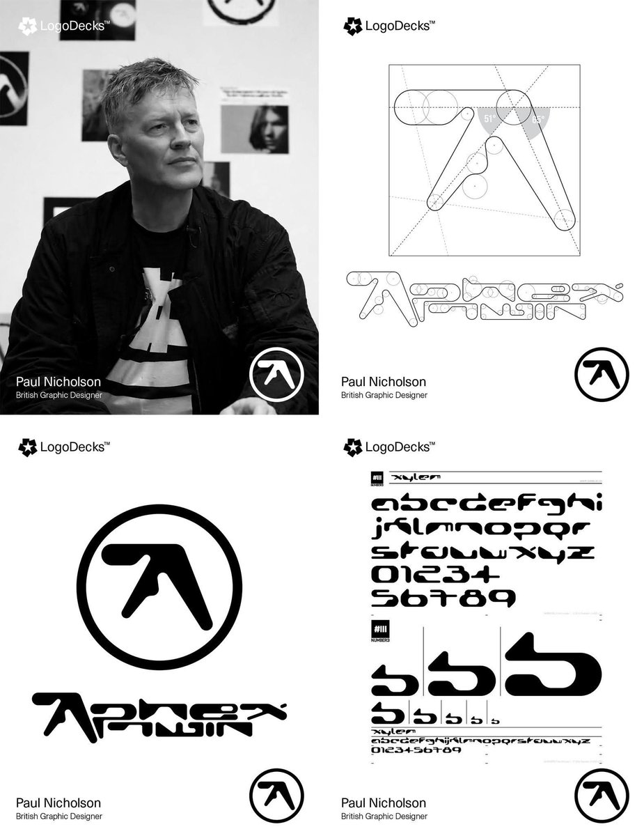
Aphex Twin’s Logo Wasn’t Drawn — It Was Engineered: The Paul Nicholson Story.
Paul Nicholson is a British graphic designer whose career spans music branding, typography, and visual identity work, most famously for his long-standing collaboration with Aphex Twin. Beginning in the early 1990s, Nicholson developed a reputation for clean, conceptual mark-making that merges technical drafting discipline with experimental visual language. His Aphex Twin logo became a defining example of this approach: a carefully constructed geometric form composed of controlled curves, and calculated negative space. Rather than sketching a loose symbol, Nicholson engineered the mark using measured proportions so that every stroke thickness and angle relates harmoniously to the whole. Beyond this iconic design, he has produced record sleeves, typography systems, and visual identities for electronic music labels and artists, consistently emphasizing structural clarity and symbolic strength. His work demonstrates how minimal shapes, when precisely constructed, can carry strong cultural meaning and remain visually durable across decades of reproduction and reinterpretation.
#logodecks