Email Design Non-Negotiables 🎨
1) CTA button above the fold on every single send. The above the fold section is the only part every opener is guaranteed to see. If your button isn’t up there, you’re banking on them scrolling to find it.
2) Every product gets its own button. Subscribers don’t assume the image is clickable. One general “Shop Now” at the bottom loses everyone who wanted a specific SKU.
3) End every email with a “Shop All” CTA. The people who scrolled all the way down without clicking are still warm, they just didn’t connect with what you featured. Give them another way in right before the footer.
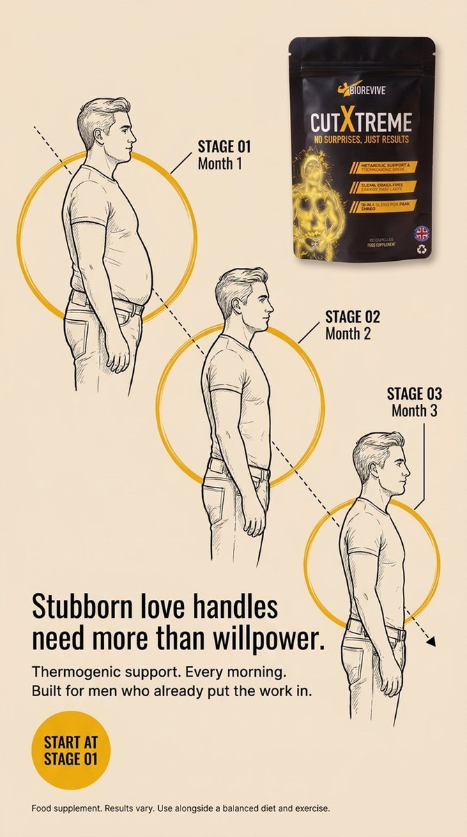
4) Infographics over walls of copy. Anytime you’ve written more than 2-3 lines in a row, that’s your signal to turn it into a visual. Before and afters, us vs them charts, stat blocks, step-by-steps.
5) Keep the background behind your hero text clean. No faces, no busy product shots, and no detailed scenery. Extend the image with AI or drop a gradient over the top so the headline actually reads.
6) Never run two hero layouts in a row that look the same. The same headline + body + button every send makes your calendar feel templated, and templated calendars stop getting opened.
7) Include category buttons in every footer. It’s the one section that repeats across every campaign and flow, so the optimization compounds for the lifetime of the account.
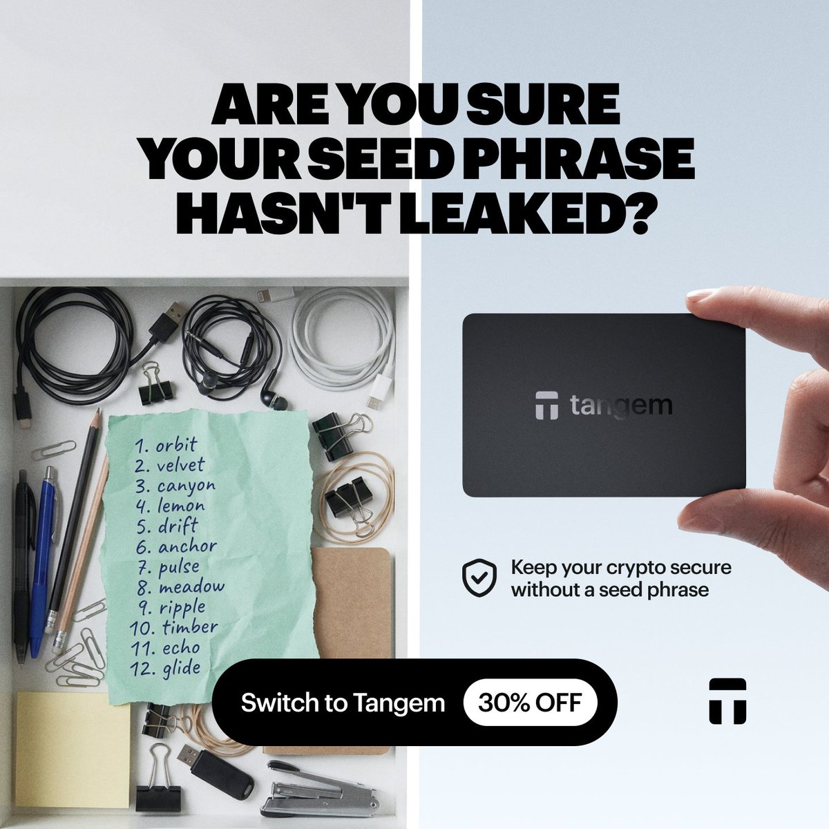
If your seed phrase has been exposed, your crypto could be at risk. Move to a Tangem wallet and choose a seedless setup — no recovery phrase to write down or store.
Switch to Tangem and save 30% today.
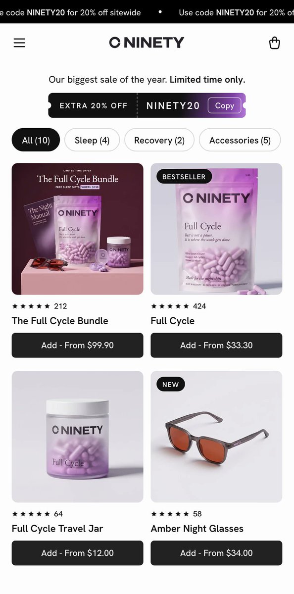
Your product page shouldn't make customers work harder to buy.
Here's a great example of how to structure a high-converting subscription offer 👇
Instead of overwhelming visitors with options, everything is designed to make the purchase decision easier.
5 things worth testing:
1. Simplified product selection → Less decision fatigue.
2. Prominent discount messaging → Makes the value immediately obvious.
3. Free welcome gifts → Increases perceived value without lowering the price further.
4. Clear shipping benefits → Removes uncertainty before checkout.
5. 90-day money-back guarantee → Reduces the perceived risk of purchasing.
Notice how none of these elements work in isolation.
They all address a different reason someone might hesitate to buy.
That's what good CRO is about.
Not just changing button colors, but systematically removing friction and making the offer more compelling.
All you guys heard about HEARS
Their product is earplugs, one of the most boring products out there, and they turned it into smth special
Checked what their emails look like, since retention plays a huge role in their business model, and thought there’s room to make them better, so here’s the remake:
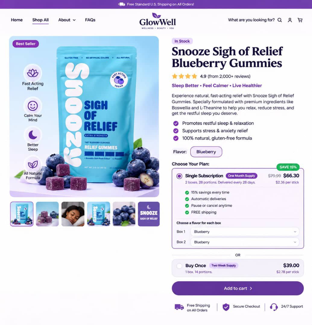
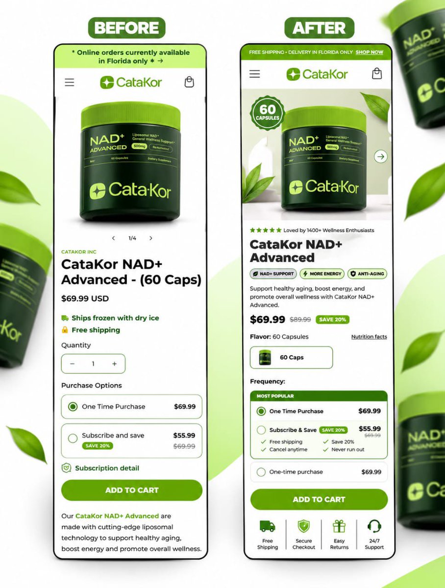
💜 PDP Redesign Concept for GlowWell!
Clean design, beautiful product presentation, and a seamless shopping experience.
Focused on modern UI, clear product details, and conversion-driven design.
What do you think?
Hi to the new people here 💓 we also have FREE ad templates in time for #BlackFriday
Follow us and comment READY on the original thread to get these freebies!
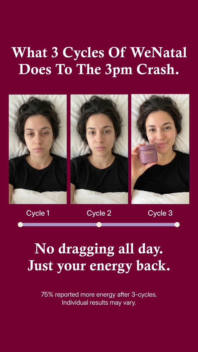
As someone who is very self conscious about my double chin (like if I had the money I’d get surgery) this is exaggerated BUT it’s how I FEEL that I look. Would change to how I felt > how I looked > how I look now to tap into emotion + sell an outcome that feels achievable.
Started designing static ads, and here’s my first batch. 👀
Looking to help brands create scroll-stopping creatives that grab attention and drive conversions.
Need static ads that actually sell?
My DMs are open. 🤝
Recent ad concepts designed for Ritual ⚡️
Is your ad creative actually driving sales? I build clean, direct-response static ads that stop the scroll and scale your brand.
Want high-converting assets for your brand? Drop me a DM to collaborate! 📩
Recent ad concepts designed for Gruns
I create scroll-stopping, conversion-focused static ads that help brands turn attention into sales.
Need ads that deliver results? My DMs are open. 📩